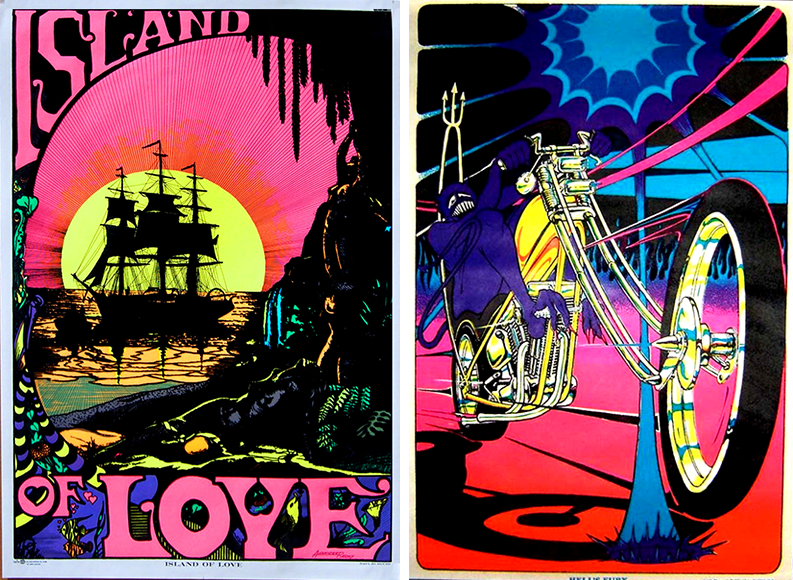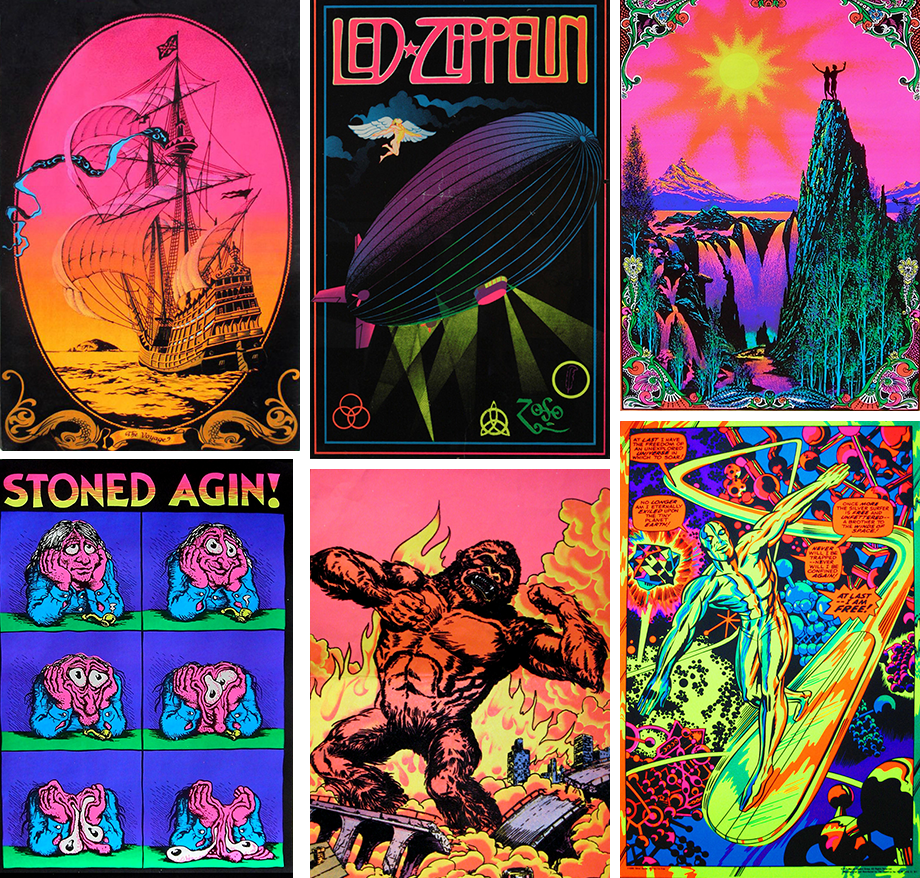
I found the world of black light posters in late 1978, when I was in middle school. Every day, after school, we rode our bikes to a friend’s parents’ motel in downtown Reno. Frank’s parents owned one of those cookie cutter motels surrounding the main strip with names like The Pioneer, Thunderbird, and Stardust. We used quarters from a lobby slot machine to play video games at Pizza Hut. While everyone was excited about Centipede and Asteroids, I wanted to go back to the motel where Frank’s older brother lived in the room behind the office. He covered the walls with black light posters, kept the blinds drawn, and lit the room with a black fluorescent lamp and with a lamp with statue surrounded by simulated rain.
My world at home had nothing as remarkable. We had old family photographs in frames, paintings of ships, and models of ships. Boring. When one is fifteen, it is far groovier to have unicorn and Viking posters and a waterbed. Now, Frank’s brother was indeed a pot-head, had dropped out of high school, and spent his days listening to Led Zepplin. He was not particularly motivated. But, he had the coolest room I’d ever seen.

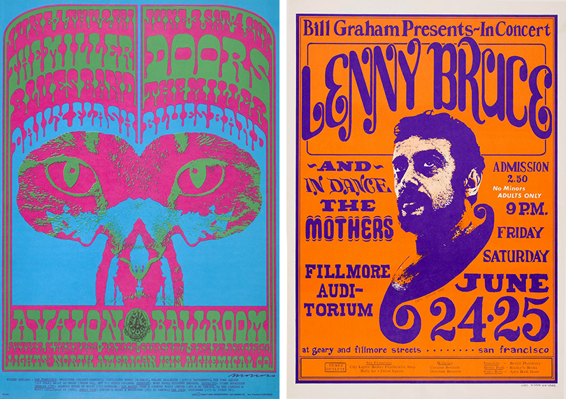
Left: Victor Moscoso, The Chambers Brothers, 1967. Right: Wes Wilson, Lenny Bruce, 1966
At the time, the fluorescent posters represented rebellion and a bad-ass attitude. Now I see the black-light posters were the logical evolution of the counter-culture movement. If we look at the Fillmore poster movement of the 1960s, we see the connection to drug usage. A group of incredible counter-culture designers such as Wes Wilson, Stanley Mouse, Victor Moscoso, and Rick Griffin designed and produced these posters for concerts promoted by Bill Graham in San Francisco. They relied on hand lettering, found imagery, art-nouveau forms, hallucinogenic drug references, and intense color.
The goal was not to be Madison Avenue mainstream Helvetica-driven design but to connect with the anti-establishment. The posters are complicated, hard to understand, and use vibrating colors to replicate the LSD experience. The viewer related to the message that reinforced youth-culture, anti-war sentiment, and embraced Timothy Leary’s “Tune In, Turn On, Drop Out” philosophy.

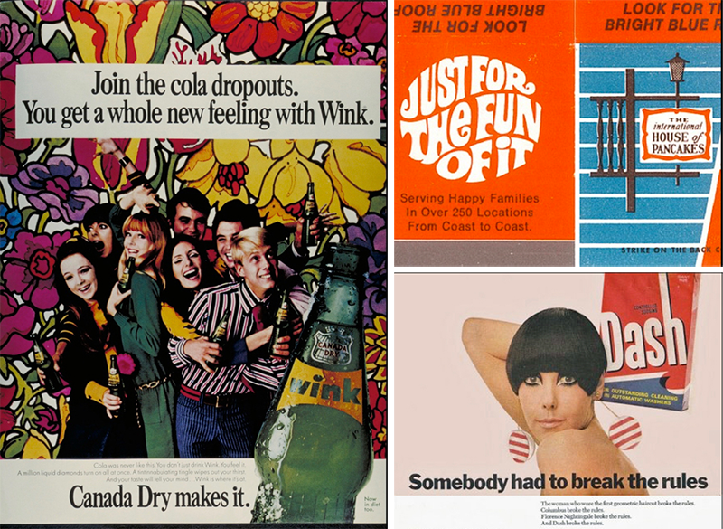
By the early 1970s, mainstream advertising co-opted the counter-culture movement. An ad for Dash detergent suggested that it was ok to break the rules, not by taking LSD or running from the police, but by switching detergents. Dropping out no longer referred to leaving school, quitting your job, moving to a commune, and engaging in free love. With Wink Cola, you could “drop-out” by not drinking Coke. The end of the movement is evident when IHOP (the International House of Pancakes) adopted the LSD aesthetic “Just for the fun of it,” although, I imagine some people go to IHOP after smoking pot.

The black light posters moved away from counter-culture messages and imagery toward escapist fantasy, rock and roll, and sex. Head-shops (a store that sells marijuana paraphernalia) often displayed the posters in a back room to highlight the black light effect. The people that frequented the head-shops to purchase bongs bought the posters. They hung them on the bedroom wall above the waterbed, or near the cinder block bookcase in the living room. The poster market adjusted the imagery to meet demand, realizing that there was a large group of teenage and young men who enjoyed fluorescent posters of the Zodiac and intercourse positions. And this brings us full circle to that motel apartment in downtown Reno.
