
Van Cleef & Arpels, Egyptian Bracelet, 1920s, from "Set in Style: The Jewelry of Van Cleef & Arpels"
Fodder for my perhaps-never-to-happen shortform blog, Let's Get Critical. Let's Get Critical would pick choice reviews from the wide world of culture, so you (if you were like me) would always have a place to go when you needed to read something (constructively, eloquently) mean. Exquisite Corpse is also a good respite. Collecting reviews of different types in one place would allow some patterns to emerge, an anatomy of critique.
One area ripe for some meta-analysis is the contemporary design show. No one seems to like them anymore, but it is hard to put a collective finger on why. Alissa Walker tired of the chairs. Karrie Jacobs found the triennial too recyclable. Two recent examples made strong attempts. Here's Helen Walters on Core 77:
At the entrance to the "ParaDesign" exhibit currently on view at the Museum of Modern Art in San Francisco, visitors get to read a definition of the term. ParaDesign, we are told, is work that is "about, against, around, aberrant to, alongside, or not quite design." The work we are about to see, the curators continue, "was intended not to solve problems, as professional architects and designers must do, but to pose keen, significant questions about the codes and habits that give built and designed objects their air of inevitability."
Somewhat surprisingly, my reaction on reading this was not one of giddy joy and expectant excitement. Rather, it was one of grim foreboding. "Oh dear," I sighed aloud, to the slight consternation of the man standing next to me.
"Oh yes," I thought. The more explanation required, the less good the show must be. A properly executed design exhibition should speak (as its objects should speak) for itself. And besides, what "air of inevitability"? Why "para"? And what's so wrong with dull old professionalism? I'm readying myself for the DIY backlash in 2013.
The root problem in this instance, of course, stretches far beyond the walls of SFMOMA. We are all stuck in a vicious, relentless death spiral of a search for the shiny and the new. This quest has infected our curators (and magazine and newspaper editors) with the desperate need to feature something different, and designers with a feeling that they have to come up with ever more outrageous ideas to get the attention they feel they deserve. Yet separating design from the demands of a client with a problem results in a dangerous elevation of the weird and the ego-based, and a sorry devaluing of the subtle and the useful.
This exhibition would have been much more appealing if it had laid off the faux-intellectualism and just admitted that it was about witty items intended to catch your eye and perhaps make you think twice.

Ron Arad, AYOR (At Your Own Risk), 1991, from "ParaDesign"
My other favorite design review of the weekend made precisely the opposite point. Karen Rosenberg, reviewing "Set in Style: The Jewelry of Van Cleef & Arpels" at the Cooper-Hewitt in the Times is desperate for even a little faux-intellectualism, so underthought and oversponsored is the exhibition. She writes:
The extravagance isn’t the nauseous part; staggering displays of wealth don’t look out of place in this former Carnegie mansion. But allowing a luxury brand that’s still very much in existence to bankroll its own exhibition — one that often looks as if it were put together by the company’s creative directors — does not seem like a smart move, even if it draws A-listers to the opening-night gala.Rosenberg seeks more explanation, not less, of the shiny and old before her. But it seems to me that both critics are suffering the same malaise. Anyone who follows design sees shiny things all day long online. One hardly need go to a museum, since you can't touch them there anyway. If you want a Ron Arad, or an Egyptian bracelet, it will take you only a few clicks to find it somewhere for sale. So that means design curators need to work extra-hard to have a point, to make it simply, and all without seeming like shills. It is not a new problem (see Ouroussoff on MoMA from 2005) but one not yet solved. Pulling all these critiques together seems like a start.
“It’s like a buffet,” said one viewer angling for a spot on a crowded Saturday. And the designers have added some distracting elements straight from the merchandising playbook: canopies of metallic leaves, handblown glass bubbles encasing the jewels. Meanwhile, the few sketches and other materials from the Van Cleef & Arpels archives are tucked away in corners, where no one is paying them much attention.
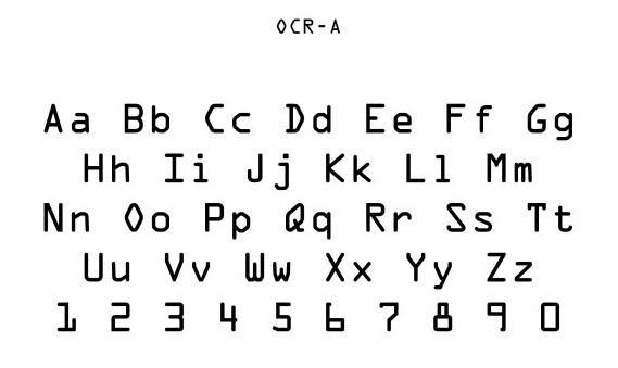
American Type Founders, OCR-A, 1966, from "Standard Deviations"
Perhaps due to the un-thing-ness of typography, but my favorite recent design show is the display of the 23 acquired digital fonts at MoMA, "Standard Deviations." I was quite happy to read two-thirds of the wall text explaining why these particular fonts made the cut. (For demolition by the experts, see Paul Shaw's Blue Pencil blog.) It didn't feel like the sales floor of a Hoefler & Frere-Jones showroom. It didn't feel like a random assortment of swoops.
Once I left the walls, however, the para-problem returned. The objects from the collection, trotted out (I would guess) to add a little sex appeal to the type, required way too much explanation for their presence. Give me my Tejo Remy drawers straight, please.


