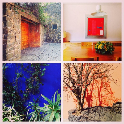
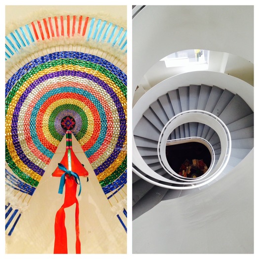
In Mexico, everyone seems to be Alexander Girard. Not afraid of color, of two colors together, of tiles and stripes, of patterns on pattern, of humble materials made noble by aggregation. The Loeb Fellowship took me to Mexico City for a week in February, and there I found the roots of Girard's "opulent modernism" still growing. Everywhere I looked — underfoot, on the walls, over the doors — something particular was happening. I understood why he had been so inspired to collect and reinterpret Mexican precedents; more importantly I also saw Mexican designers and everyday people reinterpreting for themselves. Design with a small "d" was everywhere, reflecting a culture that seems to understand the small gestures that make a room, a building, or a city special. A church in Queretaro with checkerboard floors, a neo-classical facade, and a golden altarpiece of many doors. A museum in Mexico City with real Mayan artifacts, reconstructed Aztec facades, red-and-purple upholstery, bowls floating on plexiglass mounts. Girard distilled the elements of Mexican style, transforming them into an American modernist idiom, but it is not as if Mexican modernists weren't doing the same. Architect Luis Barragran spotlit a golden angel with a perfectly placed skylight. Artist, architect, designer Mathias Goeritz remade the baroque icon as a simple gold-leaf square. Contemporary projects embed ceramic trees of life in Art Deco hallways, or echo the peacock circles of traditional decor in industrial spiral staircases. At the studios of Frida Kahlo and Diego Rivera, lines of cacti march past Bauhaus silhouettes.
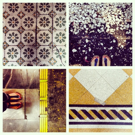
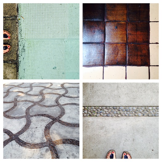
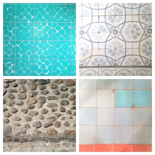
As I made my way through the city, primarily on a large red-white-and-blue bus, I tried to take note of these extraordinary planes, posting PicFrames of walls, floors, and other details that simultaneously clashed and sang. How dull the medium-width oak floors of my childhood began to seem. The brick walls of my Brooklyn neighborhood. The cookie-cutter house numbers from the hardware store. The white subway tile on backsplashes, wainscots, walk-in showers. Why do we do this to ourselves? In Mexico City, it felt like all surfaces were activated. Why not get an artist to paint a mural on the concrete slot between a building's wings? Why not park a bike up the green wall in your restaurant garden? Diana Vreeland's observations about Indian color style apply equally here, with yellow swapped in for pink, cobalt for navy blue.
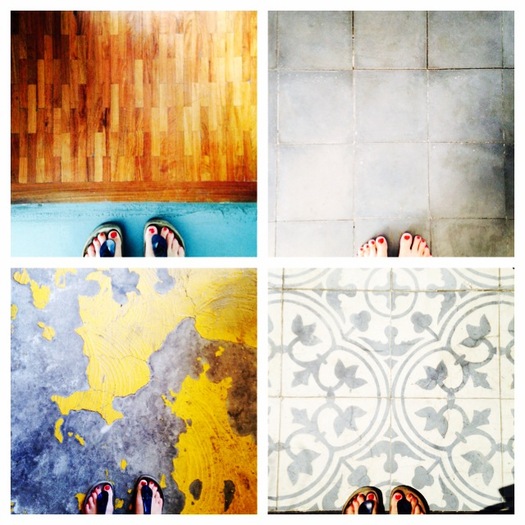
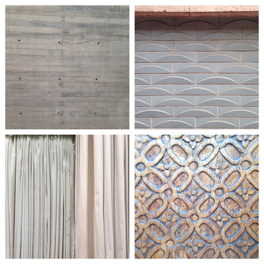
Architects from the global north may revere Barragan for the subtle cast of pink on a white wall, but many won't go beyond blush themselves. His Mexico City house, and the villa he designed for the family Prieto, suggested that cobalt and coral, sunshine and flame, are easier to live with than you might think. Seeing so many examples of skillfully deployed color and pattern over a handful of days, examples high (Casa Barragan, below), low (turquoise apartment building foyer, top), sacred (three-tone cathedral floor), durable (two-tone rubber garden path) allowed me to understand the intense patterns I snapped not as a precious, professional choice but as part of a larger cultural valuation of the visual. What I loved was the too-muchness of it all, which felt like aesthetic freedom. My current housemates make fun of my desire for everyday bling, which manifests itself in plastic necklaces from Forever 21 and silver sneakers and metallic sweatshirts. I saw that blinginess everywhere in Mexico and it made me feel unexpectedly at home.
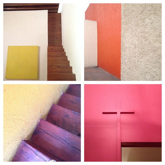
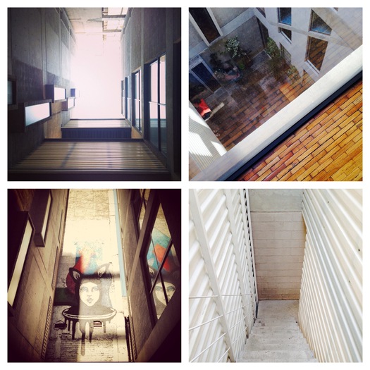
Pictures of the houses of Luis Barragan tend to focus on the colorful moments, as I have in the rainbow collages above and below. But the white walls, and the windows on to sky and garden, are equally important. Barragan isn't trying to overwhelm you (as Ricardo Legorreta does at the Camino Real), but to get you through the day, in the house, with a series of views that surprise and delight. In his own home, each room is shaped to a particular activity and time of day. The pink cross is built in over the door of his solo breakfast room, to offer a wordless blessing. The sunshiny Albers painting is set next to a two-story window, providing an alternative sun on a rare cloudy day. At Casa Prieto, a tree with flame-like flowers grows out of a rock in front of a coral wall, emphasizing its heat from the cool of the aqua pool. Contemporary architects can't help but pay homage. I visited the clever, elegant Lisboa 7, designed by at.103, and found those murals tucked into slots. There, the hot colors are reserved for the sunken garage, flashes of orange through a block wall, common storage in lime. Upstairs, the palette is paler, allowing residents to create their own Barragan moments, or not. In the apartment we visited, the walls were gray and the rainbow palette provided by a collection of California pottery. It was fun to recognize an old friend, transformed by geography into a different reference.
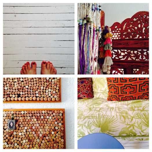
My last night in Mexico was spent at the home of a Mexican architect and an American recovering landscape architect. Mark, the latter, traveled to Mexico on a Fulbright some years ago and never came home. His decor seemed to me another entirely accessible version of the simple and baroque, minty and regal, combinations that I was seeing outside. The homemade cork boards stood in for the tricky, intricate ceramic Trees of Life, incorporating photos and other mementos. The white-painted floor offered the simplified backdrop of the neo-classical ceilings in many churches. A Crate & Barrel table kept company with hand-stitched pillow covers in patterns made since time immemorial. He even had a vase full of hand-blown glass balls, an inadvertant homage to the oversized bowl of such bubbles at Casa Prieto. Maybe this is a stretch, though it was a charming apartment. It was fun to see what happens to your taste when you fall in love with Mexico City now.
