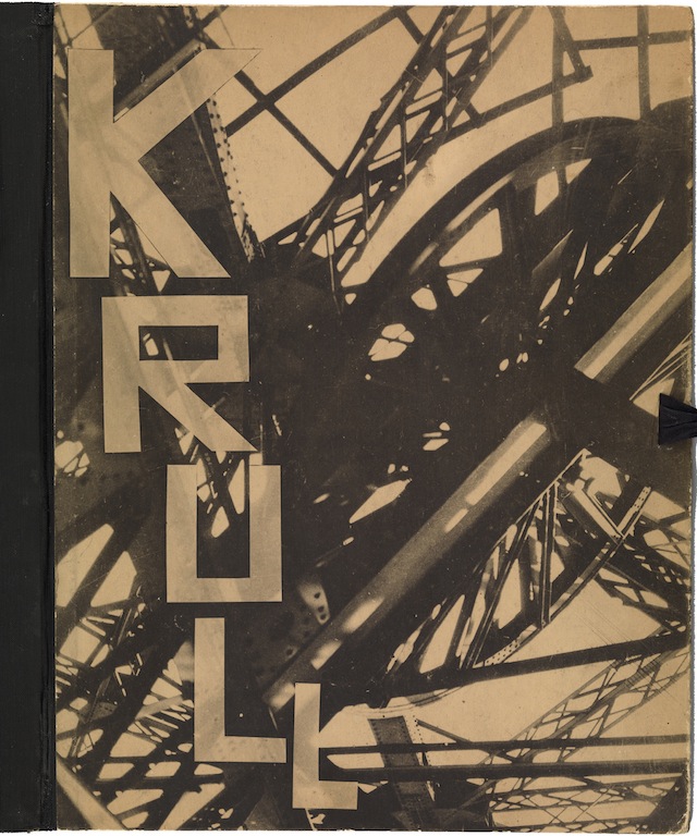
Front cover of Métal (Metal) by Germaine Krull, published by Librairie des Arts Décoratifs, Paris, 1927
Source: Museum of Modern Art
Germaine Krull’s Métal, an album of 64 unbound collotype prints published in 1927, is a photographic symphony to the age of the machine. While plenty of artists and photographers were enthralled by industrial imagery in those years, Krull (1897-1985)—subject of an exhibition at the Jeu de Paume in Paris—was one of the earliest to produce interpretations that were not merely descriptive, but an entirely modern way of seeing these mechanisms and structures.
The photograph on the cover shows Paris’s most recognizable icon, the Eiffel Tower, a machine for winching people into the sky, though one would need to be highly familiar with the structure to identify it from this angle. In other pictures in the portfolio, Krull observes the tower from vantage points that make it a little more intelligible as engineering. Here, she is inside it, presumably looking upwards, and her viewpoint generates a jumble of criss-crossing girders, so that it’s hard to be sure what is up or down. Beyond the angular cage of wrought iron only pale brown emptiness can be seen. The picture shoots out diagonally from the corner, and all the elements appear to be tumbling around each other, as though the structure is an animated machine of indeterminate purpose rather than a static tower for elevating sightseers. The lattice of riveted limbs conveys massive strength, and yet the image also tends toward a constructivist style of abstraction, with the girders and wheel semi-silhouetted and brushed by highlights, a softening that the sepia color accentuates.
See all Exposure columns
