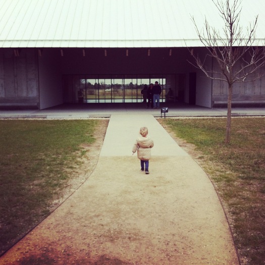
Herzog & de Meuron, Parrish Art Museum (2012), Water Mill, NY
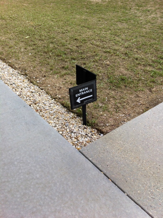
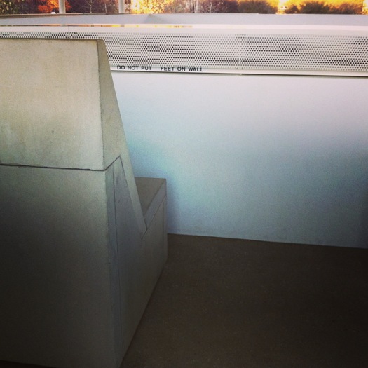
I love graphic design. I understand the importance of way-finding systems. I own a label maker. I wish I had a color-coded closet. But architecture needs to work without words. The building should point your way to its entrance without an arrow. Finding the visitors desk should not require a level change. If everyone is putting their feet on the wall, the bench is too close.

Entrance, Parrish Art Museum, Water Mill, NY
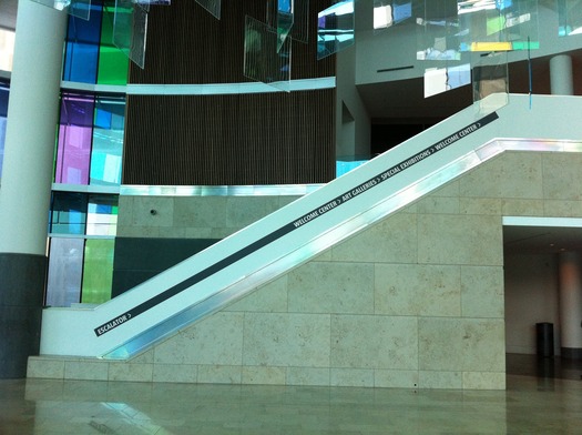
This may seem like an obvious statement, but on three recent occasions, in buildings designed by architects for the display of art, the signs crept in. At the James Turrell-created Skyspace in Houston the lettering was a rogue gesture, born of the frustration of the maintenance staff. At the Parrish Art Museum on Long Island, the landscape architecture (by Reed Hilderbrand) undermined the architecture (by Herzog & Meuron) by suggesting there were two ways in to the museum when in fact, there is only one. My kids ran down the other path the first time, reading the windows of the staff offices as an opening rather than a sealed surface. At the Indianapolis Museum of Art, the entrance rotunda had been emptied of any form of greeting, sending the visitor into the museum's taupe depths in search of a map. Up? Who wants to go up? We just got here. Especially when you have a stroller. (I've been told the new director will be moving the visitor desk back downstairs, an indication of the whiplash the staff is currently feeling.)

Upper level, "Twilight Epiphany" Skyspace, Houston
An intuitive understanding of where to go is a hallmark of the best interaction design, one of the many places the physical and digital worlds (should) overlap. But I wonder if our increasing reliance on apps isn't sapping design attention to real portals. It is certainly sapping the ability of the general public to read maps and make advance plans. I could stand in the IMA atrium and look up a map of the museum on my phone. But why? I should be able to find art without asking any questions, reading any signs, turning to my digital companion. Or reading too many "No"s about my art-viewing behavior. Inviting people in goes beyond free admission, which they have at the Skyspace and the IMA, but not at the Parrish. Entice them in through glimpses of actual art rather than lobby art, or a lobby masquerading as art with its pretty colored glass panels. The Parrish reads as a museum through our prior knowledge of the art barn type; that typology doesn't include information about whether you enter at the end or on the side.

Lobby, Indianapolis Museum of Art
I recently describd an ideal, frictionless, wordless environment in an essay on the children's app maker Toca Boca on the New Yorker blog. In Toca Boca's case, much of their target audience can't read, making words superfluous and irritating, as well as adding extra costs for translation. I feel strange asking architects to treat us all as children, but that may be the easiest way to test the effectiveness of buildings at working without signs. Imagine a five-year-old dropped into the parking lot or campus. Where will he go? What will she climb on? Can they, pulling together, open the front door? Architects should not allow the visitor to trip, physically or graphically, on the threshold.
