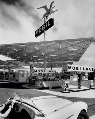
I showed my NYU architecture criticism class the recent documentary on Julius Shulman, Visual Acoustics, last week. (Shulman died last year, and this Fast Company slideshow was one among many tributes to his work.) I had to stop the doc before it was done, I got so restless. While the material was fascinating, and Shulman, along with his follow 90-year-olds, charming, the film seemed uncertain in intent and baggy in construction. We never paused for long on any of the photographs, so gorgeous in their stillness, so active in the recession of the lines. I could have spent all morning at Case Study House #22, by architect Pierre Koenig, the site of Shulman’s most famous image and (at the time of the film) still inhabited by its original owners. Instead the photos swooped by in timelines, swishing the 1920s into the 1930s into the 1950s into the 1970s, Schindler and Neutra and Case Studies and gas stations and Lautner. We got jazzy fragments of animated history, Adolf Loos as a cartoon character, the world’s shortest account of modernism, and a too-brief diagram of what might have made Shulman’s photographs special (one-point perspective). Talking heads sitting, not moving, in front of tableaux of famous chairs. Tom Ford, looking far too handsome for such a crowd, gets the best line: “The houses never look as beautiful in person as they do in Julius’s photographs.”
By the time we came full circle to the Disney Concert Hall, past the bad old days of postmodernism, when Julius couldn’t bear to shoot, past an infomercial for the Taschen Shulman book, I was done. And so were my students. The end was nigh… but where was it? The film had no shape, it just went on and on. It didn’t really tell me the secret of Shulman’s success, and it didn’t let me dwell in Mad Men-era nostalgia. It was neither informative enough technically or gorgeous enough visually to hold my attention for more than an hour.
That restlessness was a familiar feeling, and I realized it is one I often get reading online. There is a point soon after you begin reading any long blog post where your screen is filled with an uninterrupted column of text. On either side there may be landmarks to indicate how far you have come or how far you are going (link lists, Twitter feeds, ads) but eventually, as your eye flicks past 1000 or so words, there will just be the text and nothingness.This tends to make me nervous. I should really be writing something myself. How long have I been reading? How long is this going to go on? Do I get another picture?
When you read a magazine you always have some sense of the end (except in the New York Times Magazine, with its infuriating multiple jumps). Maybe you always flick through to see the whole layout before you start reading. Maybe you just know, in New York Magazine, it can’t be more than eight pages. You have expectations and the physical magazine gives some shape to the experience. The iPad must solve this problem to a certain extent, by reorganizing text on a page, but will people virtually “flip” before they start reading? Or will some other visio-spatial icon let us know how much focus we need to bring?
When I have written long I have often divided my points into three parts (that’s just the way my mind works) in hopes people would keep going, knowing I as writer was heading for a conclusion. But stream-of-consciousness blogging (or stream-of-consciousness-style blogging) doesn’t really give you that sense of security. Paradoxically, knowing where the end is, at least for me, makes the middle more interesting.


