06.29.07
Alice Twemlow | Essays

When Did Posters Become Such Wallflowers?

Fake posters for cokemusic.com commercial
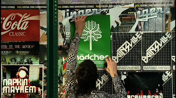
Fake posters for cokemusic.com commercial, Brand New School, 2007

The Cinematic Orchestra's latest album, a recent Very Short List missive informs us, is a movie soundtrack for a movie that was never made. The fact that this album lacks its external referent prompts the VSL reviewers to speculate gleefully on the existence of other content-less formats: "Dazzling book jackets without novels inside; awesome stage sets on which actors never set foot; kick-ass magazine covers with no accompanying articles...we love the myriad possibilities of this new cart-before-the-horse genre."

In fact, the signs of this "cart-before-the-horse genre" are already evident, especially within the time-honored discipline of poster design.

Posters
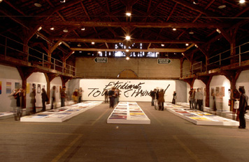
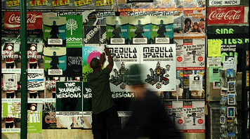
Student work on display at the Chaumont Poster Festival, 2007

One weekend last summer I was a juror for a poster competition in the remote hunting town of Chaumont in the Northeast of France. For the duration of a few weeks each summer the entire town is overtaken by poster fever. All the main buildings—including a bus garage and a Jesuit chapel—are filled with poster exhibitions and the bakers, grocery stores and pharmacies strive to outdo one another with their poster-themed window displays. Even the local bar is called L'Affiche.

Posters
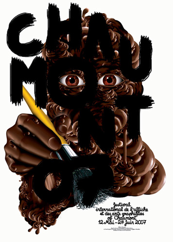
Poster for the Chaumont Poster Festival, Mathias Schweizer, 2007

Despite the fact that we live in an era of viral and multi-platform marketing, posters still excite a peculiar intensity of passion among their makers and their beholders. The poster represents for graphic designers a powerful and alluring force—a rectangular arena in which to exercise their most expressive, experimental and potentially significant work. Perhaps it is because it was so much a part of graphic design's emergence as a discipline in the late 19th-century that the poster is still considered the sacred cow of graphic design. The poster remains what the stage at the Old Vic is to actors, a form through which to measure oneself against greatness.

The other 5 jurors and I spent a long day pacing around the interior of an old warehouse viewing 117 posters, pre-selected from almost 2,000 entries. Our progress was slow since each of us spoke a different language and the text on the posters in this international competition was in 20 languages. Several times our deliberations were brought to a complete halt when we came up against posters that, even after we'd translated them to everyone's satisfaction, still felt mysterious and empty.

At first glance these posters seemed like the others: they had the same proportions, they were professionally executed and had devices that look liked logos on them. Many of them were visually compelling. What was odd about them, we soon realized, was that they didn't promote an idea, event or product. The posters weren't actually for or about anything, unless you count as a purpose entering the numerous annual European poster competitions. The problem was, that while these designers had submitted posters that looked like posters, they just didn't feel like posters.

Posters
World's Minimum Dog, Ten do Ten, 2005

At the center of our debate was a set of four posters by the Japanese designer with the moniker Ten do Ten. The posters use only red and black pixels to create graphically economical images such as "World's minimum dog" and "Calligraphic self portrait." The only textual content on the posters is a proportionately small red seal and vertically oriented above it in text that mimics Japanese calligraphy the name of the artist is spelt out. Could we evaluate Ten do Ten's submissions as posters, or would we do better to acknowledge they were representative of a separate species—artworks in the shape of posters?

The fact that previously he was a non-guitar playing guitarist in the conceptual art band Delaware, and that he describes himself as the "Japanese pixel designer who designs only sexy pixel," might suggest the nature of Ten do Ten's relationship to graphic design's conventions, and to the entry rules for a poster competition.

According to Chaumont poster competition organizer Etienne Bernard, in order to qualify for selection, a poster has to have been "published." This means, he says, "that the poster must have a commissioner and must have been shown in public space." To some this sounds straightforward, but you can see how an emerging generation of designers might think that since they had published their poster on a website (albeit their own) and that it was commissioned (albeit by themselves in one of their other identities as fashion designer, musician or store owner) then they were actually following the rules.

A similar situation came up on this side of the pond when Brand New School entered into a competition some fake band posters they had created in the process of directing a cokemusic.com commercial. The commercial shows a time-lapse sequence of hipsters putting up band posters on a wall. Brand New School decided to design the posters themselves, using only their own typefaces and hand lettering. When they attempted to enter them into the typography section of AIGA's annual design competition, the posters were rejected on the grounds that they were props and not designed for the marketplace. Brand New School creative director Jens Gelhaar related this story at a conference earlier this year. "What's wrong," he asked incredulously, "with an imaginary message, usage and audience?"

It could be that the language associated with posters is the problem. Terms like "publish," "commission" and "public space"—terms that the Chaumont festival believes to be commonly understood—are today so variously interpreted as to be unrecognizable, or at least unusable without careful explanation.

In her seminal analysis of the Cuban revolutionary poster (the essay is reproduced in Looking Closer Four), Susan Sontag offers several useful definitions. One which echoed in my mind as I looked at the crop of product-less, event-less, and message-less posters at Chaumont, and considered Brand New School's imaginary usage and audience, is this: "(What is properly called a poster implies a certain context of production and distribution which excludes work, like the pseudo-posters of Warhol, produced directly for the fine arts market.) The space within which the genuine poster is shown is not elitist, but a public—communal—space [...] the poster is a public art, which addresses an undifferentiated mass of people on behalf of something public (whether a political idea or a cultural spectacle)."

Posters
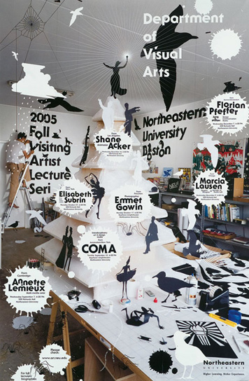
Fall Visiting Artist Lecture Series poster for Northeastern University, Harmen Liemburg, 2005

Sontag was writing in 1970 and since then the idea of a public or communal viewing space has eroded. The concept of a collective audience may well be a relic. None of the posters in the competition could reasonably be said to have communicated with mass audiences. All were directed to very particular groups: people who like Swiss Jazz festivals; people in Sydney who like Himalayan films; students in the Department of Visual Arts at Northeastern University who like lectures by visiting artists and so on. Tied to this is another anachronism: mass production and its corollary, mass distribution. Many of the posters submitted to Chaumont were reproduced in extremely small editions as silkscreen or digital prints. In some cases their reproduction in competition annuals and magazine articles may be the full extent of their distribution.

Posters
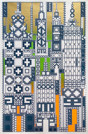
Kong, Richard Niessen, 2005

Richard Niessen's "Kong" poster is a typical example. A mosaic built up from pixellated K's, O's, N's and G's and fusing the game-scapes of Donkey Kong and Pong to create an architectural setting for King Kong, it was created as a piece of limited edition art to be displayed at the opening of a design store and gallery in Mexico City and to be sold in an edition of 20 on the designer's website.

Some of them expressed worthy sentiments: "Water for Life," "Space for Green Roof Planting" or "Stop Sex with Kids" for example, but, without the legitimizing force of an institution behind them, and thereby the promise of distribution, they felt insubstantial and even disingenuous.

Posters
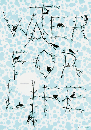
Water for Life, Watanabe Office, 2005

I realize that what I love about the poster, and what defines poster-ness for me, is the way it is conceptually attached to a motivating force — a product, or some event that will happen or has happened on a particular date and at a particular place. Temporal and physical fixity are integral parts of the visual language of the poster, anchors that help prevent it from floating into the ether of art. Ultimately it's the tension between those anchors and the tug of the designer's artistic ambition that produces the powerful, beautiful poster.

But the real essence of a poster, rather than an artwork, I think, is the invisible but palpable contract between a designer, the commissioning institution, organization or company that funds a poster's distribution, and the viewing public who engages with it. The designer agrees to make something to promote this product, advance this cause, project this message because he believes in it and, because of that, often makes it more beautiful than it needs to be. The client promises to produce as many copies of the poster as she can afford to and to circulate them in the most strategic ways she knows. Lastly, it is understood that if the passerby is persuaded and seduced by the poster, they will carry out whatever action it calls for. It is this unseen tripartite contract, and all the conflict it brings with it that gives the poster its urgency and reason for being. Without that tension, the poster ends at the wall.


Posted in: Graphic Design, Theory + Criticism


Comments [26]

Great article. I became quite heavily involved with poster design while in college. I never considered it a Holy Grail of Greatness in design or anything, but I appreciated what it was -- a one-sided capture of attention with only a couple seconds window. Upon graduation the company I started working for never really involved itself in poster design, only for lack of the type of clients in need of posters. Having not designed a poster in a couple years now, I'm both anxious to tackle the medium again, and slightly more conscious of its importance.
Blake
06.29.07
08:57

Dear Alice - Your last paragraph reads like a manifesto for poster design today.

Perhaps this prose is best served in the form of a poster? :)
Jessica Gladstone
06.29.07
10:10

Susan Sontag´s essay was published in looking closer three.
european intern
06.29.07
11:18

The title of sontag's essay - "Posters: Advertisement, Art, Political Artifact, Commodity" - emphasizes how a poster can circulate through different functions:

-A failed poster made for a client can survive as a collector's item or canonical example (Peter Saville's Haçienda inauguration poster).

-A poster can be massproduced specifically for teenager rooms (Milton Glaser's Dylan, perhaps).
european intern
06.29.07
11:38

By anchoring the life of a poster to the triad of designer/client/public, you are stripping designers of a portion of their voice in the commons of public debate.

The requirement of a commissioner empties the designer of the authority to speak, reducing them to a tool of the institution. Designer as paint brush that must be wielded by a marketing department and dipped in branding paint.

The tension between designer and fine artist is classic, but is there no room for the designer to bleed across the modal space, taking their forms, the poster, an more fulling embracing their cultural and civic expression?
Oxa
06.29.07
12:01

Passengers:Original Soundtracks 1 (1995) is an album by Brian Eno and members of U2 which is comprised of purported excerpts from the soundtracks to fictional films.
Dystopos
06.29.07
12:06

Alice, I enjoyed your essay very much. I have thought about many of the things that you have outlined.... One thing that is really not expressed here is the difference the role of the poster had in the 19th-early 20th century vs now (TV/internet/media-assault-society).

I'm thinking back to the example of the Apple iPod posters that Rick Poyner encountered at South Station on his recent trip to Boston. Another version of iPod posters currently blanket the station. I can never look at these images the same way since one person commenting on on the RP essay observed that all of the iPod figures looked as though they just had been shot...

So my question is: What is it that these iPod posters are really communicating?

I don't think the role of the poster today will or can be all that it once was...

Not sure how I feel about this --hgLucky

hgLucky
06.29.07
12:13

"Lastly, it is understood that if the passerby is persuaded and seduced by the poster, they will carry out whatever action it calls for."

Sometimes the poster calls out to the viewer, "Deface me with a sharpie! I need a mustache, or better yet genitals drawn upon me!"
HP
06.29.07
12:21

maybe partying will help.
zach
06.29.07
01:05

@Oxa:

Maybe that's the reason why Alice & Co. (well, I assume "Co.") are so afraid of posters that give full agency to the designer. In historical terms, there has always been some sort of "client" -- whether an organization or a company. In some sense, designers are almost never given full agency, which is why the idea of design for design's sake (which this post is essentially about) is so... foreign? disturbing? etc. to orthodox thinking about design. Not to say that Alice and Abbott and the other pillars of design writing are orthodox (really, they are a heterodox bunch), but they do represent orthodox views at times.

I like the Ten do Ten poster -- it promotes nothing, yet it promotes everything. There is tension in that. It is graphic, it is designed (is it fine art? nah.), it has gestalt-ish features. It seems a little mastubatory, yet it has the formal qualities of a poster (which is generally less mastubatory than it is commercial). I think it points to alternate tensions that can exist and are as interesting as the tension between client, designer, and public.
Clarence Yung
06.29.07
02:45

We're flirting with two discussions that I feel are best considered separately. On one hand, we've the question, "What is a poster?" I liken this to the old "What is art?" question — a fantastic discussion/debate piece that is as interesting as it is unlikely to yield a solid, unanimous conclusion.

The other question is, "What is permissible for a competition?" In lieu of an official, universal definition of "poster," it is left up to contest organizers to formulate their own in the form of entry guidelines. I like that flexibility — not imposing a universal definition (theoretically) allows each competition to accept different flavors of poster design, affording opportunities to a wider range of designers. For example, if one competition defines a poster as "a piece produced for a commercial client on an offset press," a designer who produces personal work on a laser printer may (again, theoretically) be able to find another competition better suited to his/her work...

...which leads us directly into a discussion of entrant responsibility. It is up to an entrant to seek appropriate forums for their work, and to read and heed guidelines as a matter of respect. I think Alice was very generous in her statement that "the language associated with posters [may be] the problem. Terms like 'publish,' 'commission' and 'public space'...are today so variously interpreted as to be unrecognizable, or at least unusable without careful explanation." I personally don't see much grey area in those terms, but even if another designer does, that's no excuse for submitting ineligible work; how difficult is it to email or call someone who can address questions regarding entry guidelines?

The true — and unfortunate — difficulty is in actually finding competitions that cater to unpublished and experimental work. While a few competitions have opened up to unreleased work (the Art Directors Club Annual Awards has a category called "Playground"), opportunities are, for the most part, scarce. Perhaps the need to share one's very good — and very ineligible — work is what drives designers to feign confusion and ignore manners/ethics?

To answer Jens Gelhaar's question, there's nothing wrong with "an imaginary message, usage and audience." There is something wrong with ignoring entry guidelines. There is also something wrong with not acknowledging the need for more, prestigious competitions that include categories for both published and unpublished work.
Leila Singleton
06.29.07
04:24

I think the gist of the distinction between poster and art is in the last paragraph, and it's not about whether there's a client or mass production. A poster has an implicit or explicit call to action, whether it's "Buy!" or "Attend!" or "Protest!" or "Vote!" or whatever. When this is missing, when it feels hollow. It becomes art, meant to be enjoyed or appreciated or just thought about, as opposed to a poster, which is always meant to make you act.
Dan Kohan
06.29.07
05:05

Fascinating post, Alice. Thanks. I went to the Chaumont poster festival in 2005. It was the most enjoyable and inspirational design event I have ever attended. As a Brit, I was disappointed not to see a single British poster in the competition, though hardly surprised. In the UK, the poster is pretty much dead, and the reason for this is the commercial colonization of public space by 'outdoor media companies'. This means there is no shortage of brain-rot billboards inviting us to renew our car insurance, but no space for inventive posters with less abrasive messages.

In metropolitan areas, the city councils have successfully outlawed fly-posting. Since the 1970s, record labels have commissioned street posters to announce new releases. These 'illegal' posters were often bravura displays of graphic invention. But they have gone the way of thatched roofs and horse drawn vehicles - a thing of the past.

So the 'tripartite contract' you talk about has been broken by the intrusion of a fourth element - the death of public space.

Adrian Shaughnessy
06.30.07
03:28

Yeah, I have a problem with the tripartite stuff in this context. The suggestion that the involvement of a commissioning institution is necessary for a poster to possess 'the real essence of a poster,' as Alice suggests at the beginning of her last paragraph, is disturbing in its capitulation to the capitalist status quo. Either that or it signals approval of the tendency of elites (in this case, the poster elites) to protect their little place in the sun. While any competition can set any rules they like (and designers should most certainly play by those rules), the presence of a 'commissioning institution' has nothing to do with the essence of a poster. I agree that a poster must be distributed and experienced by the public (therein lies the essence), but, please let's not assume we are dependent on the beneficence of third-party 'organizations' for this dialog to occur.

As Adrian has mentioned we have lost our public spaces, but I disagree that this is something we should accept as a relic of the past—we've found more secure means of shelter than thatch, and we've found faster means of travel than horses, but a more meaningful means of communication does not occur with the advent of creative patronage. One could even argue that it is the very presence of such patronage that often denigrates the quality of communication between those who would 'speak' with a poster, and those who would listen.

Mass production is a fine criterion for a poster competition; just as a public speaking contest should be gauged by performance in a public forum, so too should posters be gauged by their intent to speak to the public. But mass production—and yes, even mass distribution—should not be qualified by the presence of a rubber stamp from an organization.
Scott
06.30.07
11:30

fantastic article. I feel so much more appreciative of this medium. Thankyou!
madelaine
07.01.07
11:14

Perhaps it is because it was so much a part of graphic design's emergence as a discipline in the late 19th-century that the poster is still considered the sacred cow of graphic design.

Maybe you are also a sacred cow and when the baby boomers release control we'll all rejoice in laughter that you couldn't understand our new context.
Catelijne van Middelkoop
07.01.07
12:18

In the past, a poster was always supposed to make you act, but I think the poster carries different roles now. These days, a poster's sole purpose can be to make you feel a certain way. Not saying that there's no place for the traditional poster, I think there will always be the need for posters that bring a call to action. It's just that the boundaries of what is a poster and what is graphic design and what is art have widened and spilled over into each other. I think my generation of designers (early 20-somethings and younger) tend to see little difference between graphic design and art. In general, we don't like to compartmentalize things. Just my opinion.
Nate
07.01.07
09:26

Catelijne, why are you waiting for the baby boomers to 'release control'? Waiting becomes a habit so that at moments when it's no longer needed it's still resorted to. And why should it be that you keep 'your new context' an undefined secret? By all means rejoice in laughter, but share your new context. In fact, insist upon it if it is something you believe in. The older generations rarely release control--it must be wrested from them.
Scott
07.02.07
09:09

Fascinating and well written article, Alice. Bravo! I have always had a soft spot for posters, and I agree that they are certainly the litmus test for a really talented designer- when one is good it is really, really good. It's hard to make a brilliant poster.

But I also agree that a poster does not need a commision. Some of the work of James Victore is positively exceptional and is self-created. It still sends a very special and important message to the greater public.

I think it is very interesting how you can't hide behind empty aesthetics. I read a very interesting article with Lawrence Weschler and David Hockney last month. Hockney speaks about how art is only able to be looked at in proportion to how much work was put into it. This is why he believes that photography is a quicker "look" than an oil painting, which you can study for hours. He says there is no labor in a photo.

Anyway, I thought the article was fascinating and I totally think that the viewer can always tell how much work is put into a piece. It's that sixth sense thing.
Matthew McNerney
07.02.07
09:29

Catelijne begins to bring up the point I was thinking of as I scrolled down here. The essay unknowingly speaks more to the fact that designers, surely, are designing for clients, yet enter work of their own authorship. Why?

Designers have some sort of reason for not entering client related work. Maybe some clients are too conservative, and are behind the times of the current roles of communication and media. Maybe some designers and clients let market research design their work, let trend setters pick their colors for them, and jump at the chance to think for themselves, or not...this, I think is the control Catelijne has brought up.

Is Catelijne waiting for a point where more designers can be proud enough of commissioned work to display it in a poster festival?

designer=author, first things first, designers have brains, adverbatim, advertis-ing is not design-ing, bla bla bla.
Eric
07.03.07
01:11

I would love to be at that time in Chaumont, to see all those great designs.
Mike
07.05.07
12:05

I trully want to live in that town full of posters.
:) That can make me more addict of it.
Stiff Dan
07.05.07
02:42

Excellent insight into the essence and endangered art of "poster-ness." Very thought provoking.

But regardless of it's purpose, I really like Ten do Ten's "World's Minimun Dog." I posted it today with link to your article on my blog Dog Art Today. I think my readers will really enjoy it.

Thank you.

Moira
07.26.07
11:43

Make peace, not war!
Orarepebeef
01.15.08
07:25

"These days, a poster's sole purpose can be to make you feel a certain way."

I make posters and put them up in the city. My sole goal, to produce or give away a feeling to the viewer they may not have been ready for. To show a piece of one's self or ideals is the point.

To say a poster's legitimacy or lack of feeling is increased or decreased by the "unseen tripartite contract" is saying that design is only validated by cash. It also implies that designers are technicians, who's trade is producing emotion or need. Which may be right.

I think that's why the word "designer" is so dirty to someone who considers themselves an "artist". These days, the latter is so common and so well paid, it could be the bohemian aesthetic that pushes better artists away from posters as a medium.

Design is so integrated with PRODUCT and CORPORATIONS that artists forget that they can also be the product if need be to get the point across.
Mister Staples
08.06.08
01:49

Personal and unpublished poster designs now have a competition of their own -- check out the brand-new HOW Poster Design Awards. According to HOW Magazine, "There are no categories, and it doesn’t matter if your poster was created for yourself, for work or just for fun…we want to see what you can do!"
Leila Singleton
10.24.08
11:27


Jobs | March 28