Designers and design historians told me over the years that they had heard about the existence of a Nazi graphics standards manual. No one could say they actually saw it, but they knew of someone who had. So it grew into something of a Big Foot or Loch Ness Monster tale, until one day I actually saw it too – and it had been right under my nose the whole time.
I had envisioned a manual of the kind that Lester Beall did for International Paper or Paul Rand did for IBM, showing acceptable logo weights and sizes, corporate typefaces and colors. I was so familiar with these standards manuals, that it never even occurred to me they were postwar formats — and decidedly modern. Maybe the Nazis did theirs in a different way.
The Nazis brand may indeed be uniformly distinctive, but for all the significance they placed on graphic design, there was more variety and greater leeway than one might think. Nonetheless, once I determined who was responsible for maintaining the NSDAP brand, it was a bit easier to identify the identity manual.
First, there were different bureaucracies: The Party’s identity was overseen by one leader, while the state’s identity was handled by another — and within these were many sub-chambers too. Dr. Joseph Goebbels’ Ministry of Enlightenment and Propaganda (PROMI) did not oversee the signs and symbols of the Party. Although his Ministry had a graphic design atelier, it was primarily for creating the propaganda materials. Albert Speer, Hitler’s architect and the designer of Nazi spectacles, did not administer to the identity either. His office designed monumental ways of displaying the existing brand.
The policing of all things Swastika was the responsibility of Dr. Robert Ley, the head of the German Labor Front (Deutsche Arbeitsfront, DAF) and the Strength Through Joy (Kraft durch Freude, KdF). Known as much as anything for his heavy drinking, this former editor of the anti-Semitic newspaper, Westdeutsche Beobachter, was not a designer or art director, but garnered considerable power owing to his intense loyalty to Hitler. One of his most ambitious design initiatives was taking over the development of the Volkswagen (people’s car) from Porsche.
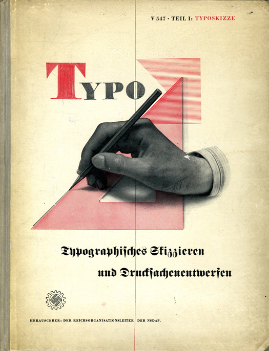
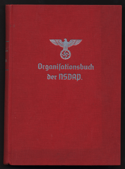
Perhaps a lesser, though significant, responsibility was developing a NSDAP handbook that detailed the organizing principles and mechanics of building the Nazi movement. It is this 550 page, red cloth-bound book titled Organizationsbuch der NSDAP, with the symbol of “Greater Germany” embossed in silver on the front, which turns out to be the elusive standards manual. The DAF was also responsible for typesetting guides and other graphic arts handbooks, but this is the graphic masterpiece of the Master Race.
It is not exactly clear how much Dr. Ley (who hanged himself after the war) was personally involved, although his introduction is in the volume. Perhaps he did not know the difference between typefaces, or even what graphic design was. But it was his office that determined the standards of stationery, enamel signs, flags and pennants, awards and badges, party uniforms and all things involving the swastika and ancillary symbols. So someone in Dr. Ley’s office knew what he was doing, though received no credit.
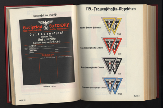
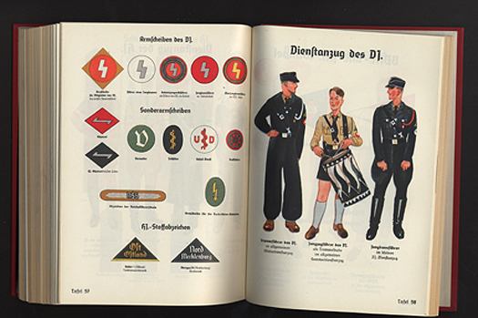
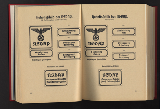
Published in 1936, The Organizationsbuch der NSDAP (with subsequent annual editions), detailed all aspects of party bureaucracy, typeset tightly in German Blackletter. What interested me, however, were the over 70 full-page, full-color plates (on heavy paper) that provide examples of virtually every Nazi flag, insignia, patterns for official Nazi Party office signs, special armbands for the Reichsparteitag (Reichs Party Day), and Honor Badges. The book “over-explains the obvious” and leaves no Nazi Party organization question, regardless of how minute, unanswered.
When I noted above that the book was under my nose, I meant this literally and figuratively. Many of the color plates, which visually establish the identity standards, have been reproduced in histories of World War II and the Nazis, without proper attribution. So, I’ve seen some of them before. Also, the Nazis issued a 255 page book, ABC des Nationalsozialismus (1933) by Dr. Curt Rosten, which in a more condensed fashion provided some early Nazi visual standards. It turns out I had this book in my collection all along without knowing its significance.
There was a standards manual after all. It just was not what I envisioned or expected. It turned out another record of graphic standards existed where I least expected it: the Reichs Gesetzblatt (Law Journal). When a graphic element was changed by law or decree it was chronicled in this document. So the Loch Ness mystery was solved, somewhat.
Iron Fists: Branding the 20th Century Totalitarian State by Steven Heller will be released in paperback by Phaidon Press in March 2011.
