08.02.07
Rob Giampietro | Essays

The Fonts of Summer


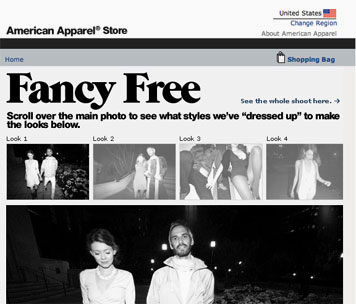
American Apparel product page featuring ITC Grouch, 2007.

Some things are made for summer. The summer hit, for example. Recently, I'm thinking of "Crazy" by Gnarls Barkley, "Hey Ya" by Outkast, or, this summer, Rhianna's "Umbrella" (which you might want to stand under whether it's raining or not). Summer brings us beach reads and popcorn flicks, and, of course, summer food — light, cool, and refreshing. Design-wise, we've definitely got summer clothes and summer places: wear your flip-flops out on the deck or your seersucker and khakis out to your country house.

So: why not summer fonts? I can't think of a good reason why not. Like all things summer, a summer font need only follow a few simple rules. Be catchy. Be simple. Be happy. And be gone soon enough to belong to a single summer only.

Everyone's heard of the Summer of Love. But I predict that this summer — in nerdy font circles at least — will be the Summer of Grouch. ITC Grouch, that is.


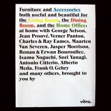
"Select, Arrange" catalog by Cornel Windlin for Vitra, 2006.

I first spotted ITC Grouch on the cover of Cornel Windlin's outstanding "Select, Arrange" catalog for Vitra at last year's International Contemporary Furniture Fair in New York. Always artfully ahead of the curve, Windlin seems to have plugged into the '70s typographic revival that's been happening for some time by digging up a lost vernacular gem and injecting it into a high modernist context. Grouch's serifs pair beautifully with Vitra's all-lowercase Futura Bold, and Windlin even uses Vitra's quirky built-in period as the conclusion to his Grouch-y run-on sentence. Apart from a few colors and some underlining for emphasis, Windlin's cover has one star only: ITC Grouch. With so much personality, Grouch almost becomes a character on the cover, a stand-in for the irreverent owner of a house where all this classically cool furniture so naturally gels. The boldness of ITC Grouch swells with enthusiasm and confidence; the casualness of ITC Grouch puts its feet up on the expensive coffee table and makes it accessbile.

Reviewing the catalogue in Eye Magazine, Rick Poynor adds: "What is so impressive about the catalogue is the unerring accuracy with which it strikes the right contemporary note. These are luxury objects conceived by some of the finest designers, manufactured to exacting standards and with price tags to match, but they don't want to appear to be trying too hard, standing on ceremony, or making a fuss." Windlin recently won a Swiss Design Prize for his efforts.

Once ITC Grouch had entered my bloodstream, I found it hard to get rid of. As soon as this summer kicked off, I saw it used in serveral of American Apparel's ads. Then, strolling into a local Nolita bookstore, I found myself face-to-face with it on the cover of the Walker Art Center's new Kara Walker book. Following this cultural hat trick, it seemed a summer font was decidedly afoot, and I set out to learn more.


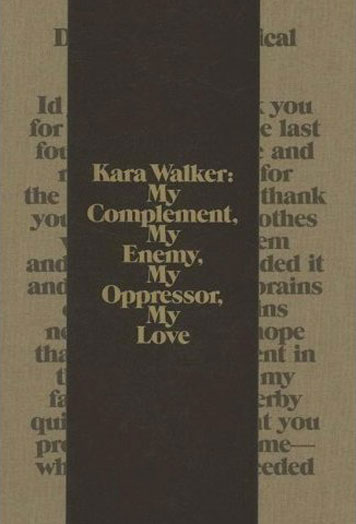
"Kara Walker: My Complement, My Enemy, My Oppressor, My Love," catalogue design by Andrew Blauvelt & Emmet Byrne, Walker Art Center, 2007.

ITC Grouch was designed by Tom Carnase with Ronnie Bonder in 1970 while Carnase was vice-president and partner of Lubalin, Smith, Carnase Inc. along with noted typographers Ernie Smith and Herb Lubalin. American Type Founders (ATF) — already proud parents to Oz Cooper's Cooper Black and Pete Dom's Dom Casual — were reviving turn-of-the-century Caslon poster typefaces when ITC decided to jump into the ring.

Bonder and Carnase's typographic sensibilities seem enmeshed with the cultural fabric of the early '70s. As Mungo Jerry's "In the Summertime" played on the radio, 1970 brought not just ITC Grouch but ITC Machine, these days most recognizable from its use on the Blockbuster Video logo; ITC Busorama, immediately used for the first brand of mass-marketed pantyhose, L'eggs; and the classic ITC Pioneer, which by 1971 had a starring role on the poster of Shaft. At the same time Carnase was collaborating with Lubalin on his well-known typeface Avant Garde Gothic, and in 1973 Carnase drew the scripty Saks Fifth Avenue logo recently rivived and slightly redrawn by Pentagram. Carnase, now nearly 70, is still practicing in Miami, where the weather, as in American Apparel's L.A., is always distinctly summer-like.

In addition to all the sequels, backbeats and gazpacho, summer also brings us the summer fling. How long will our love of ITC Grouch last? Who knows. But don't fall too hard too fast, because this font is literally off-the-market. According to Mark Simonson, "The Bitstream version seems to be the only digital version of this font. ITC doesn't even carry it. It was one of the first fonts they released in 1970 when they began and it's almost like they have disowned some of those early releases. Not hip enough for them, I guess." At least until I have to put a coat on, I beg to differ.

Posted in: Typography


Comments [25]

Grouch sums up my response perfectly. Hate it, hate it, hate it! Aside from my natural aversion to serif fonts, Grouch seems too self-consciously retro, too knowing. It says "Look at me! Yeah? Yeah!" We get the joke, already.
John Brissenden
08.03.07
06:05

not me - i'm in a shameless summer crush now.. bah, it's too late once it's so proliferous. i can still pine from afar though!
lb
08.03.07
10:00

I know its not the same, but Grouch reminded me of the TV show All In The Family's opening title font. Major flashback. Ha!

VR/
Joe Moran
08.03.07
10:06

Having seen the book iteself, I can testify that the combination of the goofiness of this typeface with the carefully calibrated incendiary language of the Kara Walker catalog is truly startling. It is a brilliant choice.

And no matter what else, you have to love that lower case e.
Michael Bierut
08.03.07
11:01

Rob, this post is like Us magazine for designers. Perfect match between the writing form and the visual content. Thanks for this. I was beginning to think that all design writing had to be turgid and obscure. I'm happy to be reminded that it can be trashy and fun too.

Graphic Designers...They're just like us!
dmitri
08.03.07
11:36

My choices would be Cooper Black, Eclat or VAG Rounded...
ChrisM70
08.03.07
12:45

each season has its song... my summer 2007 song is the 1982 classic... "forget me nots" by patrice rushen.

http://www.myspace.com/prushen
guilty standby
08.03.07
01:39

I just wanted to state that I was critiquing the typeface, not the pieces. They look great. Even a hideous typeface, on the right project, can be perfect. I believe the essay 'I hate ITC Garamond' contains the best example.
james
08.03.07
02:01

My choices would be Cooper Black...

I always think of bowling shirts (ie: winter, not summer) when I think of Cooper Black. That was one of the only typefaces that actually held its real name in the heat-press section of the T-shirt shops when I was a kid. Most of the other typefaces that were available for custom naming on shirts were renamed by the shop (or the industry as a whole)... but Cooper Black (usually) kept its real name. Props to Oz...

Doug B
08.03.07
03:31

Really, you don’t have to write “ITC” in front of the name every time, as thought it were some kind of German honorific (Herr Doktor ITC Grouch).
Joe Clark
08.03.07
04:39

Really, you don't have to write "ITC" in front of the name every time, as thought it were some kind of German honorific (Herr Doktor ITC Grouch).

You do if you are referring to the specific ITC version of a particular face. There's a *LOT* of differences b/w ITC Garamond and Stempel Garamond (for instance).

ps: Claude prefers the Stempel cut...
Doug B
08.03.07
05:18

I worked for a guy at a t-shirt shop who absolutely hated Cooper Black. I always thought that was funny. Of course he also thought Comic Sans was a great choice for a design that needed a more informal feel. I still shudder thinking about it.

My summer 2007 song, "Anthem for the Earnest" by The Bad Plus.
RyanB
08.03.07
05:33

Vitra's "select, arrange" catalogue was published in Europe at the beginning of 2005. Looks like ITC Grouch is already enjoying its third summer, then... and deservedly so. Carnase's font is not just a whacky retro number, it's a true forgotten classic. Respect.
Charles Denby
08.03.07
09:22

More like the Winter 2006 of ITC Grouch.

American Apparel was using this typeface during the holiday season last year, and the Walker's exhibit opened in the dead of winter as well.

But thank you for identifying the font.
Old News
08.04.07
02:56

I can't help but loving ITC Grouch. I really like the goofiness and, as Mr. Bierut said: that lowercase e is great!

Another font I really like lately is Slimbach's ITC Giovanni. Not as goofy as Grouch, but I love that e as well.
http://www.myfonts.com/fonts/itc/giovanni/
rob
08.04.07
07:50

I recommend tracking down the European version of "Select, Arrange". It's actually two books bound in one in a nice way, and has more content as it includes all of the Eames furniture. Rick Poynor has a good review of it here.
Manuel
08.04.07
04:08

Thanks for the tip, Manuel. But how could one track down a copy of "Select, Arrange" - it is not available on the market anywhere, and it is quite a rare thing. Any suggestions?
Matt Jenkins
08.04.07
05:49

Oh jeez, I remember using Grouch back in the mid 1970s when it was available as Letraset rub-off lettering sheets.
Charles
08.05.07
12:21

Unfortunately, I can't agree with the sentiment expressed in this article. Grouch is directly opposite my impression of summertime. It is heavy, unrefined, and outdated like a bad backyard hamburger. It calls up memories of wide ties, polyester clothing, and incredibly large hair. These are things I do not want associated with hot weather.
Sean Flanagan
08.06.07
01:02

Total stretch.

And seersucker... wow, I wince at the thought of a designer wearing that shit... it's almost hilarious.
Kevin Hopp
08.06.07
07:27

Unfortunately, I don't know where to get a copy. But I do remember when I first saw the American version (I think there have actually been a couple of different versions in the US), it seemed like a truncated version of the original. The primary reason is that Eames-designed furniture is licensed to Herman Miller in the US, and thus can't appear in an American version of the Vitra catalog. However, I'm glad the spirit of Grouch shined through.
Manuel
08.07.07
01:55

Grouch is a font I always overlook, in FontAgent it is kerned so badly and looks too bulky. In the above examples I really think it looks great. Thanks for the eye-opener
Fanboy Creative
08.08.07
04:02

Very pleased to see this font be promoted here... I use it already titling my blog and website... I remember the very beautiful catalog of Ronne Bonder, using near exclusively types with serif... modern old school faces... thanks for this back-vaccin. One could be indifferent to some types, but it's difficult to hear somebody hating a font-shape... the word hate seems a litle too strong, don't you think so? ;-)
peter gabor
08.08.07
06:18

I'd hate to admit it, but I have never been subject to this typeface before, and can see why it's a good contender for the all the trendies. However, Cooper Black is a very close second.

I think that both typefaces offer a little something for everyone to realate to, use and enjoy. While Grouch is a bit retro it fits perfectly into the current hippster trends of today.
cory galster
08.08.07
02:00

Once ITC Avant Garde started popping up all over the place, this point along the arc of typographic revival seemed inevitable. I've long shuddered over faces that conjure up this time period, simply out of personal preference. In spite of that, I always enjoy it when a dusty face is pulled out and shown around town with a different attitude.

I enjoy seeing new threads of meaning teased out of what seemed like a static visual context. Sometimes it's trendy and maybe a bit too ironic for my taste, but sometimes it enlivens a bit of character and quality I wasn't able to see through the lens of historical context. What's old is new again...
Chris Rugen
08.09.07
11:43


Jobs | March 28