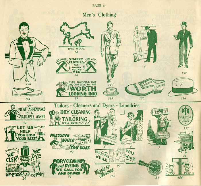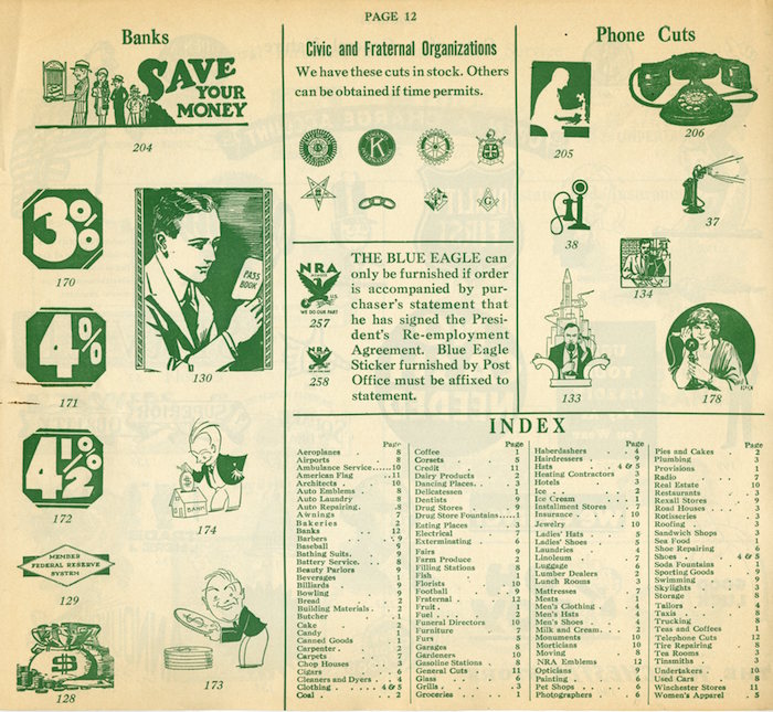
The printer’s “cut” (a.k.a “cliché”) is as common to graphic design practice as yodelling is to mountain climbing in the Alps. Yodelling is an oscillating, trill, and often polyphonic sound that fills the snowcaped peaks with vocal resonance; printer’s clichés are visual noise—signs, symbols, vignettes—that fill mountains of empty printable space.
The practice of using pre-made art and design may have begun as early as the sixteenth century with engravings or stamps used to distinguish artisans’ bookbindings in the early days of printing. These were one-of-a-kind, but nonetheless models for printers’ marks that appeared on inside pages. Most were decorative, including swags and floriated sprays, but eventually representations of birds, dogs, deer and the like appeared.
When brought to mass printing they became clichés, derived from a printing plate cast from moveable metal type. This evolved into the stereotype, the printing term for the form from which a plate was created that made multiple impressions on press. An essential part of a printer’s tool kit, cuts were made by either by a type foundry or, increasingly during the early twentieth century, by commercial art studios, and used by compositors and printers to fill space with an appropriate illumination or illustration.

Pointing fingers were the most ubiquitous, watch faces, smiling and frowning heads, horses, fruits and vegetable baskets and funerary iconography have long been staples of the cut business—but thousands of others have been produced celebrating everyday events like birthdays, marriages, and Christmas. In addition to the garden variety of stand-alone symbols, there were comic cuts, symbolic cuts, and conceptual cuts—cuts that were impressionistic, expressionistic, and cubistic. Anything that looked good, gave relief to the eye, and helped tell a story. Most were anonymously done.Today’s pictographs and icons are direct descendents of the cliché. In fact some are direct copies too.
