02.23.05
William Drenttel | Essays

Stop The Plant: The Failure of Rendering


Photograph of a model of the St. Lawrence Cement project commissioned by Richard Katzman.

I received an email last week that "The St. Lawrence Cement Plant proposal, which so many residents in the Berkshire Mountains have followed for the last six years, is now in a crucial public comment period..." There was a call to action, of course. Come to the meeting. Give money. Write your Congressman.

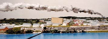
St. Lawrence Cement wants to built an enormous cement plant, powered by coal and the burning of tires and medical waste, on the Hudson River, about 120 miles north of New York City. The stacks on this plant will be 406 feet tall — being on a hill they will loom 600 feet above the Hudson. The plume will stretch 6.3 miles on many days. Up to 20 million pounds of pollution will be emitted from the project, which will burn 500 million pounds of coal annually. Further, the Swiss corporate parent has a terrible track record of pollution and price-fixing violations worldwide. Their cement plant in Texas, built when George W. Bush was governor, is one of the worst polluters in America.

We live 35 miles away, in the Berkshire Mountains that cross the northwest corner of Connecticut, where under moderate wind conditions, pollution will reach us in just about an hour.

Opposition to this project has been strong from the start. Movie stars have sponsored fundraisers and lent their names, including Meryl Streep and Natalie Merchant. Newspapers have written endless editorials. Serious environmental and health groups have weighed in, from the American Cancer Society to the Natural Resources Defense Council to the Sierra Club. Even the local antique dealers association has signed on. Many organizations, however, have larger priorities: the NRDC, for example, is also fighting the Fish and Wildlife Service to block mahogany imports from Peru, urging the Bush administration to be a global leader in mercury reduction efforts, and suing the Environmental Protection Agency for making secret deals with pesticide manufacturers.

When I first heard about this project a number of years ago, I urged the opposition leaders to find a way to visualize the scale of this project and to dramatize the scope of the pollution. There have been many efforts to do this.

There was the balloon-flight test to demonstrate the height of the towers and its resultant "blight on the landscape." There have been photo stimulations, photographs of modeled plumes, parties where the building columns illustrated the stack height, new taglines, and threats that the plant will ruin historical sites. There have been posters by nationally recognized designers and by local artisans, as well as billboards. There are other "Stop The Plant" movements to learn from: the 325 foot stack on the proposed powerplant on the Greenpoint/Williamsburg waterfront in New York City; other cement plants on the Ohio River in Cincinnati and on the Ichetucknee River in Florida; and the "Campaign Against the New Kiln" in Padeswood, Flintshire, UK.

Yet, there is no single rendering ominous enough to establish public fear; no image so compelling as to create political momentum; and no symbol so memorable as to unite the opposition. Whether through artistic renderings or information design, no one has made a visual case against these plants that is wholly effective. This is, I believe, a fundamental failure of design.

Architects have a long tradition of rendering the future, of creating images that excite the public and unify political interest in building things. Hugh Ferris's studies opened the door to the modern skyscaper. In 1922, even the losing entries for the Chicago Tribune Tower were imaginatively rendered, deeply affecting architectural history for years to come (e.g., Eliel Saarinen and Adolf Loos). More recently, the Freedom Tower was emotionally rendered by Daniel Libeskind (as well as symbolically rendered in its 1776 foot height). Not all these buildings were built. But they excited the public imagination, creating energy and discourse.

My favorite recent example is the commission won by Field Operations / Dillier + Scofidio for the High Line project in Chelsea, Manhattan. The beaches on the railroad tracks near the Hudson River, of course, bring Miami to mind. This is not a project one ever expects to be built with fidelity to the drawings. But these renderings did expand the conception of what disused railroad beds might be, and in the process, they galvanized the public (as well as the politicians). The High Line was saved, in part, precisely because of such images (as well as by the dedicated photographic work of Joel Sternfeld).

Back in the Berkshire Mountains, we're not so lucky. There are no fantasies of Miami on the Hudson here: our future looks quite different. We have only photographic renderings of long plumes of pollution — cotton balls hanging from miniature wires — waxing in the wind of a model.

Posted in: Architecture, Photography, Politics, Social Good


Comments [20]

Render, Hahahahahah, unto Caesar.
Brian Weaver
02.24.05
12:00

In my Corporate ID class last year, oddly enough, we worked on a sort of "call to action" project ourselves. It was simply the most difficult project I've been faced with in my design education. It has to function like a branding problem, but not to sell an object, but instead an idea. How do you "package" something so seemingly intangable? How do you determine whether one solution is truly better than the other?

In the case of the Plant, it seems with such a wide variety of attempts to stimulate reaction something would have hit the nail on the head. Perhaps it was just because the efforts were so spread thin as Drenttel suggests.

Mr. Drenttel I'm sorry this is affecting you so directly. I'm sure it doesn't seem abstract at all to you.
JT Helms
02.24.05
10:29

William, all these renderings don't really show me anything. You're right. Showing me a fluffy plume of smoke gently hovering above the trees has little effect. Tiny indoor cardboard models trying to portray the scale and enormity of the plant also has little impact.


I want a closer more personal view of the destructive nature the plant will cause. All of these billboards, posters, etc, seem to show me a view from a hundred miles away.


I don't want to see a plume of smoke or a cardboard stack. I don't want to know what could happen. I want to see what has happened up close and personal. It exists, doesn't it? Throw it in my face. Make me look it in the eyes. Shock me, damn it.


Don't let your sensibilities stand in the way of presenting the ugly truth.

Steven K.
02.24.05
12:20

No matter what you do with a rendering, it's still a small-scale, relatively sterile, 2-dimensional depiction. (A 3-D model isn't much better.) Now if you could only accurately simulate the affect of an offensive element on a person's sense of smell, on their respiratory system, as well as the chemical affect on their eyes or skin...well, you might be able to make a more powerful statement. There's nothing like immediacy to change opinion.
Daniel Green
02.24.05
01:14

Is there any posibility that someone with modeling skills--
not 3-D modeling, but full "system" modeling--would be able to donate time or services to model accurate and comprehensive projections?

Is there anyone with access to grant money or other resources that could help develope a powerful tool to support the opposition to the construction?
Randy J. Hunt
02.24.05
09:43

> This is, I believe, a fundamental failure of design.

See, I would blame Meryl Streep and/or Natalie Merchant, not design.

> Tiny indoor cardboard models trying to portray the scale and enormity of the plant also has little impact.

It may be the pictures, but I actually find that little model quite effective in its eerienes; its lifelessness and stillness give it a very somber cast.
Armin
02.24.05
10:29

> I want to see what has happened up close and personal.
> It exists, doesn't it? Throw it in my face. Make me look
> it in the eyes. Shock me, damn it.

But it's hard to make a cement plant look intimidating, especially if it's a modern clean-sided plant awash in the wide Hudson Valley. It's hard to make a smoke plume look more threatening than a far-off contrail. A smoke plume is going somewhere else. A skeleton forest killed by acid rain might make a compelling image - but even so it looks fairly natural.

This isn't the smoke of Edwardian England, with soot staining buildings and powdering noses with black. And even London's notorious air pollution provided a rather pretty atmosphere for a city (see Robert Frank, perhaps), until the 1950s smogs killed thousands in a few weeks.

Whether health-related, spiritual, or ecological, the feared effects of this plant build up over time. That's why they're so insidious, and so hard to picture. Perhaps this is a job for visual metaphor and statistical facts.
David Ramos
02.25.05
12:27

If the Swiss corporate parent already has a cement plant operating in Texas that is "one of the worst polluters in America" why not focus attention on that?

Physical evidence trumps visual metaphor.
Andrew Montgomery
02.25.05
09:35

David, victims other than trees must exist. I don't only want a bird's eye view of a power plant or skeleton forest. I may also have to see the victimized bird, or a rendition of it.

Look at what thetruth.com has done. Their anti-tobacco campaigns don't just cite statistics and spew clever taglines, they have some pretty disturbing images that show the destructive nature of smoking.

When you see coverage of oil spills, what has the greatest impact on you -- the arial shot of the spill or the up close shot of the cute seal or duck suffocating in the petroleum? I think together both have the greatest impact.

I guess this is the irony of it all; the most disturbing and convincing images appear only when it is too late, but with this knowledge, why not create an accurate rendition of the damage before it's too late?
Steven K.
02.25.05
09:38

Thanks for putting some attention on this issue.

In point of fact, there has been a single image which has been hugely effective for the opposition to St. Lawrence Cement.

When the following image was created in 2001, groups such as ours (Friends of Hudson) immediately saw a huge jump in the response. You can view a small version of the image I'm talking about at:

Plant compared to Statue of Liberty, Olana, et al.

This image has been repeatedly requested and published by media outlets (e.g. New York Magazine, Preservation Magazine, et al.) and by other groups fighting the plant who also found it effective in newsletters and presentations. In addition, I have found at least one other activist group which copied this idea, which we don't mind at all.

There is also a modestly interactive version of this image at the Friends of Hudson site. This frameset lets you click on specific points of reference to convey the scale and enormity of the proposal:

Interactive comparison chart

I don't see this key image linked in your post, but it's possible I missed it since there are a lot of jumps here.

Another modestly interactive page, which uses simulations from SLC's own application, is online at:

Porthole-style images of plant from SLC application

We have also created many maps tailored for specific communities to show how far they would be from the project. This is another effective approach for meetings, flyers, websites and other graphics.

Two obvious problems citizens groups face are (A) if the developer won't provide CAD files for the facility, doing one's own visualizations can be guesswork at best; and (B) even if you do get the CAD files, the cost of a fancy simulation is steep. Groups like ours would like nothing better than to have a 3-D, fully-interactive walkaround version of the plant on our websites; we need the data and resources to make that possible. One good thing is that the technology and skills necessary are becoming more and more available. (This fight started in 1998.)
Hudson
02.25.05
12:00

Dire messages of doom work fine for rallying activists, but not if you want the attention of Joe Average.

I worked for 2 years on a marketing campaign to launch and support the implementation of a regional by-law banning smoking in public spaces (workplaces, restaurants, bars etc.). Research and focus group testing showed that people are already scared and stressed about day to day news etc., therefore "disturbing" images or shocking statistics about the ravages of smoking would most likely have been counter-productive. In addition, people (even non-smokers who would support the by-law) don't appreciate being preached to. We adopted a 100% positive messaging campaign. Instead of anti-smoking we became pro-breathing; instead of targeting the dangers of inhaling smoke we focused on how great it is to breathe fresh air.

Not exactly earth-shattering, but it worked quite nicely.

Instead of a skull and bones rendering of a smoke plume, how about a positive rendering of the potential for the site, or what may be lost if the project moves forward? Blue skies, not black.

Attract more bees with honey.
Andrew Montgomery
02.25.05
12:00

The failure of these renderings is the total lack of emotional resonance. Even the scale model, easily the best rendition, still shows a quality landscape with fresh, blue water. Sure there's a plant there, but it doesn't seem to be affecting anything. "Look at how green the grass is!"

The public responds to fear with greater importance than how they respond to kindness (look to any negative political campaign for an example). There is a real cause for fear of this plant, and the pollution it will bring. It is that emotion which, in my opinion, should be present in these renderings. Not just a cloud. I hate to be the one to advocate scaring people into action, though.
Nathan Voss
02.25.05
01:02

Well, while it is easy to armchair quarterback on these matters, here are some of the facts that are being ignored in this discussion:

1) Friends of Hudson grew from 40 to over 4,000 paid-up members during this controversy, also gathering 16,000+ signatures against the project. This was done in a relatively sparsely populated, rural area;

2) The groups opposed now total more than 35, including national organizations such as The American Lung Association;

3) The groups opposed have garnered massive publicity, including numerous articles in national publications, editorials against the plant in every major northeast paper including The New York Times, Boston Globe, and Hartford Courant, TV coverage on CNN and other high-profile outlets, and received support from figures as distant as the Governor of Maine and Attorney General of Connecticut,

4) The range and pervasiveness of the printed, video and other presentation materials in the target communities would not be obvious to the outside observer. For example, an enormous retrospective of these materials was mounted last summer at TIme & Space Limited in Hudson, including a large walk-in space with an 8-foot-tall silhouette of the plant facility, in which the plant comparison chart was made on a more human and tangible scale.

Designers should look beyond their narrow expertise, and consider the totality of activists' efforts before judging. The graphic materials assembled in service to this fight have received wide praise for their appropriateness and accessibility from those actually using them.

As a former design critic myself for publications such as the AIGA Journal and I.D. Magazine (in the Chee Pearlman era), I think we have done a splendid job, frankly, when one looks at the results of our graphic work.
Hudson
02.25.05
06:20

A few final comments, before I forget:

The St. Lawrence fight has gone on for 6 years. During that period, the applicant has failed to obtain a single one of the 17 permits and approvals it has sought -- despite spending over $60,000,000 (yes, $60 million) on advertising, lobbying, mass mailings, p.r., lawyers, etc.

I mention it not only as proof of the success of the oposition's work -- of which graphics are only a minor component -- but also to remind those who approach these issues as a purely illustrative job that the most difficult task in this particular battle has been to sustain interest and prevent exhaustion among those opposed.

As a result, both the messages and the branding have had to constantly evolve and rotate. No one image will suffice for 6 years, obviously. The groups opposed have succeeded at that, pace the criticisms posted here.

Secondly, to the person who posted about appealing to the "Average Joe" (a useless concept, to my mind, especially in such small and idiosyncratic communities as those affected by this project), popular support for a grassroots fight is won through face-to-face contact. Nice graphics are helpful, but this is not an urban population that approaches ads in the same way as most designers.

And the model images some have found underwhelming? It was built to be seen in person, for local people, first and foremost. It was made for people who live here to walk around and experience. The photos of this model are indeed a poor substitute for that experience, but that mises the point.

In any case -- third point -- visuals are not what drive the opposition to this project. It's the health concerns. The biggest watershed in this fight was not any new graphic, but when the doctors of the local hospital came out against the project. When doctors say a project would increase asthma, lung cancer and heart attacks in the local community, people listen. And the opposition used every means possible to spread that news, including radio and TV ads, mailers, letters to the editor, press releases, blast emails, etc.

But most of all, activists must use their own voices and personalities to reach out, live, to our neighbors -- and not expect to win by communicating at arms length through printed matter or screens.

Something to keep in mind before assuming Quark, CAD or Photoshop can singlehandedly win battles: What works for an art catalog doesn't necessarily work for activism. Activists aren't selling sneakers. We win win not by promoting community, but by living it.
Hudson
02.25.05
06:39

I am happy to hear from "Hudson." A quick google search reveals that he is Sam Platt, the executive director of Friends of Hudson. Sam is also, as he notes, a former design critic; he is also a webdesigner, and a zine publisher. I suspect he has designed some of the materials discussed in my post. Knowing whom we are speaking with is occasionally constructive.

My post was never meant to denigrate the heroic efforts of local environmentalists, whether in Florida or Ohio or England or Hudson, NY. Significant political inroads have been made. However, the battle is not over, or I would not still be receiving emails and being asked to support Elliot Spitzer, the Democratic challenger for New York State governor. The significant number of signatures and organizations supporting this movement have not yet stopped the plant. This fight is not over, as I am sure Sam will attest.

Further, I would not be so naive as to suggest that good graphic design could ever stop such a plant in the face of $60,000,000 invested by the foe. My post never suggested such.

Nonetheless, I stand by my assertion that the visualizations associated with this, and other projects, are hardly of a visionary, innovative nature. Rather than being defensive, I would hope that Sam and other environmental leaders would be challenging the design profession to do better.

I'm intrigued by Sam's comment that real progress was made when local doctors came out against the project. In my post I included the notion that information graphics could play a constructive role. Why is medical and health information so poorly communicated in general? I wish this particular challenge had been given to students at the Illinois Institute of Technology or Carnegie Mellon, places where information design is taken seriously.

My post suggests that great architecture is sold, increasingly, through its renderings. I think it is a fair question to ask why does not the same energy and talent go into rendering things we should not build.


William Drenttel
02.28.05
02:00

William: My last name is Pratt, not Platt, so long as you're playing Philip Marlowe...

(Indeed, my email address, which is my full name, and a link to the Friends site were included when I posted -- and I referred directly to "our" work and "we." So you are giving the appearance of having uncovered something that was in plain sight... with no apparent motivation except to cast aspersions on good-faith responses. And while I do design most of our group's internal membership materials and website, the graphics for our more public materials have been handled not just by me, but by a wide range of designers working on a volunteer basis -- including Nicholas Blechman, John Isaacs, George Gruel, Frank Aultman, et al. -- hence the "we" in my messages. Anyway, to characterize such responses as "defensive" is frankly kind of passive-aggressive... You cast a stone, perhaps not expecting any rebuttal.)

The biggest problem with your analysis remains that you based it upon a narrow sampling of the materials which have been distributed around this issue by our group, and others.

Given that you never joined our group or signed our petition -- and are located in another state -- it is likely that you have mainly seen materials produced by one of our many allies. Indeed, as I said, we're just one of 35 groups fighting this project.

Expecting a corporate-style branding of an issue across 35 diverse groups is unrealistic -- and not necessarily even desirable from a grassroots perspective. Again: We're selling community, not Coca-Cola.

That's the bigger issue which I hope designers here may chew on: how to adjust design assumptions for a local or regional audience, over a long period of time.

Evaluating specific images in isolation, from the lofty distance of a design studio, fails to recognizing the nature of a long-term grassroots campaign and the design challenges faced by activists.

Having dealt with a large number of advertising and graphics professionals over the course of this six-year controversy -- many of them at the top of their field on Madison Avenue or in Soho -- I have encountered a profound lack of understanding of grassroots communication among all but a handful of those professionals.

Many of the design ideas proposed over the years to our organization would be swell for a campaign to preserve an historic house in the West Village from demolition. But it should be obvious that the audience in Upstate New York is a totally different animal, with a unique set of values and cultural reference points.

For example, we found that with our particular audience a certain home-made look actually gave us an advantage over our opponents' slick, glossy, full-color mailers (which as ugly as they were overproduced). It sent a message that "this is a message from your neighbors, not some giant Swiss corporation."

This should be obvious, but in my experience it is not -- to many designers, at least.

So in our graphic and type choices, our group has deliberately sought to strike a balance between professional and down-home. The plain fact is that our community has responded strongly to our materials, even if some high-end designers don't. We routinely are thanked by our supporters for the clarity and useability of the information we provide.

Another misconception in some of the comments here is that the main goal of our graphics should be to convey horror or shock. We are focused on educating residents to act on their concerns, not scaring the hell out of them.

In fact, we have found that what works best is a non-alarmist approach which lays out useable facts in clear detail. The biggest design difficulty has not been to find a shocking image, but rather to strike a balance between enough detail and too much. Given the long duration of this controversy, this was a smart choice.

It's about context and usability, not just slickness or drama. Someone could and probably should write a manual titled "Designing for the Grassroots" -- and actually interview people with experience in the field.

[Meanwhile, give my regards if you would to Tom Vanderbilt.]
Hudson
02.28.05
12:46

Sam Pratt,

It is so nice to have a dedicated practitioner of grassroots communications add a voice to this discussion. You have added much to the dialogue. You sound like the perfect person to write the book on Designing for the Grassroots, and I would urge you to do so. Designers would benefit from your perspective.

I want to plead a certain naiveté. I am just part of the audience: a regular person who lives downwind. This is an important issue in my area -- despite being in another state. There are Stop the Plant signs posted throughout my town. I receive the emails, requests to come to fundraisers, appeals to join, read articles in my local newspaper. In fact, as a local constituent I am totally confused by the 35 organizations who have joined this initiative -- I have probably received communications from a third of them. You suggest that the opposition has been incredibly successful ("the applicant has failed to obtain a single one of the 17 permits and approvals it has sought -- despite spending over $60,000,000") -- so why am I still receiving urgent emails? So many people have jumped on this bandwagon that it is hard to know where to join or to participate, or in light of the success you have achieved, whether there is still a crisis. Thus, the scale of the opposition is confusing to many of us who just live just over the hill. On this level, my personal experience is as valid as the next guys: my experience of the opposition is my experience.

You did show some interesting graphics that I have seen before (but which I could not find on your website in researching my post). The Plant Compared to Statue of Liberty and Olana is a nice rendering, and I can imagine that it gartered some support. (It reminds me of those great 19th century steam plant illustrations championed by Erik Nitsche).

I'd like to pursue further a couple of the points you raise.

"Having dealt with a large number of advertising and graphics professionals over the course of this six-year controversy -- many of them at the top of their field on Madison Avenue or in Soho -- I have encountered a profound lack of understanding of grassroots communication among all but a handful of those professionals. Many of the design ideas proposed over the years to our organization would be swell for a campaign to preserve an historic house in the West Village from demolition. But it should be obvious that the audience in Upstate New York is a totally different animal, with a unique set of values and cultural reference points. For example, we found that with our particular audience a certain home-made look actually gave us an advantage over our opponents' slick, glossy, full-color mailers (which as ugly as they were overproduced). It sent a message that "this is a message from your neighbors, not some giant Swiss corporation."

You note the names of many good designers who have volunteered: Nicholas Blechman, John Isaacs, George Gruel, Frank Aultman. There is also the award-winning poster by Woody Pirtle. Why do I still see the mundane (but probably effective) poster of a red circle with a line through it as the Stop the Plant poster on lawns in my village? Is this, in fact, more effective in your eyes than the more designed or illustrative posters done by others? (I have never seen the Woody Pirtle poster anywhere around where I live.) [There is no critique of Woody or Nicholas, who are friends, or of the other designers named. This is a sincere question.]

"Expecting a corporate-style branding of an issue across 35 diverse groups is unrealistic -- and not necessarily even desirable from a grassroots perspective. Again: We're selling community, not Coca-Cola."

I was never suggested that corporate-style branding was an answer: it never entered my mind to suggest that you turn to Madison Avenue. I simply suggested that better visualization and information graphics might be useful, and that the quality of these, as deployed by the opposition to plants in Florida and Ohio and New York and London was not as the same level as modern day architectural renderings, or the best in information graphics.

I'd like to return to the example I raised in my original post. Saving the High Line in New York was an enormous grassroots initiative. It was not as simple as saving a historic building by going to the Landmarks commission. It involved thousands of people, many agencies and levels of approvals, public hearings, etc. The visual work, however, that united all these folks through a multi-year process was a large-scale body of photographs by Joel Sternfeld, outstanding graphic design by Paula Scher, and then the almost fantastic architectural renderings of Field Operations / Dillier + Scofidio. This was not about branding: this was a vision that turned into an initiative that was sold with strong visuals. (A solid economic plan was the other key element.)

Again, isn't it possible that stronger design and visualization would be an asset?
William Drenttel
02.28.05
02:50

William (or I guess it's Bill)...

You ask, You suggest that the opposition has been incredibly successful ("the applicant has failed to obtain a single one of the 17 permits and approvals it has sought -- despite spending over $60,000,000") -- so why am I still receiving urgent emails?

That's an easy one: We are facing the 2nd largest cement company in the world, willing to spend $60 million without making progress.

Until an agency says no, or the corporate management pulls out, we have keep up the drumbeat, and stay vigilant.

If SLC's owners had less money and more sense, they would have been gone long ago.

And if you knew the extent to which this project was considered a "done deal" on both the State and local level when it was proposed, you would consider it a miracle that we've held them back for so long. That's not a boast -- just trying to put things into better perspective. Things were really grim for the first couple of years.

This could go on another 6 years. I know a guy in the neighboring town to Hudson who fought a 12-acre gravel mine for 8 years before he finally won a court ruling... SLC wants to open a 1,200-acre mine. Do the math -- we may be passing this battle down to our grandchildren, in theory. Sure hope not.

So the endless alerts are due to the fact that there are 12 separate agencies with permitting power over this project. If any one says "no," the company can't build, and each one has its own process. These don't move forward on a rational or staggered time frame, but unpredictably.

None of those agencies has made a ruling yet; one is expected to in April. If it says no, the fight should be over -- unless the company re-re-designs the project and resubmits its application. If they say yes, we tackle the next 11 agencies.

The good news is that not a single permit has been issued. But each time an agency announces a comment period, all the groups opposed have to ramp up and engage our constituents to participate. (Both the NYS DEC and Army Corps have held their comment periods -- but not ruled.) There's no real way around that.

2) The Statue image was prominently linked on our website for about 3 years. As most residents of our target area have seen this image so often now, and as it has also been endlessly published, we have somewhat de-emphasized it of late (though continue to use it in some applications, such as a recent postcard action pack).

3) Long item, due warning...

There are three main parties fighting this project. Friends of Hudson began the challenges in early 1999. We've since been joined by HVPC/Scenic Hudson and The Olana Partnership. In certain areas, we overlap efforts, and we make a strong effort to coordinate them. But in others we operate somewhat unilaterally. (For example, Friends of Hudson tackles the Berkshires, where I grew up.)

While I did make three presentations in Litchfield County in the early days, for the past three years or so your area has been the responsibility primarily of HVPC. I can't speak for their graphic approach; suffice to say it's different from ours. I will just comment on one item you raised below.

Namely, the Woody Pirtle poster (it's the first time I've heard his name -- but I think I know the one you mean. With all due respect to the designer, this is a good example of the problem I'm talking about... an image that appeals to design juries, but is not as effective in practice on a grassroots level.

Our group did not endorse the use of the Pirtle skull logo, and has declined to use it. We think the skull is kind of heavyhanded and overused. It's not likely to convince anyone not already on our side, but quite likely to play into the sterotype of enviromental activists as alarmists.

We don't win by parading around in gas masks or staging die-ins in front of the plant. We win by talking with our neighbors about the facts, patiently, over a long period of time if necessary. It's a multi-faceted approach, at times a bit like Chinese water torture. We've had people change their minds after five years of persuasion -- that's how stubborn some of the support has been.

But back to Pirtle... In addition, the heavy use of black and dark red on these lawn signs was to me a fundamental useability error -- these fade into the landscape far more than the bright red on our admittedly more rudimentary signs. I've tested it. Okay, not quite to the extent that Montalbano tested Clearview. But you can spot and read our simple design from a far greater distance, in a wider variety of situations -- which is important when you're aiming to demonstrate greater numbers than the opponent.

A few other points which again may be counter-intuitive for professional designers...

In a community which endures a controversy for so many years, lawn signs and posters become mere placeholders. All you see after a while is red (quite common in Columbia County) or blue (these have virtually disappeared now). They are simply markers of how many households are on which side. And as such, it does not pay to change a basic color scheme or image, unless we want to dilute our overall impact from signs. In any case, signs at this stage are more for maintaining morale at this point.

This might be an argument, at some point, for taking up all the old signs and doing a jazzy new campaign; maybe we're there. But I'm not so sure we wouldn't be better off just getting twice as many of our existing signs out there this spring. (Convince me!)

Trying to be clever or dramatic on a lawn sign is kind of irrelevant. The signs serve one purpose -- to tag another "stop the plant" house. Six words is about all you've got, if that. So we've only made incremental upgrades in our sign design... We tweaked the shade of red very slightly, adapted the type from plain vanilla Helvetica to Kievit, and added the small "Tell the Truth" tagline to "Stop the Plant."

(The "truth" line was by Enid Futterman, who among other credits came up with the "friends don't let friends drive drunk" slogan.)

I would also note, for what it's worth, that we did not use printed lawn signs for the first 18 months or so of the campaign -- all of our signs were hand-painted. This was done to again contrast our group with the company, which was actually paying people to put their slick blue signs on their lawns. We wanted to say: We're human, we're local -- they're corporate, and Swiss. (There's a pun in there about Swiss design to be made, but I'm resisting it.)

Once the group grew too large to produce enough hand-painted signs (I myself slapped together about 150 of these), we had to go to the basic red ones.

But enough about signs...

4) One of the guys who handled the High Line publicity is a member, ironically enough... So I'm familiar with a lot of those materials.

Nice campaign -- but note the context: Downtown Manhattan. That's a designer's dream audience, arguably the most graphics-literate population in the U.S. I'm not suggesting that our population here is graphically illiterate, but rather that the frames of reference can be stunningly different. (Isaacs convinced me to switch from an Egyptian font for our logo and Georgia for all our text to the Kievit family in 2001, but we did this as gradually as possible.)

A prime example of this cultural difference: We hold an annual picnic at The Federation of Polish Sportsmen. (I'm not making this up -- they're great guys, and they have an amazing property with outdoor pavillions ideal for a cookout, surrounded by the plant's proposed quarries. Most of them are actually Italian.) Anyway, it's a very down-home atmosphere, burgers, hot dogs, face painting for kids, etc.

But after our second picnic, a local woman emailed me privately to say that she still found the look and feel of the event "too avant-garde" and that she felt she didn't fit in. Maybe it was just her personality, and I shouldn't have read too much into the comments, but this was a revelation -- we thought the event was just the opposite. And when I reviewed some of the choices we made (for example, only selling red and black t-shirts), I realized there were some subtle signals we were sending out with our design and other choices, and made adjustments -- in a direction I would not have othewise gone.

Sure, one can always tighten up one's graphics, and do a better job of communicating. But my point is that when designing for the grassroots, a lot of assumptions have to be thrown out the window. Palatino may be more effective than Ms. Eaves in some grassroots venues, even though I wouldn't want Steve Heller to catch me using it. Ideally, you strike a balance so as not to lose those put off by that darned "avant garde" look.

I also remain uncertain that you have actually seen most of our group's printed materials, especially given your location, and would be glad to send a packet along. For example, the book Nicholas Blechman designed is terrific -- maybe too good looking, in fact -- and includes a fold-out of the Statue graphic. Our newsletters also pack a ton of useful information into a small amount of space, if I may say so.

5) As much as I love design myself, the absolutely key factor for us, given the size of our communities, has been our group's willingness to be available for face-to-face meetings. In the past six weeks, our group has held over 20 meetings in people's homes, in churches, on farms... Wherever we could get an audience, to inform and empower people to act as part of the current comment period. These have ranged from as few as six to up to 60-80 people.

The ripple effect of the spoken word, and of Q&A sessions, is huge -- and we have honed these presentations, I must say, down to an art. People become ambassadors to their neighbors once they've heard information firsthand, and had a chance to ask all their questions.

We do bring lots of printed matter, but mainly to transmit key info such as addresses to write later. (And I loathe PowerPoint presentations.) In a place like NYC, it's not really possible to use this approach, but for us it's crucial. We gain members through personal contact and referral, first and foremost.

When designing for the grassroots, the bigger picture of what you're trying to achieve, over a long period, has to be kept in mind. There is no such thing, in my experience, as a single graphic knockout blow... much as we want to believe in them as designers. (Even the hooded Abu Ghraib image, arguably the most powerful war image since some of the more famous Vietnam photos, wasn't enough to stop Bush.) Each mailing or flyer for us is an incremental step in increasing our base of support, in increasing our existing members' knowledge base, and in keeping an exhausted community's interest and focus on a crucial health and quality of life issue.

[P.S. I really don't want to write a book about any of this. But the word counts in these posts are getting up there... If anyone is still following this thread, you're a glutton for punishment.]
Hudson
02.28.05
11:56

Someone posted a while back, "so why haven't you stopped the plant?" (or words to that effect).

Well, we stopped the plant yesterday -- winning a decisive ruling from the Pataki administration.

SLC spent (according to their April 2004) annual report $57,000,000 trying and failing to impose a massive plant on a small upstate community, and lost.

More at: http://www.friendsofhudson.org
Hudson
04.20.05
09:20

Congratulations to Friends of Hudson and the many organizations and individuals who wisely fought this power plant. As a neighbor, I am personally indebted to all of you for the efforts that will keep this nasty pollution from flowing my way.

For those interested in the inspired architectural renderings of the Highline Project I mentioned to in my original post, a new exhibition opened at the Museum of Modern Art last week.

William Drenttel
04.21.05
11:28


Jobs | March 28