Seymour Chwast, a man of few words, wishes there were more than 26 letters in the alphabet. He is a lettering fanatic—with a few complete character sets in his quiver, including “Beastial Bold,” “Blimp,” “Buffaloo,” and “Artone.” He routinely embellishes and invents his own one-offs that mix imagination and ingenuity with alphabetical pragmatics. Chwast wittily plays with the form, content, and symbolic resonance of letters—and I, for one, would be thrilled to see more alphabets and more alphabet books by him. Of the two Chwast ABC books that I know of, The Alphabet Parade (Harcourt/Brace, 1991) and Still Another Alphabet Book (McGraw-Hill, 1969) by Chwast and Martin Moskoff, the latter is among the most jolly and eclectic examples of this venerated illustrated genre that dates back to 1570.
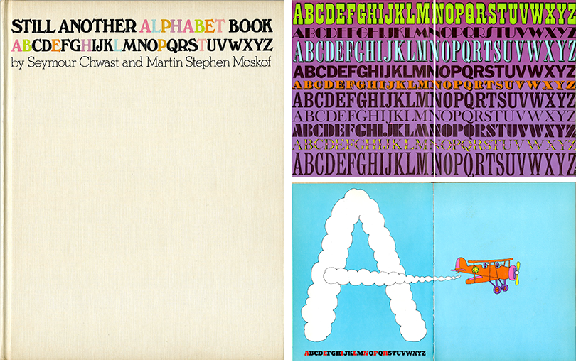
Still Another Alphabet Book was republished by Dover in 2014 but it is the original edition that is the jewel in his cap. It has a risky cover/jacket for a children’s book, insofar as most of it is blank—no picture at all. Only two justified lines of black title type and one with the byline are scrunched at the very top of the book with the word “ALPHABET” printed in pastel colors. The second line, a tightly spaced 26 letter alphabet is highlighted by colored letters that duplicate those in the word “ALPHABET.” The astute reader will notice that this typography is actually the key that unlocks the conceit of the alphabetic puzzle embedded within the book.
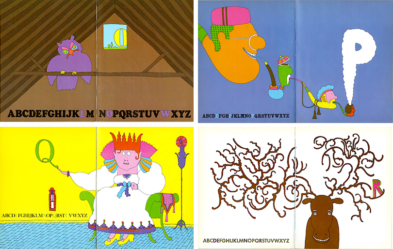
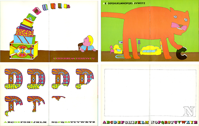
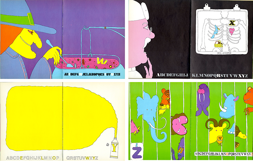
Although not nearly as vexing as the Enigma code, the World War II German encryption system used for sending secret military and diplomatic secrets (and deciphered by the British), Chwast’s scheme is not without its challenges. Each of the illustrated letters is a clue to a word represented by the picture but also jumbled in the 26 letters appearing on each spread. The letters flow from A to Z with the characters making up the keyword printed in color other than black. One needn’t be Alan Turning to decipher the meanings but the drawings are so delightful, that the obvious clues, hiding in plain sight, are easy to overlook.
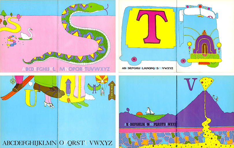
I am particularly fond of the enormous CAT that paws at the smaller “C”. For the letter “S,” Chwast draws a serpentine creature with art deco scales, while off to the left included are other decoy “S”-objects, including a winding road, a swerving swan, and colorfully arranged stones. The typeface chosen for “Snake” is Prisma, a sly typographic in-joke for type-minded parental readers. For the letter “W” he concocts a witch stirring her brew that includes a floating letter. And the F-word is aptly represented by an exquisite fish blowing bubbles forming an “F” from its massive mouth.
In the history of graphic design, with notable exceptions, like Die Scheuche (The Scarecrow, 1925) by Kurt Schwitters and Theo Van Doesburg, and About Two Squares by El Lissitzky (1922), children’s books are not always as prominent as they should be. Chwast and Moskoff’s Still Another Alphabet Book, originally planned as a “Still Another . . .” series, should have a place in the legacy starting now.
