01.03.05
Dmitri Siegel | Essays

Mysterious Disappearance of Carol Hersee

Carol Hersee

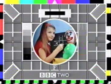
Have you seen this girl? Her name is Carol Hersee. This portrait of her is perhaps the most widely broadcast image in the history of television. Since it first appeared in 1967 on BBC2, Carol's face has been on-air for over 70,000 hours and is still in use today in over 30 countries. She used to appear regularly at the end of the daily broadcast schedule and accompany the sleepless (and the very patient) until programming resumed in the morning. With the advent of 24-hour programming, however, her schedule has been drastically reduced. As Carol joins the composing stick and the California type-case in the dustbin of design history, the public loses yet another tangible connection to the process of design and an oddly comforting reminder that culture is essentially a mechanical process.

This image of Carol is called Test Card F and was designed by her father George Hersee, an engineer for the BBC. As the name implies, this was not the first test card ever designed, nor was it the last. Test cards (or test patterns as they are called in the United States) are the descendants of tune-in cards, which were first broadcast in 1937. The tune-in card was used to identify the station, and to aid the viewer in fine-tuning their sets. Originally test cards were actual cards, usually hand-drawn and measuring two by three feet. Broadcasting a card required little besides holding it in front of a camera. The first test signal consisted simply of a large black cross on a white background. But as video technology evolved, circles, grids, diagonals, and converging lines were added and redrawn. These black and white graphics were essentially an optical obstacle course. Negotiating them was a quick way to test and adjust vertical and horizontal linearity (proportions), scanning linearity (even spacing of the scan lines), video frequencies (shadings), picture resolution (focus), interlacing (reducing flicker), and, finally, oscillation (especially at the corners, where picture quality is most likely to degrade).

These early graphic cards did not, however, address the most significant technical challenge that arose with the advent of color television. Suddenly, it became critical that cameras and televisions properly display flesh-tones. This was what led George Hersee to take some snapshots of his daughters, Carole and Gillian, for a mock-up of Test Card F. He did not think either of the girls would ever be on the air. He used Carol's picture simply to demonstrate to the management of BBC2 that a test card featuring a picture of a person would be the most useful graphic for adjusting the color performance of the channel's cameras and monitors. The management agreed, but they also decided that replacing the little girl in the mock-up with an adult model meant risking that the card would need costly updating to conform to the whims of grown-up fashion. So Carole was brought in for a proper photo shoot and the now famous photograph was taken.

Each of the props that surrounded Carole that day served a technical purpose. The chalk cross was positioned on the chalkboard to help engineers locate the center of the picture. Mr. Hersee once admitted that the BBC considered using a South Asian model with a bindi forehead marking for this purpose; apparently, the white cross on its black background proved more versatile. Because white images on television are made up of overlapping red, green, and blue, poor convergence of these colors shows up as "color fringing" on the cross. Even the somewhat unsettling clown has a purpose. Color televisions filter red, green, and blue signals from the black and white ones and decode them separately. This process causes the color signals to be delayed. If the black and white signals are not properly held back as well, a television suffers what is called a chrominance/luminance delay error. This causes the yellow of the clown's buttons to jump to the right, leaving the buttons themselves plain white.

Despite its functionality, Test Card F is seen less and less as the 24-hour programming day becomes the norm. Broadcast designers and editors still use test patterns to adjust color temperatures, but it is more and more rare for the average person to encounter this rough edge of the designed world. There are still little reminders: the "Not found" message that appears in a Web browser, the occasional "Searching for Satellite" screen on cable. But this default vocabulary has already been co-opted and reused by designers. Printers' marks and error messages have become commonplace design elements. Carol faces oblivion at best, and stylistic regurgitation at worst. In either case, a chapter of design history will be lost — the story of how a somewhat arbitrary, thoroughly constraint-driven process made a picture of a girl playing tic-tac-toe with a clown the most widely viewed show in the history of television.

Dmitri Siegel is a designer and writer living in Brooklyn. His writing has appeared in Dot Dot Dot, Emigre, and Adbusters; he also publishes Ante Magazine, a journal of visual culture. He is currently working on a history of feedback.


Posted in: History, Media


Comments [16]

I'm on the wrong side of the pond to be aquainted with Ms. Hersee, although a quick search reveals quite a bit of information, not only about Test Card F, but test patterns in general.

Here are some interesting takes on the subject...

Test patterns from around the world
Andrew Montgomery
01.03.05
03:45

I'm on the right side of the pond, so to speak, but I'm not sure I've seen this in at least ten years. Even before 24 hour broadcasting was the norm they would usually cycle through Ceefax pages with some music playing in the background. All the same, it's kind of doubtful that most people understood that the patterns and images served a purpose, let alone what that purpose was.
quis
01.03.05
05:52

The most common test pattern of my youth was the old "Indian Head." Black and white; I must be old.

If I remember correctly, the Amiga computer tee shirt that Garth wore in Wayne's World was loosely based on it. Wayne's World. Amiga. I still must be old.
Gunnar Swanson
01.03.05
06:32

If I were to engage you over a beer, it would be about this sentence
As Carol joins the composing stick and the California type-case
in the dustbin of design history, the public loses yet another
tangible connection to the process of design and an oddly comforting
reminder that culture is essentially a mechanical process.

First, they're not consigned to dustbins but to museums, which, with
any luck, do precisely what your piece does: point out what we are
seeing, or used to see.

Second, do you mean that there are no mechanical processes anymore? Do
the residues of what replaces them (digital?) have any less tangible a
connection to the process of design?
designproof
01.04.05
11:18

These are good questions designproof (and I look forward to that beer). As to your first point, I am not nostalgic about relegating design tools to the dustbin or the museum. As someone who would actually have to use a composing stick or a typecase, I am glad to see them go. But as a consumer of culture, I feel their absence (and this speaks to your second point I think) as a decreased awareness of how things are made. I disagree with quis quite strongly on this point. I think that people are intuitively aware of when something is "wrong." They may not graps the details, but they know that the test pattern is a functional image rather than entertainment. It's form begs the question, "What's this all about?" and I think that's a fascinating experience. What worries me is that the designed world might become so hermetic and the signifiers of functionality so appropriated that the opportunity for that fascination never arises.
Dmitri Siegel
01.04.05
04:06

Following the evolution of the BBC tuning signal provides an interesting bit of design and typographic history. Test Card F was designed by an engineer; one might assume that the earlier versions were as well, although there is definitely some thought put into form as well as function.

As an aside on the topic of out-dated design tools, I didn't have a chance to meet printer and designer Bill Poole, although I had the pleasure of visiting his studio before it was sold and disassembled, and was charmed to meet his wife Margaret. Bill had passed away a year earlier in a tragic accident on his property and therefore the police had been called. The investigators briefly suspected foul play when they discovered—and couldn't identify—a strange object in Bill's hand... it was a folding bone.
Andrew Montgomery
01.04.05
06:14

I recently came across a very short short on the sundance channel? about color bar test patterns in film/video, specifically, the ubiquitious "china girl," directed in part by Matt Owens. It calls to mind a similar nostalgia and general Kaleidoscopia, if that can be a word. It also conjuours up the name Paul Elliman, who worked/works with Xerox test patterns for the AIGA. A great example of Paul can be found here. Enjoy.
dazz
01.06.05
01:53

That was a pretty cool story about Carole. I found her imdb profile: http://www.imdb.com/name/nm0380875/
Al aka El Negro Magnifico
01.07.05
05:46

Nice work Dazz. You nailed two big influences on the piece. I happen to work at Sundance Channel and I love the China Girl piece by Chris Wilcha and Matt Owens. Paul Elliman's definition of graphic design as primarily a means of translating the human voice through technology changed the way I think about graphic design. I think its far more accurate (not to mention interesting) than the more common definitions of "commercial art" or "type and image."
dmitri
01.11.05
11:17

Second Beer:
An awareness of "how things are made" does seem important to our appreciation of the visual and aural, but I'm not sure why or how. After all, the piece is the piece, regardless of how it was made. I'm similarly puzzled by the value added by knowing some biographical details about the artist/designer/fabricator. (For instance, the fact that composing sticks are only right-handed and Luis Siquot is left handed.) Do you really think that the tools by which the designed world is created are getting beyond the awareness of the audience? Granted, the geezers don't know how dancing pigs work, but their youngers do.
designproof
01.18.05
02:13

"Since it first appeared in 1967 on BBC2, Carol's face has been on-air for over 70,000 hours and is still in use today in over 30 countries."

Which countries?
eeksypeeksy
01.28.05
04:46

i believe Carole Hersee has the same birthday as me.Nov. 25th. I also heard some time ago that she was born in same year as me,1960,but if she was 8 in 1967,then this cant be true.I would like to know for sure.
terry egan
04.24.05
06:12

does anyone have a recent pic of carol hersee or know where i can find one?
donna
05.07.05
08:11

I was wondering if any U.S. TV stations used 'Test Card F' in the period when stations were converting to color in the 1960's. After all, an NTSC equivalent of Philips' electronic PM5544 test pattern was used by some U.S. stations (and a variant thereof by the Canadian Broadcasting Corporation/Radio Canada) from the 1980's to a few years before the end of analogue NTSC TV.
W.B.
08.23.09
12:29

I was at School with Carole, we were very close freinds. She was born in Nov 58 and me June 59
Caroline Boris
01.05.11
03:32

i thought when for the very first time ever i clapped eyes on this i thought the girl in the picture was not a real girl to find out that she is very real indeed came as a shock to me i thought it was all computer generated because of it been a test card and a test card has a job to do and that is to get the color and picture right with your tv sets so that girl as we now know her as carole hersee with 70.000 hours of tv screen time she must of got a lot of money for this but yes i agree this is an iconic and unreplacable and unforgettable image that will haunt people forever in a nice way that is
julieann
08.26.11
06:43


Jobs | March 28