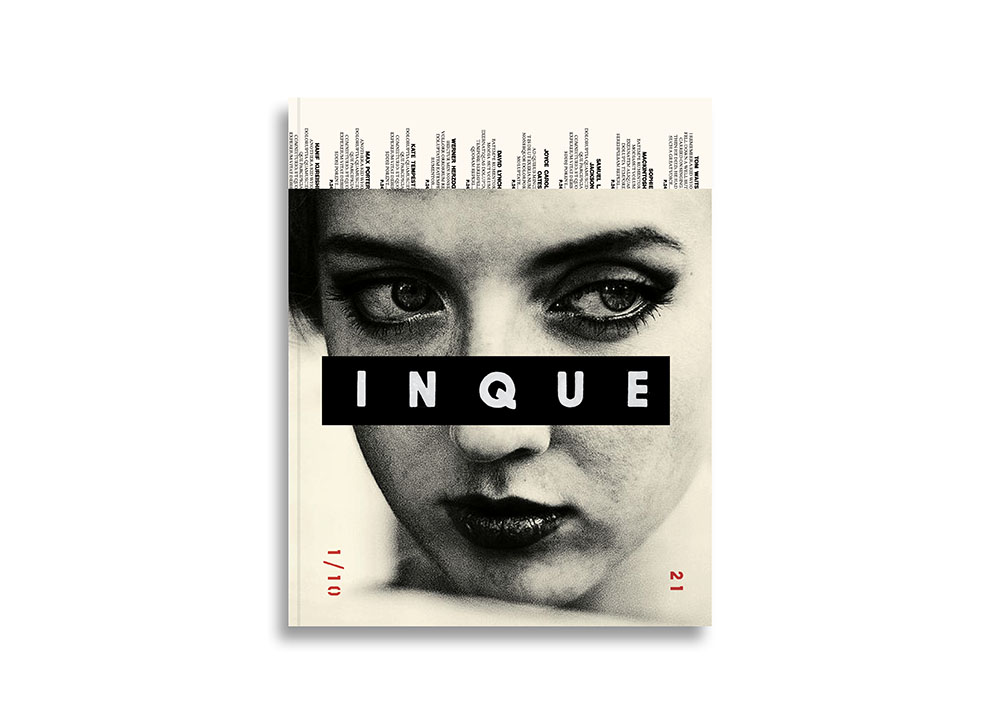
Photograph by Jack Davison
Returning home after seven weeks of Covid-19 self-exile in Northwest, Connecticut, I was faced with three large neat piles of unforwarded mail: Boxes of books, scores of invoices/reminders/junk in 10/11 envelopes and postcards and, finally an ominous stack of unread magazines. I could easily live without the boxes and bills — recycling the junk took minutes — but the magazines were not easily disposed. I love magazines, so those that arrive must be savored, if not retained, for months, even years after publication. Therefore, as a matter of survival, long ago I reduced my subscriptions to all but two, which is why I was surprised when the other day I involuntarily clicked the Kickstarter “donate” button for a startup mag called INQUE (e.g. ink). I was enthralled by the exquisite, flawless design of the reproduced sample pages and only after committing to the donation did I realize INQUE was co-founded, art directed and designed by Matt Willey, whose designs for Port and Avaunt magazines, which I’ve collected and/or written about, recall the virtuosity of two heroes of publication design, Alexey Brodovitch (Harpers Bazaar) and Willy Fleckhaus (TWEN), maestros of precisionist, inventive, editorial typography and cinematic page flow.
After five years, immediately before the 2020 pandemic, Willey left his position as art director at The New York Times Magazine to become a partner at Pentagram New York. Although it was an unfortunate time to start a new professional venture, the corona-hiatus gave Willey and INQUE co-founder, editor-in-chief Dan Crowe, co-founder of Zembla (which Wiley designed with creative director Vince Frost) and Port, a chance to focus on developing the new magazine that they conceived four years earlier and started working on in earnest about twelve months ago.
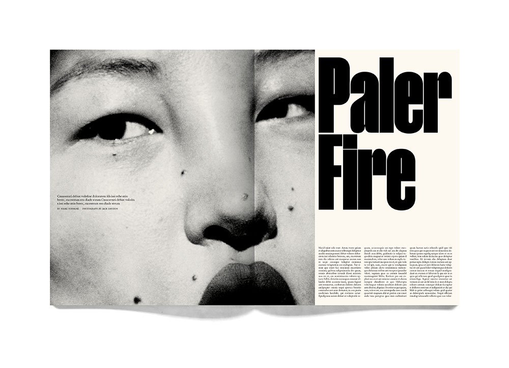
Photograph by Jack Davison
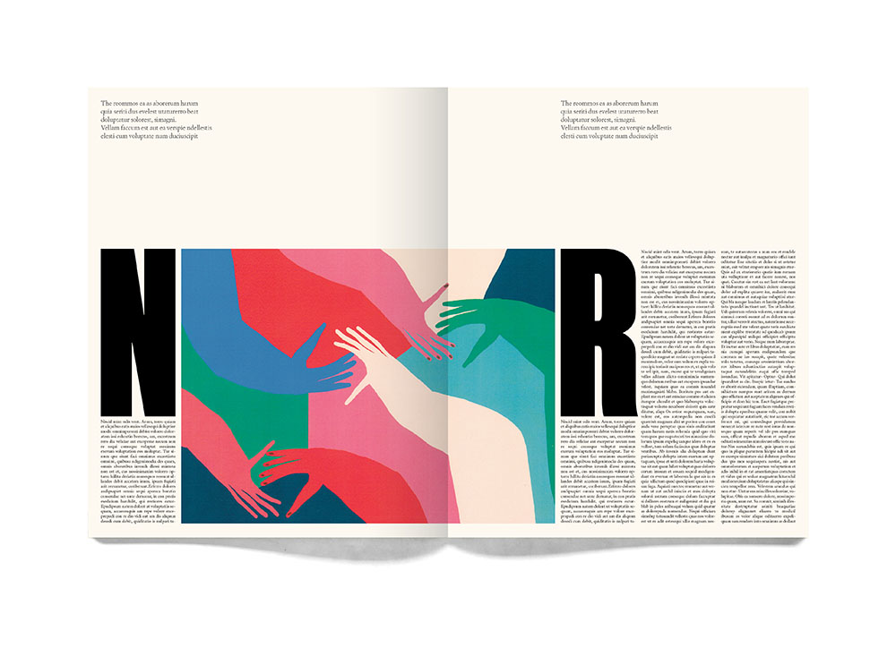
Illustration by Amber Vittoria
“Somewhat over-optimistically, it would seem,” Willey said in a recent email, “I’m trying to launch a literary magazine . . . . It’s a sort of publishing experiment that sidesteps all the things that frustrate me about the old broken mag-publishing system. Large format, print only, no ads, one issue a year for ten years… and then it stops. A sort of creative document that follows and reflects on what I think will be — one way or another — an extraordinary decade.” He then listed “a great list of contributors: from Tom Waits to Samuel L Jackson to Chimamanda Ngozi Adichie to Brian Eno to Tilda Swinton to Werner Herzog to Barbara Bloom to Bridget Riley…a certain Paula Scher, and so on and so on. Jonathan Lethem will write a novel over the course of the decade, one chapter per issue… that kind of thing.”
For funding, the cofounders have gone with the Kickstarter gamble, and while I resist using my columns to promote most of the crowd-sourcing projects I hear about, preferring to cover the end product after they are funded for real, I’ve made an exception here. The rationale is simple: I was an avid admirer of the of Zembla’s stimulating editorial content and design, and envious of Willey’s entrepreneurial design chops. My small monetary contribution to the cause was justified when I saw he was involved. Yet for the effort, as payback, I wanted Willey to answer the following questions about how INQUE was conceived and put into motion. So here goes:
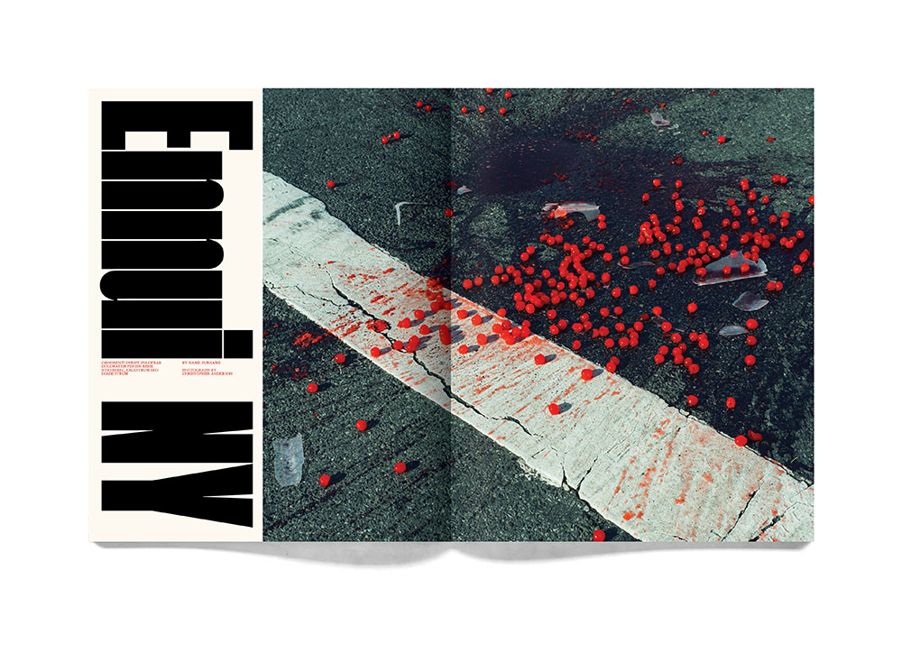
Photograph by Christopher Anderson
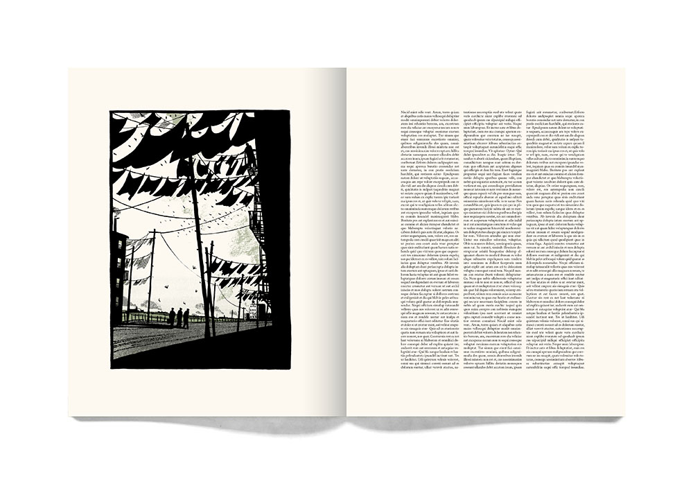
Illustration by Bill Bragg
Steven Heller: You've long been involved with magazines, beautiful typographic gems, I may add. What does this new venture provide that you have not yet experienced as a magazine designer?
Matt Willey: It’s connected to content. I obviously care a great deal about how this thing looks, how it’s printed, the format, the paper stock, how it feels as an object in your hands — I enjoy obsessively working all that stuff out — but it comes second to what we actually put in the magazine. We’re trying to carve out a space where we can make something without compromising, on anything, which is difficult to achieve. It means, amongst other things, not being dependent on the relationship with advertisers . . . I’ve never had that before. It’s exciting and rare to have complete control creatively, but the most important part is for writers and artists to be able to make something slowly and carefully.
I think one of the things that drew me to magazines in the first place (at a time when I was hugely ambivalent about the idea of being a graphic designer) was that they offered proximity to other worlds, to people doing interesting things; painters, playwrights, musicians, actors, writers, editors, poets. Magazines are entirely dependent on collaborations. With INQUE we’re just trying to figure out a way to do that with as much freedom as possible, and have as much fun as possible doing it too.
Knowing that this has a finite existence (ten issues over a decade) gives this thing a shape. A beginning and a middle and an end. I find that exciting editorially and visually — over the ten issues how the spines will combine to form a set on your bookshelf.
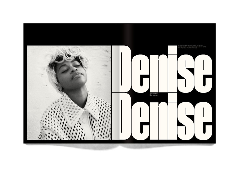
Photograph by Rich Gilligan
SH: What was the inspiration, motivation or stimulation for this?
MW: It feels like Dan and I have been slowly working up to this ever since Zembla. So, I guess the stimulus has been years of sitting around in pubs and restaurants with Dan; we fell in to a friendship and a way of working together where the two felt inseparable, our conversations always had the feel of extremely loose and easy and enjoyable and exciting editorial meetings.
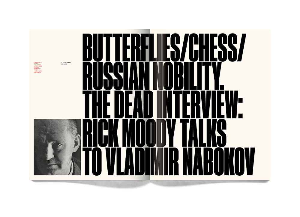
Zembla is a large part of the reason I want to do INQUE. Zembla was an unusual and playful literary magazine that took risks, editorially and visually. Wonderful and often “serious” content (as well as great writers interviewing dead people and children reviewing children’s books) presented in a way that felt unlike how a literary magazine “ought” to look. It behaved like a magazine that had aspirations to be more mainstream, or more accessible at least. Its strapline was “Fun with Words” which certainly applied to the editorial but it also applied to the way creative director Vince Frost and I approached the design. It was an absolutely wonderful thing to be a part of (even more so looking back at it than I realized at the time). And it’s how I met Dan (he was the editor and founder). And it was the first magazine I ever worked on. And it signaled (six years after leaving Central St Martins) the beginning of me taking the idea of being a graphic designer seriously (imminent parenthood had a significant role in that). Although I’ve been working in magazines ever since — non-stop for the past seventeen years — Zembla is still the one I miss.
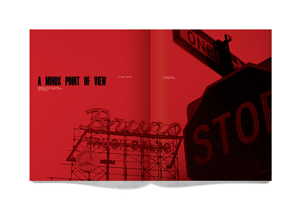
Photograph by Maria Spann
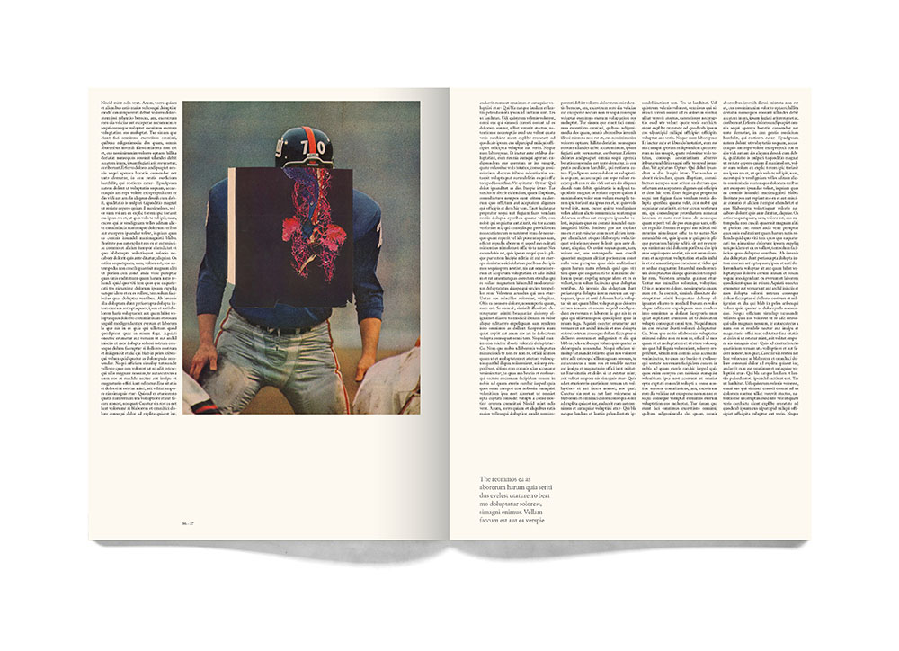
Illustration by Mike McQuade
SH: You describe it as a literary magazine and as such it is a rare breed, especially the way you're doing it. Who is your imagined audience?
MW: I’ve never really tried to imagine it. I have this blind faith in the idea that if I make something I like, something I think is good, other people will feel the same way.
The best magazines are often the ones that have been put together by someone who is simply passionate enough about something to want to make a magazine, or a hand stapled pamphlet from their bedroom, or a broadsheet they give to their friends. If you’re not worried about having a gigantic print run (which I’m not) and you’re primary aim isn't to try and make lots of money (which it isn't) and you’re not worried about trying to make something that everyone will like (what would be the point?) then you can just concentrate on making something good.
I hope people will like it, I want people to like it, but I’m not interested in the idea of mass-appeal as some sort of objective. I’m deeply bored with magazines being safe in the hope of having as broad appeal as it can manage. Nothing interesting comes out of that. I want INQUE to take risks, to be opinionated. If it pisses some people off, great. There’s so much to be upset about at the moment, so much to talk about.
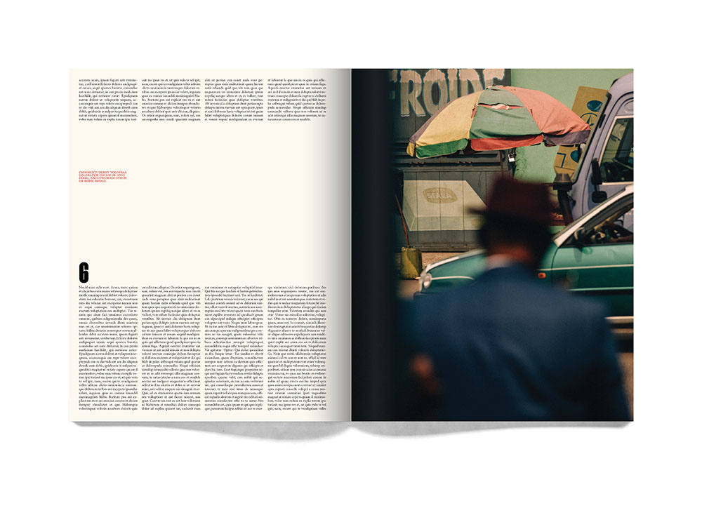
Photograph by Robbie Lawrence
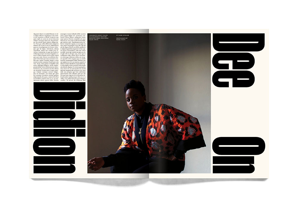
Photograph by Maria Spann
SH: Do you have any reservations (or worries) about making a print publication at this stage of the digital endgame? Or doesn't that matter?
MW: It doesn’t matter to me. The internet is oversaturated and chaotic, I’m not interested in trying to cut through that noise. These things aren’t mutually exclusive either. The internet is wonderful for certain things. The print-is-dead conversation is tedious. It’s all changing, inevitably, and magazine sales have dwindled but I don’t think that’s because the audience has disappeared, I think it's because authentic publications have.
SH: Maybe the word magazine is slightly unhelpful — archaic perhaps?
MW: Perhaps!? People have very fixed ideas about what it means. It’s an interesting time for magazines in many ways. The old ad-driven system that propped up the likes of Conde Nast and Hearst for decades just doesn’t make sense anymore. I think the rules for how a magazine works, how it's put together, how it’s distributed, what it looks like, what it even is (a website? a podcast?) is all up for grabs.
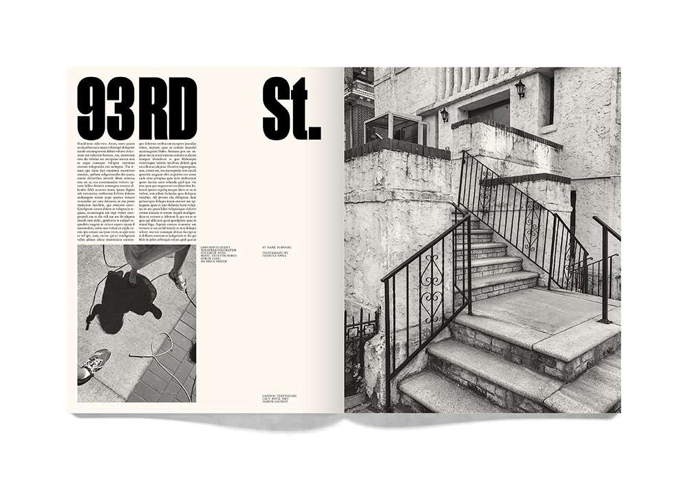
Photographs by David La Spina/Esto
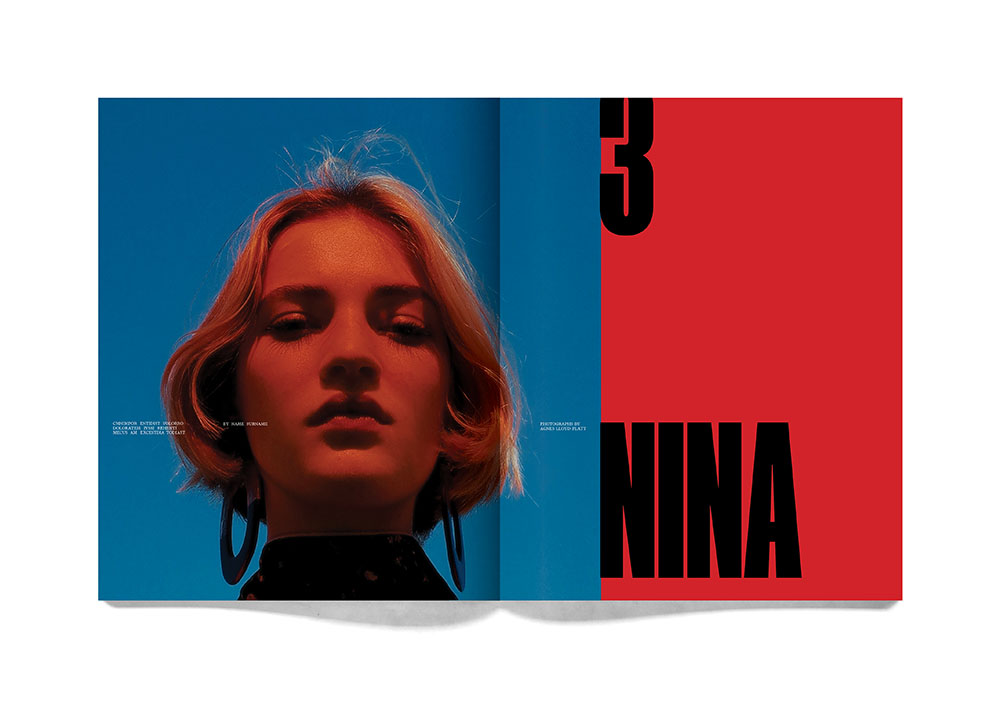
Photograph by Agnes Lloyd-Platt
SH: One issue a year for ten years does not seem difficult either to finance or to limit the readers’ mag-quilt either. Once you've raised the necessary funds, what will the next steps be? How soon will I, for example, get this sitting alongside my copies of New Yorker, which I must add, causes ever so much mag-guilt when I have not caught up?
MW: Issue 1/10 will land on your doorstep, with a considerable thump, in September/October 2021. But the only way we can do INQUE is if we make our target on Kickstarter. It’s an all-or-nothing deal. If we don’t make the target then this was just a nice idea.
SH: To paraphrase my grandmother (who would lovingly pinch my cheek and say “look at that face”): “Look at these pages . . . How can you not love these pages?” It is certainly worth a few pounds, dollars, euros or shekels to see it realized.
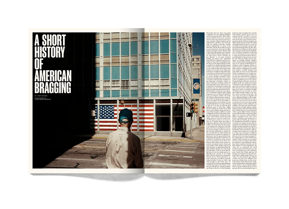
Photograph by Christopher Anderson
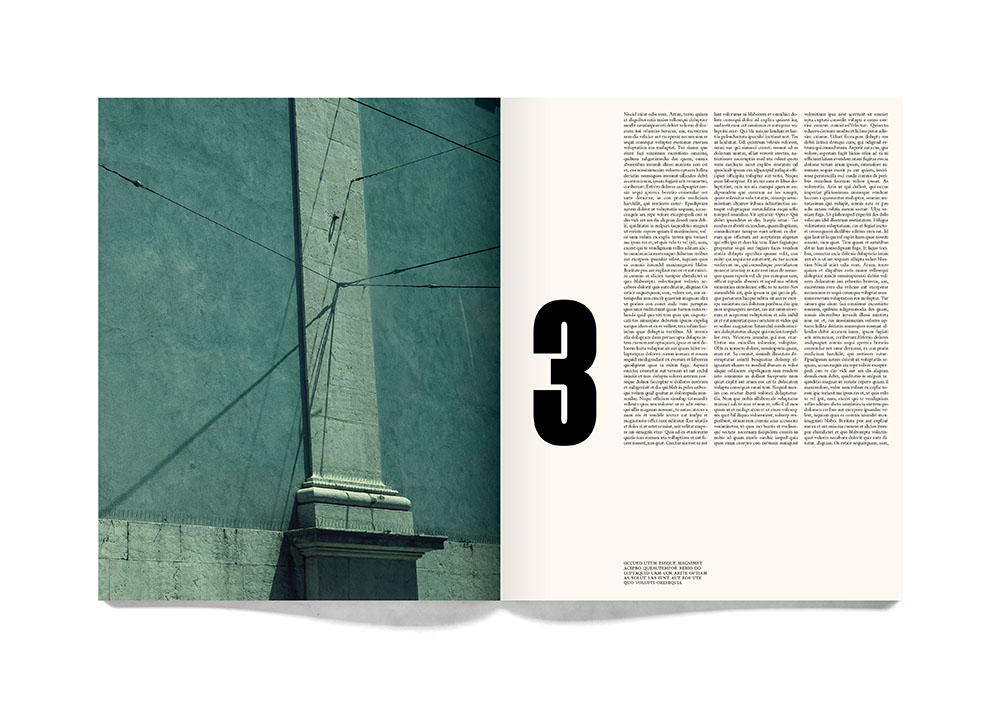
Photograph by Christopher Anderson
