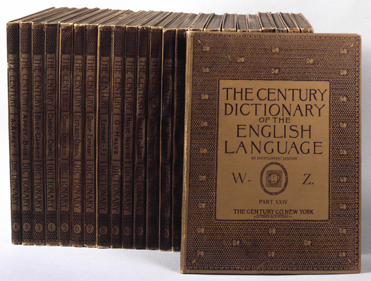
The Century Dictionary of the English Language, Century Company, 1889-91. The printing of this massive, twenty-four part set, prompted an addition to the De Vinne Press building in 1890.
We are not yet living, as novelist Gary Shteyngart once imagined, in a post-literate, visual age. Kindles, nooks, and other gadgetry may be replacing books on our nightstands, but printed artifacts can still capture our attention, and dazzle our senses. The Grolier Club’s quiet, yet noteworthy exhibition, “The Dean of American Printers: Theodore Low De Vinne and The Art Preservative of All Arts,” provides one such opportunity. On view through April 26, the story of De Vinne — as an extraordinary figure in the history of printing — comes alive through an impressive collection of books, letters, and other objects culled mostly from the club’s own library (De Vinne was a founding member), and the personal collections of curators Irene Tichenor and Michael Koenig.
Located in a first floor gallery, the majority of the show unfolds chronologically across 10 glass wall cases. The room itself — painted pink and deep burgundy — feels stuffy until you tumble into the seductive work on display. Beginning with a title page De Vinne composed as an apprentice to S. T. Callahan in 1846, it’s fascinating to watch as the young printer’s tastes shift from a purely Victorian aesthetic, toward a more restrained and refined design, across the display cases. Tichenor and Koenig’s narrative captions help move the story along, adding insightful details and providing connections between pieces. They note, for example, that De Vinne offered an alternative arrangement for this early work in his 1901 book “Title-Pages as Seen by a Printer” after later realizing there were better ways to arrange the copy. I found myself circling the room twice; first to devour the gorgeous printed specimens, and a second time to better absorb the written details (and the printed specimens all over again).
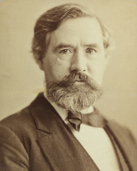
The Grolier Club's exhibition honors Theodore Low De Vinne on the centenary of his death (1828-1914). Here he is in 1866, at age 38.
De Vinne quickly rose to prominence in the Nineteenth Century printing industry, after co-founding an organization of master printers (the Typothetae of the City of New York) and by dedicating early writings to the education of his colleagues on best business practices. With titles such as “The Printers’ Price List: A Manual for the Use of Clerks and Book Keepers in Job Printing Offices,” and “The State of the Trade: Observations on Eight Hours and Higher Prices,” a passion for clear communication begins to emerge. Far from dry, there’s a thrilling efficiency to the language, even as De Vinne shifted to more historical subject matter. At precisely this point, confronted with only the fraying covers of DeVinne’s five-part illustrated treatise “The Invention of Printing,” and an undecorated four-volume brown and gold stack of “The Practice of Typography,” you may find yourself pressing unnaturally against the glass. The age and fragility of the works inhibit handling of course, but the desire to touch and smell the papery artifacts only increases from here. Thankfully, several spreads from “The Practice of Typography” do appear later in the exhibition (but sadly, remain behind glass).
Colorful woodcuts mark De Vinne’s fruitful partnership with The Century Company, for whom he printed the monthly periodical Century Magazine, designed the typeface Century, and collaborated on projects ranging from trade books to a massive, twenty-four-part dictionary. A poster promoting “The Century War Book” — a collected series of articles told from both sides of the Civil War — stands out here, as much for its graphic blue-yellow seascape as for the nature of its content. Also worth lingering over is the red and gold embossed cover illustrated by Fanny Young Cory, which highlights the pastiche of its contemporary kin, Conn Iggulden’s “The Dangerous Book for Boys.” In 1886, The Century Company helped finance a new printing plant for De Vinne (the now landmarked De Vinne Press Building, located on Lafayette and East Fourth Streets in Manhattan). The red brick building will be familiar to most New Yorkers as the home of Astor Wines + Spirits. (Indeed, the twenty-minute subway ride from the exhibition to the hulking structure is well worth an added trip. Stand outside and imagine De Vinne and his staff blissfully at work!)
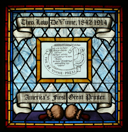
Stained Glass Window. Designed by J. François Kauffman in the 1920s to honor printers, de Vinne’s window said, "America’s first Great Printer."
The exhibition attempts through the inclusion of several more intimate objects, to get closer to De Vinne in a personal sense. There’s his leather desk chair, his velvet beret, various medals, awards and honorary degrees, a bronze bust, a snippet of his hair, and a stained-glass window (inexplicably unlit), celebrating “America’s First Great Printer,” commissioned by the American Type Founders Company. But the books are really all we need. De Vinne’s spirit is tangible in every set letter, just as his life and work were truly inseparable. His dogged pursuit of knowledge is evident in selections from his personal library, which contained over 6,000 items, and among eighty-seven books printed before 1501. Among these, Roberto Caracciolo’s Quadragesimale de Poenitentia, printed in 1472, inspired Renner, the second typeface designed by De Vinne. His continued passion for efficiency is manifest in the firm’s pocket-sized office manual. Printed on simple, brown paper, De Vinne stressed the importance of reputation and outlined his aversion to unions. Under the heading job composition, he writes what might have passed for his de facto motto, “As a rule, legibility is wanted oftener than ornament. Plain faces have more admirers than fancy letters.”
The latter half of the exhibition highlights De Vinne’s contributions as a writer, historian, and collector. One of my favorite pieces in this section was a large, wrinkled broadside listing De Vinne’s numerous writings. Compiled by De Vinne enthusiast Alexander Washington Collins, with many of the entries written by hand, Collins presented the work as a Christmas gift to De Vinne in 1910. De Vinne wrote extensively for the general public and the printing trade, though his greatest historical contribution argued that Gutenberg was the inventor of printing (because he invented the type mold), a fact which surprisingly didn’t gain acceptance for two decades. The exhibition is packed with these kinds of rich, historical details. Engaging background for those with or without a passion for the craft of printing, as long as you take the time to read the numerous panels of text.
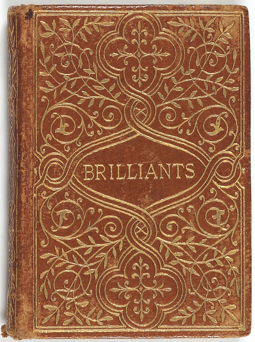
Brilliants: A Setting of Humorous Poetry in Brilliant Type, De Vinne Press, 1895. In the exhibition, this miniature is displayed next to the largest book De Vinne ever printed. A massive tome commissioned by jade collector Heber Reginald Bishop. Weighing in at 114 pounds, and measuring 25 x 19 inches, the book is described by the curators as "a librarian's nightmare."
Both lovers of fancy letters and those who prefer plain faces will be equally satisfied by this small, densely packed exhibition. “I have given the best part of my life to the making of books that have been sold and read, and are not rated as bits of typographical bric-a-brac,” said De Vinne while addressing the Yale College Club in 1901. One can only imagine in addition to his roles as beloved employer, craftsman, and master printer, he was a powerful orator as well.
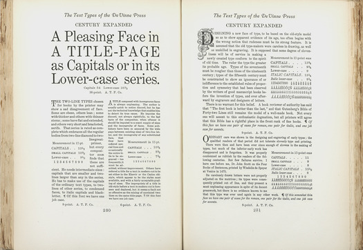
Types of the De Vinne Press: Specimens for Use of Compositors, Proofreaders, and Publishers, De Vinne Press, 1907. Image courtesy of the Grolier Club.
“The Dean of American Printers: Theodore Low De Vinne and The Art Preservative of All Arts,” is on view through April 26 at the Grolier Club, 47 E 60th St; (212) 838-6690, grolierclub.org. On Thursday, April 3, from 2:30-3:30 PM, Stan Nelson, a retired Graphic Arts Collection specialist at the National Museum of American History, will conduct a demonstration of typecasting.
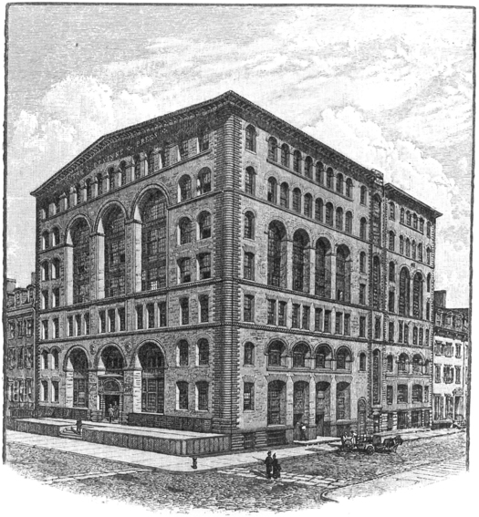
“The sanitary engineer illustrated series, The de Vinne Press building, new York. babb, Cook & willard, architects, new York.” Sanitary Engineer, v. 13, May 1886, page between 560 and 561


