Designing sets, costumes and props for Amazon’s mini series, The Man In The High Castle, is a dream assignment. World War II continues to be a gold mine for movie magicians, yet creating an alternative history that has one foot in that reality and the other in speculative fiction is a challenge for any designer looking for authenticity.

Set in the 1960s, Philip K. Dick’s original book proposes a scenario where after dropping an atomic bomb on Washington D.C., the Nazis and Imperial Japanese win the war on American soil and annex the East Coast and Middle America into the Greater German Reich while Japan establishes the Imperial Pacific States west of the Rockies. A neutral, economically depressed buffer zone separates these precarious Axis allies.
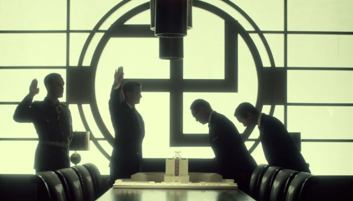
Imagining the nuanced look of this new order is not as easy as putting Nazi uniforms on actors. “The producers did not want to simply overlay superficial bits of German and Japanese culture onto scenes in New York and San Francisco,” wrote Jeremy Egner in “Red, Reich and Blue: Building the World of The Man in the High Castle," but instead sought to investigate how Axis tenets would look through a midcentury American filter.”
This meant inventing postwar environments, architecture, fashion, and graphic design that would not have benefited from America’s incredible postwar boom—an America without Modernism, and without many of those responsible for it. Swastikas and rising suns abound, but they are integrated into the fabric of American iconography and accepted by a citizenry resigned to serving or at least tolerating the foreign conquerers.
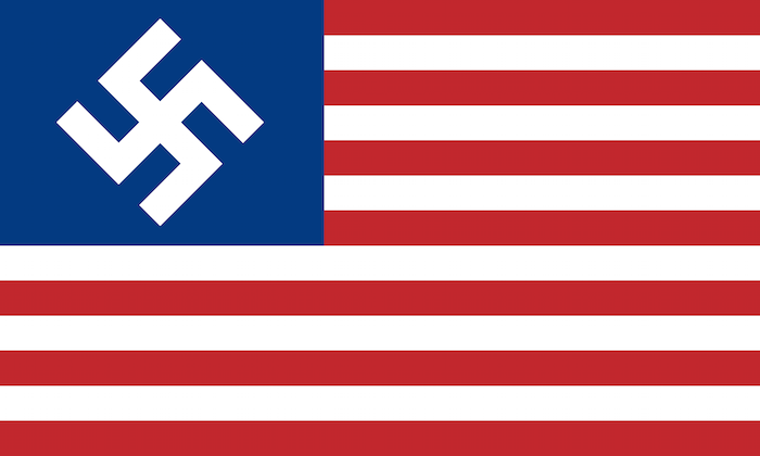
Instead of stars, the American flag has a white swastika dropped out of blue. In addition to the rising sun, red and blue stars and bars sully the pristine Japanese flag. Suggesting another of Dick’s dystopian novels, Blade Runner, San Francisco (the capital of the Emperor’s spoils) is bathed in Japanese graphics. In the Greater Nazi Reich, the telephone company logo shows a phone receiver blocking out a portion of the swastika, license plates are branded accordingly, and the ubiquitous armbands on police, soldiers, and functionaries distinguish American Nazis from German-natives by the addition of red and white stripes.

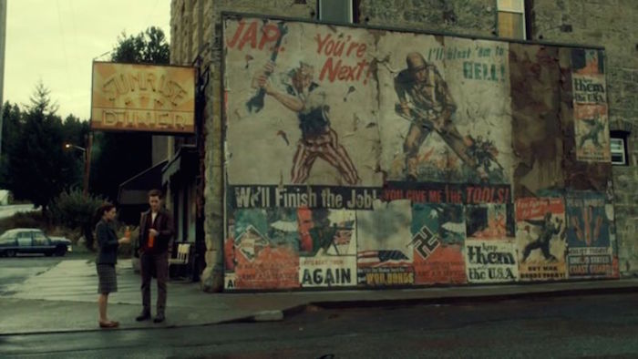
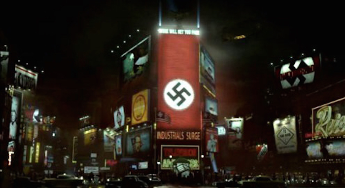
The sets could not look like a parody, so certain impulses were rejected. For example, Egner notes, “Early production art for the Times Square sequence included billboards for beer and sausages, but [showrunner Frank] Spotnitz had them changed to signs promoting the value of work and duty.” Even the SS uniforms included small details in insignia that subtly distinguished the brutal investigative branch from the even more venal SD (or security branch), which are vying with each other for power. Over in the neutral zone, US armed forces recruitment posters and other victory propaganda that were presumably hung prior to the ignominious defeat are fading, in tatters—and look incredibly real because, in fact, they are.
Since the ten episodes have labyrinthine plot turns, that last thing the viewer needs is to be distracted by visual anachronisms. The series’ production design (realized by a team that includes Alan Kobayashi, an alum of the Star Trek movies; Linda King, who worked on Jurassic World; and Neil Westlake, who workd on the Vampire Diaries) is so well curated, I was admiringly distracted by the flawless graphic design and inventive art direction, which is both haunting and seductive—and you might say, dangerously chic.
