06.03.16
Michael Bierut | Essays

Seymour, An Introduction

Design Observer is lucky to call Seymour Chwast a friend and colleague. His much imitated, but never matched, style and talents have rightfully earned him a place in the design canon. He has used his art to battle war since 1957. His new antiwar book features 70 pages of original illustrations. 

Here's Michael Bierut's introduction to Seymour, originally posted May 30, 2009.


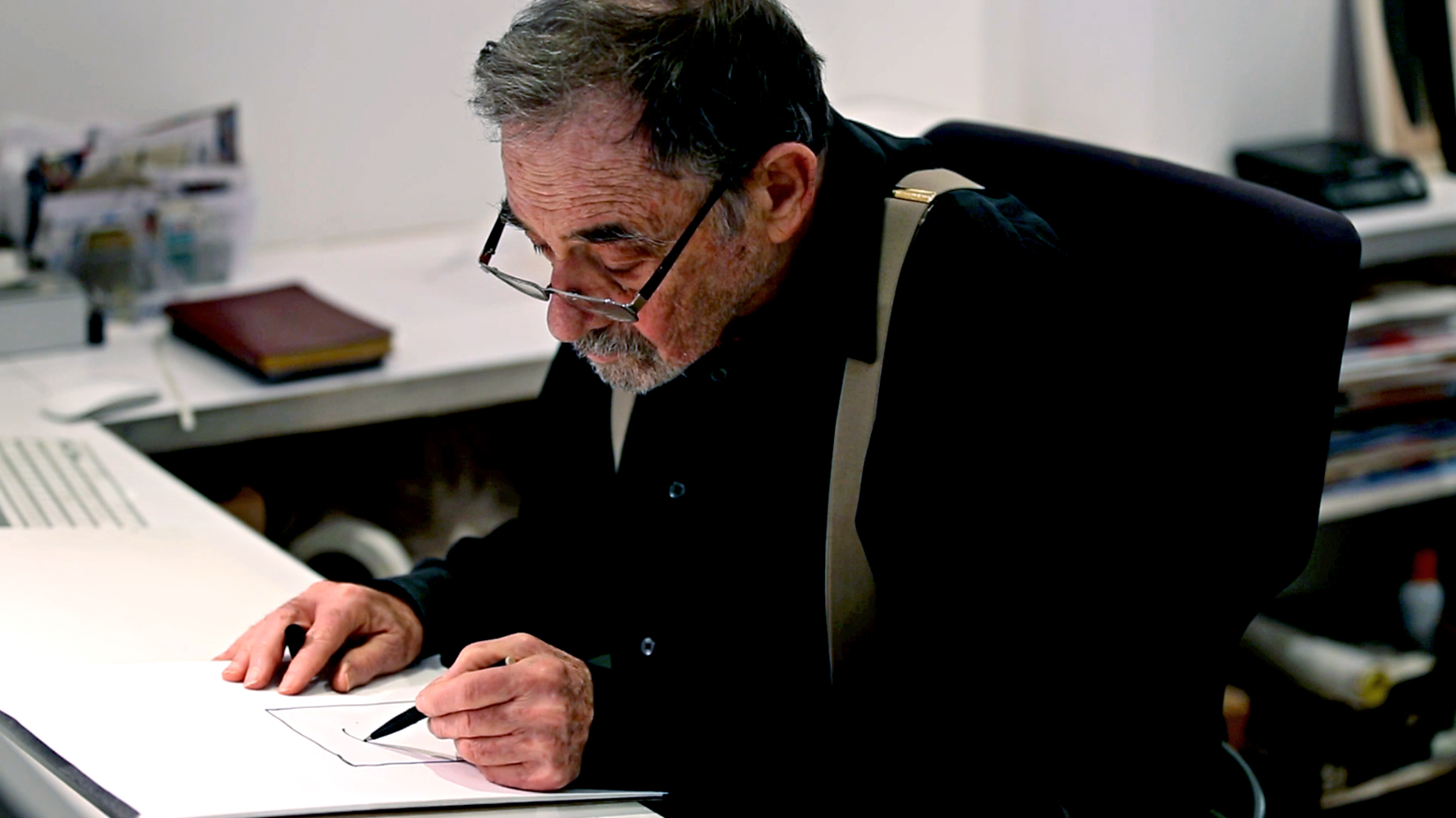
Video still from “Seymour Chwast at War with War” Kickstarter video, by Christian Svanes Kolding..

In a world of design consultants, information architects, and experience planners, Seymour Chwast is something refreshingly old-fashioned: a commercial artist. If this is a term that has fallen into disrepute, Seymour is the best argument for reviving it. He gets up early every day, arriving in his studio by 7:30am. For the next ten or eleven hours, as far as I can tell, he doesn't seem to talk on the phone about design strategy, or plan presentations, or cold call potential clients, or negotiate fees. Instead, he just draws and paints, and paints and draws. Sometimes he has to do it because he's working on an assignment. But, as his wife of 25 years, Paula Scher, observes in her introduction to his published monograph Seymour, "If there is a day that he doesn't have any drawings to make, he comes up with ideas for things that will demand he make more drawings anyway."

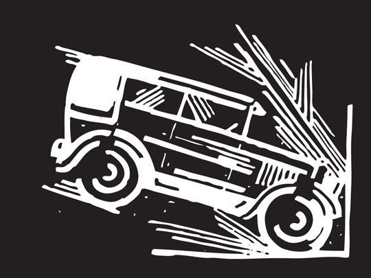
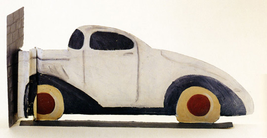
This prodigious output dates from 1948, when he entered the Cooper Union, and accelerated when he founded Push Pin Studios six years later with two fellow Cooper Students named Edward Sorel and Milton Glaser. His colleagues moved on; Seymour runs Push Pin to this day. This kind of relentlessness requires more than dedication. There is a good reason why his book is subtitled The Obsessive Images of Seymour Chwast. Seymour's obsessions over the past six decades have included hands, shoes, monkeys, Mexican wrestlers, and — my favorite — cars:

Seymour Chwast: Used Cars

A site like Design Observer is filled with words, words, words. We like to talk about design, and that talk contributes to an ever expanding global conversation that continues in other blogs and in all matter of social media. But while so many of us are talking, someone has to actually keep on doing the work. Seymour Chwast is one of the best of those someones.


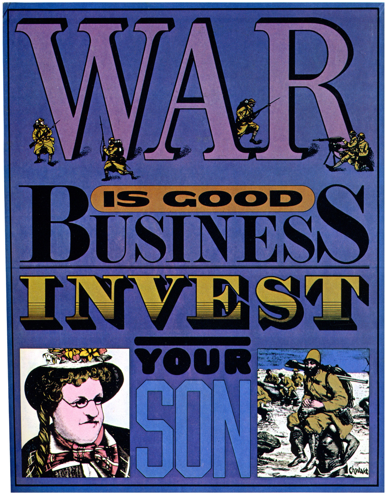
War is Good Business, Invest Your Son,” poster by Seymour Chwast, 1968


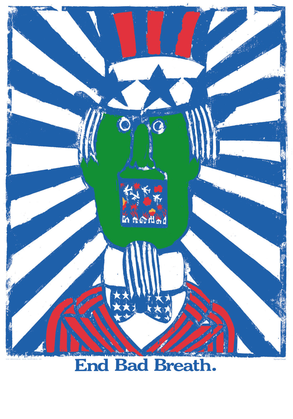
End Bad Breath,” poster by Seymour Chwast, 1968


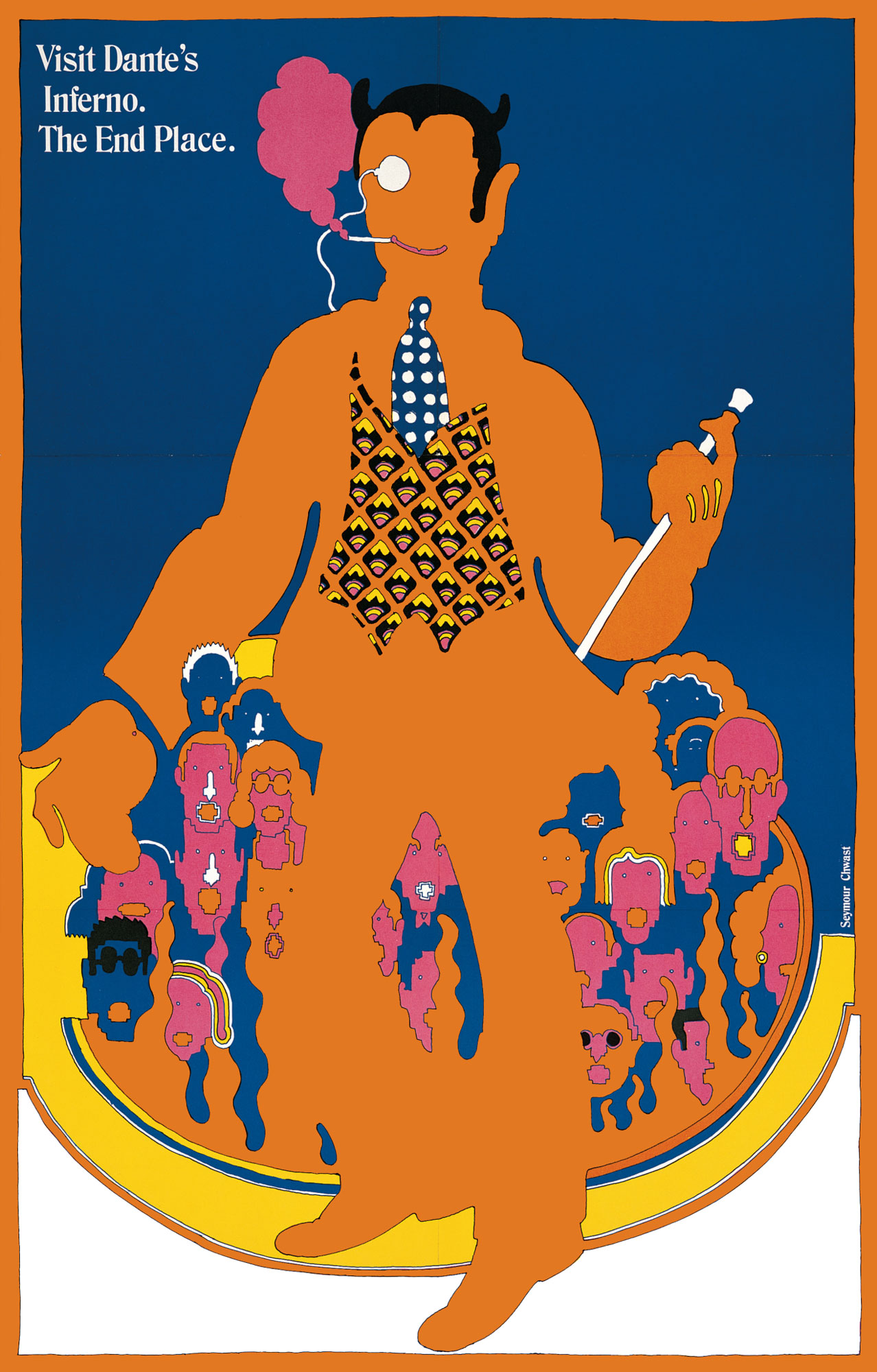
Visit Dante’s Inferno,” poster by Seymour Chwast, 1967. Featured in 2014 episode of TV’s “Mad Men”


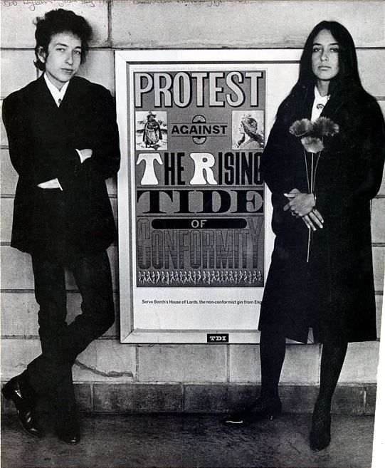
Bob Dylan and Joan Baez flanking a Seymour Chwast poster, 1964. Photo: Courtesy SVA Picture Collection.

For more of Seymour's work, check out his archives.

Posted in: Illustration


Comments [68]

dated work that wasn't good in the first place.
seynomour
06.15.09
11:00

Great post, MB.
zachary sachs
06.15.09
11:36

My favorite Chwast pieces were always the socially conscious ones like End Bad Breath (1967) and War is Good For Business, Invest Your Son (1964). That was art with a point, taking a side when it was dangerous to do so, and it came from a major design studio, with mainstream clients who might be offended.
Tobias Schmidt
06.15.09
11:36

"dated work that wasn't good in the first place."

Anonymity breeds cowards - and ignorance.
Steve Heller
06.15.09
11:42

Steve, I'll be the first one to poo-poo anonymous comments, and they are the bane of most of us bloggers' existence, but for the most part those anonymous comments represent an opposing opinion of that of the majority. That does not make them ignorant opinions. It's simply different than yours. And it's simply more infuriating that you don't know who's behind the comments. But so what if someone thinks Seymour's work looks dated? That is not ignorance, it's simply a matter of taste. It would have been nice to see anonymous boy/girl expand on why Seymour's work looks dated, but that won't happen.

And if you think about it, with all of the (period) stylistic reinterpretation of Seymour's work, it actually LOOKS dated. Dated in a "Isn't that Ettore Sottsass car funny? Remember that?" kind of way. And I enjoy it. Others might not. But that's not ignorance.
Armin
06.15.09
12:05

Armin
Give me a break. Sure, its just an opinion. But if the opinion had substance (i.e. an argument) then it would have more weight. Just because someone has an alternative opinion and spent half a minute writing it on a blog does not mean it should be given credence. Even if the comment was signed, I'd argue that its sentiment is based entirely vapidity and vaucousness. Disagree til your heart's content, but don't shovel crap on a respected person with a few poorly crafted syllables and believe it was the right or good thing to do.
Steve Heller
06.15.09
12:22

> substance (i.e. an argument)

That is so 2004. This is the New Communication. It is what it is and it's here to stay.
Armin
06.15.09
12:32

Armin,

>This is the New Communication. It is what it is and it's here to stay.

The only way I can stomach your comment is as irony.
Steve Heller
06.15.09
12:47

To link Jessica's recent DO posting to students looking to navigate the opportunities of their education and their times to this lovely tribute to Seymour, I am reminded that whether you are an "official" student or a student of the professional life – passion and curiosity combined with focus are the enduring factors that allow endurance. Chwast is case in point and has been since my dad, a "commercial artist," turned me on to Push Pin in the 60s, through my mid-70s student days, as a professional in the 80s, in school again in the 90s and today. Almost worth the trip to NY from LA.
Louise Sandhaus
06.15.09
01:25

> substance (i.e. an argument)

That is so 2004. This is the New Communication. It is what it is and it's here to stay.

Wow, this is one of the new generation of design commentators?

Clearly quite a thinker.
Immaterial
06.15.09
01:59

On this whole revival of the term, "commercial art"; I'm not so sure that's the case. Mr. Chwast seems like he would be categorized as an illustrator to me. At least in 2009. Of course, any category can be open for interpretation.
Whaleroot
06.15.09
02:28

I love this site
Ryyoamog
06.15.09
05:01

"the most part those anonymous comments represent an opposing opinion of that of the majority."

That's sort of nonsense.

I'm all for questioning the oft-lauded, but the real problem with Armin's argument is that we're supposed to equate the undigested "opinion" of someone who is too cowardly to sign their name with Steve Heller's thoughts. I think the collapse of expertise is overrated.

I don't myself have particularly strong feelings about Chwast, but I would be interested in a pass at a little analysis or better, examples from anonymous of similar and more compelling commercial artists so we have a sense of his/her priorities/taste.

I think it's fair for the editors of Design Observer to want to engage more directly (and with people who can at least pretend a little depth). Maybe this blog should require valid email addresses.
Peter
06.15.09
05:29

Remember everybody, say it with a hard 'ch' ('kwast').
Ralphy
06.15.09
06:33

God I love this site. Finally a group that is engaged, for longer than TV banners, and engaging as well. I am just an architect, so my graphic design knowledge is self taught, but I'm thrilled at the high level of commitment, intelligence, joy and precision shown by this profession on this site.

seynomour really sees no more...

Armin, there is no "New Communication", only new vehicles.
andres
06.15.09
11:06

Apart from advertising the lecture, the lasting message I get from this post is that Chwast paints or draws all of the time. There's no attempt to question the conventional view that holds Chwast in the uppermost pantheon of illustrators. The post isn't asking whether Chwast's work is actually any good!

So, I think it is a little bit funny that the very first comment (cowardly, offhand and obviously ill-intentioned though it may be) impugns the quality of Chwast's work.

Even funnier that this comment has gotten up the dander of the illustrious Steve Heller. Of course, there is no need to attempt to set anonymous straight about the quality of Chwast's work. Better to first dismiss the comment simply because it is anonymous. Even better to further dismiss the comment as vapid, vacuous, ignorant.

I've often wondered how Chwast got in the rarefied company of The Great Illustrators. As such, I'm not entirely unsympathetic to anonymous' terse comment. I just don't get the reason for Chwast's fame. It certainly mustn't be due to the work I've seen, surely cannot be due to the work in the slideshow Beirut offers.

Beirut's post helps me out a bit. Now I think Chwast's fame must simply be because he draws and paints all of the time. He simply keeps trying on one idea and/or style after another after another after another. Thanks to the shear volume of this output, there must be something for everyone. That's got to be it! If there's more to it than that, I'd sure like someone to explain it to me. Steve?
Rob Henning
06.15.09
11:43

Dear Rob,
Buy the book.
Best,
Paula
Paula Scher
06.16.09
07:02

One more note on the subject and then I'll leave it alone because, above all, I would prefer to be in NY to see all the Seymour events than type in a comment box...

> Wow, this is one of the new generation of design commentators? Clearly quite a thinker.

Since it seems all needs to be spelled out nowadays:

That is so 2004. = Back in those early years of blogging, both us at Speak Up and here at Design Observer all strived for considerate commenting and encouraged our readers appropriately. And it worked. Thousands of troll and lame comments later I think we all just got accustomed to a certain brevity in comments. Few people still have the energy or interest in going on long rants in their comments, as they did back in 2004. So, yes, it is so 2004.

This is the New Communication. = Twitter, Facebook, Tumblr, text messages, etc. Short and sweet. It's the new acceptable form of communication. It's not a prophecy or some attempt at sounding cool. It's exactly that, a new way of communicating. In this case, someone does not like Seymour's work and used less than a 100 characters to say so. Just like Paula just used less than 30. The only difference is most of us agree with her but not with the original poster.

> The only way I can stomach your comment is as irony.


Let's say it's irony mixed with reality. Goes down well with Pepto-Bismol afterwards.
Armin
06.16.09
08:49

Thanks Paula, for the invitation to add to your royalties! Would it be okay if I first browse the book at my local Borders to see if it is worth both the money and the coveted space on my bookshelf?
Rob Henning
06.16.09
10:43

There seems to be more of an interest in talking about a comment (negative or positive is no matter) regarding this "dated" "artist", which may prove or disprove a point. ..that this anonymous "Seynomour" character may be spot on, unless of course you happen to disagree (or have a book to shill).

Words, only words, the strongest weapon of the Sophists.
Michael Montanez
06.16.09
11:18

Though I had the good fortune to work with Seymour on this book, I did not bring it to Chronicle, so you'll have to query Alan Rapp on why he acquired it. That said, I find Seymour's work to be important because for 50+ years, it has been consistently GOOD. Not always new, or stylistically groundbreaking, but witty, visually compelling, and in keeping with the challenge he set for himself or the client provided to him. Very few designers, illustrators or commercial artists have that kind of legacy and continue to produce good work. Seymour does.
Michelle Dunn Marsh
06.16.09
04:50

Rob said:

If there's more to it than that, I'd sure like someone to explain it to me.

Rob, in an effort to articulate some of what makes Seymour so brilliant to those that might not be fully aware of his large body of work, I started googling around to see what other people have written about him and found an article from The Art Directors Hall of Fame. The entire piece is worth reading, but for those that like smaller snippets, I think this paragraph is pretty accurate:

Jerome Snyder in an article in Graphis wrote:

"Chwast is fundamentally a humorist. His humor is dry, ironic, only rarely sardonic. The play on images is witty, not flamboyant, taking off on human foibles or meanness in a seemingly deadpan banality that is, despite its first-glance ingenuousness, rich in veins of sophistication and subtlety." To disclaim the idea that humor is a serious business misses the fundamental fact that all comedy has its roots in basic incongruity. A deep awareness of life's anomalies detracts not a whit from the widely accepted belief that Chwast is one of the most influential artists of this century and that he has created a style that is synonymous with the most creative and progressive aspects of graphic art and design. Clearly, there is much more to the man than his sometimes amused and bemused view of the world."

Hope this helps.
debbie millman
06.16.09
05:08

Not being in the book business anymore, I sincerely wish any of the titles I had acquired enjoyed this much debate. The integrity of Seymour's work doesn't seem to be the main controversy here, though I'd be curious to see substantive aspects of this discussion extend to the Q+A session tonight.
On a sidenote, I find the notion that Paula would defend Seymour's work for the "royalties" hilarious.
Alan Rapp
06.16.09
05:52

I also worked on the book, and through the project I gained a great appreciation for Seymour's humor and his work. My favorite spread is the opener for Fab Fashion, pages 130-131. Take a look at your local Borders, Rob. You may crack a smile.

Wish I could come to the event tonight.

Brooke Johnson
06.16.09
06:10

On a sidenote, I find the notion that Paula would defend Seymour's work for the "royalties" hilarious.

Thanks Alan. It was meant to be funny, but I didn't expect it to rise the level of hilarity.
Rob Henning
06.16.09
07:58

Congratulations on your book Mr Chwast, an honor well deserved.

That said, I must admit this post reeks of nepotism. I think Design Observer and Mr Chwast would have been better served if someone not associated with Pentagram posted this.

(It also doesn't help when all the contributors to the book chime in on how great the subject is.)
Adrian
06.17.09
12:12

In viewing the Chwast slide show, I was touched by the exquisite interpretation of automotive forms. They embody an extraordinary balance of primitive, almost child-like freshness, a sophisticated color palette, and, of course, skilled drawing. Together they capture an essence of "automotiveness" in much the same way that Sol Steinberg expressed prostitutes and urban culture - through the exaggerated line. It is always mysterious how such a personal statement can yield a universal understanding. The only things dated, were the models of cars that were used. The original vision and imagination are qualities that have endured throughout history and will continue to enrich us, if we are open to such visual insights.
Peter Good
06.17.09
10:59

If everyone here had seen the animations that Seymour showed last night at SVA, I doubt anyone would be debating his merit. I would love to see that Hewlett Packard advertisement just one more time...
Sue Apfelbaum
06.17.09
11:03

there is an artist who looks "dated" as well, but whose work is quite great (unlike chwast, pushpin, glaser and the other has-beens)- gahan wilson, of whom there will be a 3 book collection from fantagraphics coming later on this year. you see what i am talking about when i say "dated," yes? that kind of graphic style which is from a certain time period, that was popular during a certain era, and which was no longer common currency once the 80s rolled in. etc etc. end of thesis.
Michael Montanez
06.17.09
11:11

Despite the rudeness of the first comment, I think it's worth explaining what makes Seymour's work so enduring and so great.

On a historical level, Seymour, with Glaser, were the first illustrators since the 1920s to look at youth culture and respond to it in their work. This made the practice of commercial image-making relevant again after a long fallow period where it was relegated to fogey-dom. They were among the first illustrators in North America to act as their own art directors and designers. Seymour is as adept with type as he is with images, and his work always made the two (type and image) inseparable. With Steinberg and Glaser, Seymour lead the way with "conceptual" illustration -- making multi-layered drawings about complex ideas, rather than only rendering a photo-realist or impressionist scene.

Seymour also acted as a visual culture historian both through his own appropriation of out-of-fashion styles and exploration of them in the Push Pin Graphic. Moreover, he remains a virtual (and, back in the large studio days, actual) mentor to generations of artists simply by exemplifying the designer/illustrator-as-educated-archivist/historian. His omnivorous visual literacy should remain an example, especially these days.

As to the work itself: It's not about the quantity of it (though that is very impressive), it's the quality. Throughout his career Seymour has approached the task of illustration as a problem solving exercise. That is, given the problem, of, say, making a poster for Doug Henning that needed to: communicate information about the event, be a striking image, and entertain a viewer, he nimbly combined Victorian-style type (riffing on magic posters of old) with a clever visual pun on Henning's own celebrity (enormous, upside down, underwater) and, of course, the topic at hand: Henning's execution of the Houdini Water Torture Escape. Look at his unforgettable "End Bad Breath" Vietnam protest poster. Using the language of German woodcuts to render Uncle Sam as a monstrous speaker/breather/vomiter of war. And then the punchline. Subtle, funny, sad and, oh yeah, visually striking. There are thousands more images like this: complex, intelligent treatment of ideas. And he has never flagged.

Oh yes, and his line work is always exciting -- an instantly recognizable precise line that delineates broad cartoon forms with verve and humor. How can a line be "funny"? Well, look at Steinberg. It's a certain gesture that communicates volumes. There's a velocity and flourish there that captures a form without rendering it static. It instead brings it to laughing life. Finally, I have to confess that, at the ripe old age of 32, his work doesn't look dated to me at all. Maybe that makes me a young fogey. I doubt it though. Rather, it's as timeless as any good work in design, illustration, music, etc. etc. It remains a beacon of intelligence, wit, and dignity.

I can understand wanting to take a shot at a canonical figure. But if you're gonna do it, know and understand the work first. I'm sure there are various holes in my argument just waiting for the internet goblins to jump in, but I saw this thread and though, "gee, why DO I love Seymour's work so much?" So there you go. For whatever it's worth.


Dan Nadel
06.17.09
12:58

I'd like to see the animations Sue Apflebaum mentions. Does anyone know if they can be found on line? I've not been successful in finding them.
Rob Henning
06.17.09
01:31

I want to thank Dan Nadel for his response, it's a pretty concise description of what makes Chwast's work so notable. And I want to add one thing that has been bothering me as I've been reading the previous responses: I'm not so sure that younger viewers "get" that the "dated"-ness of Chwast's imagery was deliberate. His use of eclectic historical styles was often used as a way to convey irony at a moment - at least when Push Pin began - when modernist photography and rather cool visual styles were predominant (along with more literal illustration). So Chwast use of the antique was provocative, and often helped make the point of the idea in the work, at least through making a strong visual counterpoint to the mainstream graphic styles predominant in New York publishing during that time. (He was not the only one to do "dated" for ironic or disobedient affect: you see it in a lot of anti-war and counter-culture graphics of the 60s as well). But that use of the eclectic is no doubt harder to "see" in the visual environment that we exist in today where all sorts of styles co-exist more as nods to one micro-market or another.

Lorraine Wild
06.17.09
01:59

Regarding nepotism...this was discussed a lot in the 90s when design writing really grew into its own. Because we don't have a whole lot of people who are by profession "graphic design writers" or "writers about design," we're currently living with "designers who write" (for a lot of reasons). They are bound to run into places where they have to critically assess their colleagues/heroes/acquaintances. You can debate whether thats unethical (or if its even possible to be objective as a critic), but I believe/hope the editors of DO would know when its nepotism and when its just honest writing (even if subjective). I would claim nepotism or some profit-making motive if every review or discussion around books on DO were positive, but thats hardly the case (see previous posts on Mevis & Van Deursen or the more recent Design History book).
Derrick Schultz
06.17.09
02:48

Very well said Peter. Bravo!
Jack
06.17.09
03:03

In the 1960s Chwast's work may have appeared dated to earlier times because he intentionally appropriated styles from those times.

Today, much of his work appears dated to the 1960s. We associate the 1960s with counterculture designers appropriating historical imagery (e.g. victorian, art nouveau, etc.) for things like anti war posters. So, when we see that device employed again, we think 1960s. At least I do. I'm 49, so don't think I am one of Lorraine's "younger" viewers. I suppose Chwast was (is?) one of the leading and first practitioners of this appropriating historical styles device, but his use of this device still dates his work. I think that's why people use the term "dated" in a pejorative way to critique Chwast's work. They might as well say: "It's so 1960s". I'd be alarmed if any "younger" viewers think Chwast's work is from the 1890s!

By the way, I happen to have great affection for some 1960s imagery and I don't think "dated" is a bad thing necessarily. (Although I am sure those who used that term here meant it to be negative). Much of the work of most of our most beloved design heros is very clearly dated--that is, identified strongly with a particular era. So are an awful lot of art, architecture and writing. I don't for a second believe there is even such a thing as "timeless" work.

Apart from Paula Scher's, most of the comments in defense of Chwasts' work have been really informative, interesting, enlightening, and enjoyable.
Rob Henning
06.17.09
03:16

I was in a bookstore here in Toronto a couple days ago and two books placed next to each other were Chwast and Basquiat, and it got me thinking. I tend to gravitate to the Basquiat work, perhaps if only because it is more familiar to me. However, both Chwast and Basquiat exhibit similar tenets, if only to different degrees.

Perhaps is the age of PostScript font technology (perfect, infinitely repeatable imaging), there is something nostalgically reassuring in the utter crudeness of Basquiat (and by extension, the work of Ed Fella, Mike Perry and the whole re-investment in hand-rendered technique). To that effect, it recalls the transformation painting underwent when photography made its appearance and freed the painted image from its adherence to verisimilitude, i.e. faithfulness to realistic representation presaged by the work of Cezanne and explored by Renoir, Manet, Monet and so on.

Chwast is a consummate draftsman, and while his work generally predates the use of the personal computer, a large body of it does coincide with the use of phototypesetting. Phototype wasn't a high point for type technology, but it was a substantial change in the way type was used. I draw these conclusions not because there was a conscious effort to react to technological development in some sort of William Morris anti-technology effort, but to perhaps throw out there that Chwast's work is part of something bigger. The fascination today's generation may have for the work of Perry, Damien Correll, Marian Bantjes, and others, is not so different than the fascination a previous generation has with that of Chwast. Chwast just did it earlier.
David Cabianca
06.17.09
03:39

This dated argument is, dare I say, a bit old. But since it has been raised let's address it further.

First, why is dated a pejorative? Isn't everything ultimately dated? All art - good and bad, applied and fine - comes with a date attached. Style is the marker of time and place. Some artists are of their times, others define their times, and still others somehow transcend their times.

Chwast has been working steadily since the mid-1950s a period marked by abstract expressionism on the one hand and romantic representationalism on the other. Art history celebrates the former as avant garde and critiques the latter as rear garde, but both represent a time and attitude. Chwast and his Push Pin colleagues both reacted to and pushed the existing verities of art and design. I like to say he was proto-postmodern in the reprise and reinterpretation of historical form, which influenced many during the 60s and 70s.

But the thing that separates Chwast from mere stylists (and frankly, there is nothing wrong with mere stylists) is an incredible ability to regularly reinvent himself by expanding his visual vocabulary.

One might argue that Chwast has too many styles - which he does - but if you look at his work you'll see style is the means not the end product. It is a method of conveying a variety of ideas - social, political, comic, satiric. His work can be the purest form of entertainment or the most serious form of commentary. He is equally adept at editorial illustration, children's picture books, comic strips, and visual essay.

Dated? There are so many illustrators and designers (and painters and sculptors) working today who have borrowed - knowingly or not - from Seymour's tool kit.

For some people their concept of history is only a decade or two. Often the originators or formgivers are forgotten while the imitators are celebrated as originals.

Dated? Yes, Chwast uses historical inspirations. In fact, if you really know your precedents you might be able to find them in certain pieces. But Chwast does so much more than copy. His vocabulary is an amalgam, but in the end its his own invention. The majority of designers don't invent at all. And the remarkable thing is that for over fifty years he is still at it.

So to those who use "dated" as a term to diminish his achievements, just look at those artists and designers who threw in the towel when they had nothing left to offer. Or better yet, those who continually repeat themselves without adding anything new to the "conversation."

Steve Heller
06.17.09
04:12

Rob,

While my comment sounded flip, I do mean what I said. If you go to a book store and pick up a copy of the book and look through it, the book will tell you more about why Seymour's work is terrific and important than any description here.

About 50% of the book has never been reproduced anywhere. The work is organized as obsessions, not as "jobs", and gives you an opportunity to understand the man as an enduring artist, not just another famous design icon. I would think that the experience of actually really looking at the work would ultimately be more inspiring and edifying than a hundred positive posts describing why it's so good.

If you like the book, and decide to buy it, in a gesture of friendship I would be glad to mail you a check for 29 cents, which I think may be close to Seymour's royalty.

paula scher
06.17.09
04:37

Rob Henning: speaking as someone who now teaches design history to persons born after 1989, all I can tell you is that the concept of "dated" generally has to be explained. You can't take it for granted that everyone can read images in their correct historical context, even from work you may think of as part of our "canon." Talk to some 20 year old design students and see what I mean.
And as far as Paula Scher's offer of 29 cents based on royalties from the first printing?....Wow, Chwast must have had a killer agent!
Lorraine Wild
06.17.09
04:51

Paula, I actually thought the royalties were probably only something like 2.9 cents per book. Now that I know they are ten times that amount, well, that changes everything! I do appreciate the kind spirit of your offer, but I'd never ask you to run at a loss by purchasing a stamp to fulfill it. I do really look forward to having a look at the book, and will now go out of my way to do so--maybe even buy it.
Rob Henning
06.17.09
10:00

No, "dated" doesn't have to be pejorative. But most of the time it is. Context is everything. And when dated is used that pejorative context people are really saying something like: "Yeah I know that was done just today, but it looks like it was done in 1960. And I really only value work that looks current. So this 1960s-looking stuff is crap."

I don't think many people use dated to mean: "Yeah, it's really cool that he used historical inspirations to evoke a certain era in his work." Steve, you can try to redefine "dated" to mean this, but I don't think it's going to fly.

And Lorraine's students born after 1989 who don't know art deco from art nouveau from de stijl? Well, they can still say something looks dated if it looks like one of those styles, simply because they somehow know it looks like it wasn't just done today. Sadly, they may not have a clue what exactly era it borrows from, or why. "Dated" ends up being a great shorthand pejorative to express dislike--even though it may be really lazy to use it.

Whenever my wife and I go shopping for our house, if I point out something I like, but she dislikes, she'll often say "that's really 1970s." I understand this to be a whole wealth of criticism wrapped up in a very concise phrase. She's telling me it looks dated, for many reasons (e.g. nothing good was ever produced in 1970), but not in a good way. We don't buy that item.
Rob Henning
06.17.09
10:50

Younger students, generally, with a little bit of design history, can recognize the broad historical styles easily, but when you are dealing with the use of self-conscious quotationby graphic designers as you start to do in the 60s, the intention of the stylistic quotation, and how it functions, is not necessarily as easy to discern as what style is being used. So the students I'm talking about do have a clue as to what is being quoted, but why is more elusive. There's a level of intention can be discussed with Neo-anything, rather than written off with a slippery term that can be thrown at objects or, obviously, the entire output of a someone's career.
Lorraine Wild
06.18.09
01:28

Lorraine, I should have written something like: "students who have not yet learned to distinguish between different historical styles." Because I imagine they do learn from your teaching.
Rob Henning
06.18.09
10:12

Like Tibor Kalman, I appreciate Seymour Chwast less for his work and more for the people who stumbled on after them (ie: Scott Stowell, Christoph Niemann). What's funny about this "dated" book hides within it's cover; Seymour hasn't smoked in ages! Therein lies another irony for our elder design statesmen.
felix sockwell
06.18.09
12:50

if only the AIGA conversation between Steve and Seymour had been this interesting and substantive.
yes, I would like to remain anonymous if only because I respect Steve, Seymour, and the AIGA. But the event was bad. A little more planning next time would be good.
06.19.09
01:03

Very entertaining, some great comments, nice flow - haven't enjoyed a post like this for ages - thanks seynomour. I'm no great fan myself but won't go into to that - respect! Indeed, would have been great to have had a comment from the old man himself. Will look out for the book...
Derek Stewart
06.19.09
08:00

Mr. Stewart, Michael Bierut said it best: "A site like Design Observer is filled with words, words, words. We like to talk about design.... But while so many of us are talking, someone has to actually keep on doing the work. Seymour Chwast is one of the best of those someones."

When AIGA/NY posts the video you'll be able to hear and see "the old man himself."

And to "yes, I would like to remain anonymous..." whatever your opinion, anonymity diminishes its credibility. But I guess that's the "new communications."
Steve
06.19.09
08:27

Is it me or do the most contentious—and interesting—threads arise from the most seemingly innocuous posts (while the deliberate provocations fall flat)? Who could question the primacy of Seymour Chwast? (Or Paul Rand? Or Sagmeister? et al.) Overall, this discussions really illustrates the conflict design has about having a literature. Michael's post was bemusing as it almost lapsed into self-loathing about writing. For a major design forum to admit "we all really should be working" is a bit disheartening. What was also on display was the primary validation that's continued to be offered for renown, the "self-evident." Paula Scher initial comment was the most succinct expression of this. Is Chwast any good? Just read the book. Any questions? No! This concept is going down hard but it was encouraging to read a number of people articulating how the "self-evident" is an aspect of taste, time and context. And reputations are built on more than raw talent: there's circumstance, fortune, geography, clientele, familial and academic connections, and relentless (self) promotion. All of which should increase appreciation for someone's achievement. Too bad it often has to be "he's just a virtuoso!" or nothing.
Kenneth FitzGerald
06.19.09
08:31

The "Steve" post is mine. I agree with Kenneth:

"And reputations are built on more than raw talent: there's circumstance, fortune, geography, clientele, familial and academic connections, and relentless (self) promotion. All of which should increase appreciation for someone's achievement. Too bad it often has to be "he's just a virtuoso!" or nothing."

But happily, most graphic designers earn their reputations (and they can be bad reputations) from the quality of their work - whatever it may be. If a chord is touched a reputation can be made.

Conversely, what is made can be torn down. And those with "reputations" are the inevitable targets.

An interesting essay at reputation is currently posted on AIGA VOICE: http://www.aiga.org/content.cfm/wheres-the-finish-line-examining-success-in-design#authorbio
Steve Heller
06.19.09
08:39

It is possible to respect and admire someone for their achievements, work ethic, success, reputation, etc., but still not see the "self evident" when looking at that person's work?
Rob Henning
06.19.09
10:17

Calling Chwast's work "dated" is especially absurd in the climate of graphic and commercial art that is gaining prevalence these days among newer illustrators.

Has anyone noticed that young artists and designers are practically raising the likes of Jim Flora, M. Sasek and Ben Shahn from the dead? I'm having a Twilight Zone moment day after day with feeling that the 50s are back and sometimes the imagery is much more than derivative. It's downright theft. It's one thing to celebrate the past; I do it all the time in my own work. It is purely another to rip it off.

I have always love Chwast's work because it is, to my eye, distinctly his. In an era of borrowing that boggles the mind, keeping true to one's own aesthetic is something to be both admired and celebrated.

I'll be buying the book for sure.

06.19.09
07:53

>It is possible to respect and admire someone for their achievements, work ethic, success, reputation, etc., but still not see the "self evident" when looking at that person's work?<

I say Yes, if you believe personal taste and critical evaluation can work independently. Primarily, the "self evident" is subjective not absolute. And as it's usually expressed, it encompasses both an evaluation on the quality of the work and the artist's reputation. These are two separate but related concerns that are always mushed together but must be considered apart.

I think that there are artists whose work doesn't personally speak to you but you recognize that its context made it important...and that your personal taste isn't universal (or should be). I also think there are figures whose renown is outsized of their talents (due to a function of the zeitgeist, shrewd promotion, the echo chamber that design tends to be with a few people possessed of gold-plated megaphones), and the inverse.
Kenneth FitzGerald
06.20.09
11:16

As hard as I have looked, I just can't seem to find any of Rob Henning's work anywhere.

As both a practicing designer and as a teacher, I find it utterly hilarious that ANYONE could question the importance of Seymour's work. Seymour has more wit, intelligence and talent than 99% of the folks out there.

As for Armin's comment "This is the New Communication. It is what it is and it's here to stay..." perhaps that is part of the reason people are so GODDAMN STUPID.

It is also the reason we race forward, blindly, to embrace to the "new" and forget what we can learn from the past.

Eric Baker
Eric Baker
06.20.09
02:56

As hard as I have looked, I just can't seem to find any of Rob Henning's work anywhere.

Eric, I don't think a good portfolio, or any portfolio, should be a prerequisite for having an opinion about design.

After that initial unenlightening and anonymous comment, this thread has actually raised a lot of interesting issues. Maybe Rob doesn't "get" Chwast's work, but his comments have contributed to a larger debate, and he's as qualified to post them here as anyone.
Michael Bierut
06.20.09
04:10

"The Left-Handed Designer" was an important influence for me; I still have my old, tattered copy. I feel a kinship for Chwast's sense of humor, and yes, for his illustrations and designs. As far as his work being dated, one might say that he happily borrowed from the past and in so doing helped provoke the current interest in using older forms in contemporary work, what is presently known as "retro" styling—retro as in "retrospective," or, "looking backward to inform what comes next."

Seymour Chwast was not the first to pay homage to his antecedents, and he won't be the last. His smart, witty work suggests a reverence for the historical-as-hysterical. I my opinion, his status as an honored elder-statesman in the field is set. I'm glad to hear that he's still busy cooking!

Patsy Monteleone
06.20.09
04:20


I can't wait for the Paul Davis post!
An0n
06.20.09
06:15

Michael Beirut:

Thanks very much for your kind and thoughtful reply to Eric Baker's comment. I very much enjoy the opportunity for dialogue which Design Observer provides. It's an interesting, informative, and stimulating process which both provides the chance to express opinions/ideas and refine them based on the comments of others.
Rob Henning
06.20.09
09:14

Eric Baker:

How very kind of you to express an interest in my work! I can only guess at your motivations for seeking it out. However, I somehow suspect, based on the rest of your comment, that your motives were more towards the malicious. I mean, seeing as how you apparently hold me in utter contempt. Perhaps you hoped to discover that I am not even in that 1% whom you regard as less talented than Seymour Chwast?

Well, while my comments on DO are certainly open for discussion, I don't think DO is a forum for discussion about my work.

Eric, if you wish to email me privately, Jessica can give you my email address, I think. I have emailed observations to her from time to time, and I'd be happy for her to share my address with you. If you are really sincerely interested in seeing my work, I'm sure you will be more than happy to take some extra effort.

Your implication that EVERYONE should like and admire Chwast's work is patently absurd--to use your words it is "utterly hilarious," in fact.

I've admired your posts on DO for quite some time, by the way. At the moment, I am sorry to have to say I find it rather more difficult to muster admiration for the author of those posts.
Rob Henning
06.20.09
09:25

If anyone is still reading, I have read and reread all of the posts here, and despite everyone's self-satisfaction at a fairly intelligent thread, I don't think anyone has addressed "seynomour"'s initial comment head on. So I will.

Seymour Chwast my husband, was an absolutely ubiquitous illustrator in the 70's, 80's and 90's and still today, though the popularity has diminished. His work was everywhere. Though he worked in different mediums most often it was line and flat color because that was what most Art Directors requested. He was instantly identifiable, always obediently solving some illustration problem. He did this for no other reason that he loves to draw and wants to work, and work some more.

I can imagine that if you are a designer or illustrator who was in art school and coming into the field in the 80's and 90's, Seymour's work would seem expected, tired, unsurprising, and ultimately dated. One wouldn't think it looked dated because he used historic references, they would think it looked dated because it looked like his work. The fact that he had (and still has) a million imitators made it worse. You could hate Seymour the way I use to hate Helvetica. He was the establishment, and it was always THERE. This has nothing to do with quality of the work, or the reputation of the man. It has to do with the age you were when you saw it. Subsequent generations will look at it differently and probably hate the work of someone the age of "Seynomour".

As designers and illustrators we are always, to a degree, prisoners of our time, our clients and our reputations. Real change and growth is more difficult the older you get. Most designers and illustrators accomplish their best work in the first fifteen years of their career and after that, real breakthroughs are increasingly rare. And while you are struggling to grow, you are also carrying all that baggage.

"Seymour", the book is mostly about what Seymour, the man, sees, and his continuing passion, against all expectations and norms to put down that vision in new ways. The section that Michael posted on cars is probably the most predictable of his obsessions. There are a series of war paintings accomplished only last year that are simply amazing and among his best work, ever. And he is 77.

I urge all of you to please look at this book. Looking at something, really looking, is work. While I agree with Kenneth Fitzgerald that important work is not necessarily self-evident, it will never be evident at all, if you don't take the time to look.

Paula Scher
06.21.09
08:48

As I take a fresh look at the "Used Cars" slide show Michael posted, I'm reminded that Seymour's work is cartoony in style, as well as being reminiscent of folk art. Not bad things, as I see them (good things, actually), but perhaps not what people would expect to represent the cutting-edge at any given time in design history. I'm a cartoonist and I like folk art, so I like Chwast's work, and I understand how it fitted and fits into the graphics time-line of recent decades.
Patsy Monteleone
06.21.09
09:13

If anyone is still reading, and is deeply bothered by my comments here, or feels I had no business making them, I encourage you to please email me directly: rob[at]henningdesign[dot]com.
Rob Henning
06.22.09
02:31

Design is a funny business . . .
After observing a beautiful woman walking down the street. Groucho Marx comments: “That reminds me, I have to get my clock fixed.” It is also one of Julian Koenig’s favorite Groucho lines and it reminds me of the way Seymour’s mind works. Seymour’s designs have perfect timing. They are both sexy and kinetic in the same moment.

Thank you Seymour you have inspired many artists, writers and designers over the years. I bought your book on Father’s Day at the Barnes & Noble across the street from the Lincoln Center where you had the Happy Birthday Bach opening 24 years ago.
Carl W. Smith
06.23.09
07:22

We are all standing on the shoulders of giants so respect should be given when it's due. As a young designer and illustrator, I am truly inspired by the process of hard work, dedication and thoughtful decision making as these attributes have fallen to the wayside thanks to things like 'New Communication' (whatever that is). And Armin, please do not try and speak as the voice of the young designer, your 15 minutes over and this 'New Communication' you hold so high only breeds ignorance and thoughtless banter.

Sorry Steve, I'll remain anonymous...

06.23.09
01:23

>Sorry Steve, I'll remain anonymous...

This is better fodder for another post but I'll mention it here. Since I sign my full name to my comments, you can tell where my sympathies lie on the question of anonymity in posting. However, I'd be fascinated to hear "on" or "seynomour" explicitly say why they feel they cannot say who they are. Obviously, they feel it would negatively affect them personally or professionally. I'd like to know exactly why and how. While I'm willing to take whatever comes from my stating my opinions (oh yeah, I'll grouse about it in private sometimes), that's me.
Kenneth FitzGerald
06.23.09
02:09

I had the pleasure of interning under Seymour almost ten years ago when I was in school and it was one of the most rewarding experiences of my life; it might be the trio of chwast posters that I took with me on my last day, still sitting in my flat files, ready to be framed and hung) but really, it was being around an individual with such a resoluteness to his craft, to the medium of illustration (commercial art, sure) and storytelling through original images and words (often a mix of the two). I love how active this thread is since it really pays tribute to a person who probably couldn't care less or be bothered by how some individuals view his legacy. For him, it's about the "work", an endless fountain it seems.

I was unable to attend the event last week but am finding this discussion quite entertaining. In China, they used to call the person who posted the first comment on any post (BBS, blog, site, whatever) "the first on the couch," kinda like calling shotgun. The ensuing discussion could either ignore this person (esp. if it just says first or something like that) or pile on to a particularly smart comment. This comment is just kinda dumb, but again, enjoying it!
avisualperson
06.23.09
02:21

Kenneth,

Eric Baker looked hard to find Rob Henning's work because he wanted to find the source of Rob's comments. Doesn't that in and of itself speak volumes as to the "why". "Why" someone might hold back their identity. I am not sure I would want people searching me just to find out if I am legitimate enough to make contrary statements on DO.

In the spirit of "Judge Not Lest Ye Be Judged" and to acquiesce Mr Heller, I will leave my name.

Brian Pirman
06.23.09
04:14

Maybe ALL comments on Design Observer should be anonymous. Then we'd be able to judge them at face value, without weighting comments differently based upon who wrote them.

A designer friend of mine wrote to me that the "new communication" is, in fact, that comments from us "regular Joes" can meld with comments from the "big shots." I thought it was a smart observation. I think it is also something that doesn't sit well with a lot of folks.
Rob Henning
06.23.09
04:37

Seymour's work possibly does look dated but the reasons for this are:

a) much of the work showcased is quite old;
b) Seymour's style defined an era;
and
c) we are looking at a small section of his output over a half century plus [and counting].

Hi work, to me, prepares the world for other great luminaries of illustration such as Crumb who created a style that defined the early 70's. Taking a few works in isolation is like taking quotes out of context, they do not paint the full picture.
Mart Gordon
05.06.10
07:26


Jobs | March 28