Bagel, designed by Per Jørgensen, 2002.
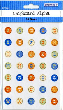
Earlier this spring, our local art-supply store closed its doors, but not before slashing the prices of its remaining inventory. Among life's many temptations, the promise of discount art supplies looms large, so off I went in search of buried treasure. Actually, not so buried, as it soon turned out — more like a paltry selection of picked-over goods, until a chipboard assortment of "birthday letters" caught my eye.
Birthday letters? I think not. This is Faux Hebrew.

Chipboard Alpha Letters, 2007.
I came back to my studio, put the Faux Hebrew upright on my desk, and gave it a good long stare. Maybe it was because it was the week of Passover — overshadowed as a week without bread always is by the sugary delectations of Easter — so I let it go.
Except that I couldn't let it go. It really irked me. I spend a great deal of time in my studio and thus, spent a considerable amount of time over the next few weeks stealing furtive glances at my Faux Hebrew letterforms — which, it turns out, have a rather curious provenance. Joseph Anthony Bartolo created a font called "Hebrewish" because, as he explains it, "the only Hebrew Latino font I have ever seen didn't really live-up to my expectations." Of course, if Hebrewish does't live up to your expectations, there is actually a real font called Faux Hebrew, and it's not the one on my desk.
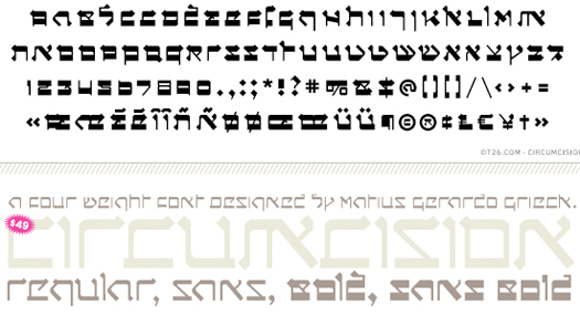
Which means there are even more, lots more like this. Yes, it turns out there's also one called Talmud, and one called Jerusalem, and a slightly more modified geometric version called — get ready for this one — CIRCUMCISION .

Circumcision, designed by Matius Gerardo Grieck, 2000.
Further research revealed that fake Jewish typefaces are sometimes grouped under the heading "foreign fonts" which brings us selections like Sholom, not to be confused with German type designer Dieter Steffman's Sholom and probably any number of typefaces from real Israeli type designers, quite a few of whom are rather gifted.
Clearly, some fonts are just too Western, and that's where modification — or in this case, "hindification" — can, when done well, can be extremely useful. What's less useful is the humor — which, just as it is for "Asian" or "Mexican" fonts, is highly questionable. And yes, it's all about appropriateness: fine to use Fake Hebrew for a deli; not so fine on, say, a yellow armband. Likewise, nobody questions a sign for a burrito restaurant designed in Hot Tamale, but what about when it's used for a border crossing sign in Texas?

Hot Tamale, designed by WSI.
I'm not the first to question the appropriateness (or lack thereof) of "type" ethnicity. (Ellen Lupton, Jonathan Hoefler and others have written about the faux naif qualities of Neuland, a font designed by the early Twentieth Century German designer Rudolf Koch, as the boilerplate "African American" font.) Nevertheless, the degree to which inappropriate things are both said and done (and worse, overlooked) with regard to ethnic, racial and cultural inappropriateness continues to rise, and this includes type decisions. Don Imus, who recently joined Mel Gibson and Isaiah Washington as the latest public figure to commit career suicide through bigotry, lost his job for referrring to the Rutgers Womens Basketball team as a bunch of "Nappy-Headed Hos." Granted, unlike people, typefaces have no feelings — so who cares if they're used without sensitivity and knowledge? But on some level, the line is a murky one: what's the difference between a celebrity making an unforgivable racist remark and a typographer making a font that clumsily perpetuates a cultural stereotype? As a rule, the study of ethics aren't taught in our design curricula. But maybe it should be.
