
Photo by Laura Mircik-Sellers.
This interview is part of an ongoing Design Observer series, Chain Letters, in which we ask leading design minds a few burning questions—and so do their peers, for a year-long conversation about the state of the industry.
October is archives month, and to celebrate we’re looking at design history through a few key questions. A tall order, we know. Luckily we've tapped the best design practitioners and historians from across the globe to tackle it—and to ask each other questions of their own.
Alexander Tochilovsky is a graphic designer, typographer, curator, and educator. He holds a BFA degree from The Cooper Union and an MFA degree from the Cranbrook Academy of Art. Alexander is currently the Curator of the Herb Lubalin Study Center of Design and Typography. In 2009 he co-curated the exhibition Lubalin Now, with Mike Essl and since 2010 has curated a number of exhibitions, including Appetite, Pharma, Image of the Studio, Thirty, Swiss Style Now, and We Dissent. He teaches typography and design at the Cooper Union School of Art, where he is an Associate Professor. He also teaches the history of typeface design at Type@Cooper, the postgraduate certificate program he co-founded in 2010.
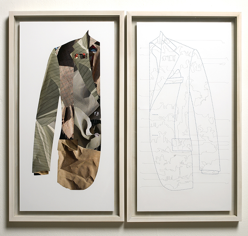
"This was my graduate school diploma piece which tapped into ways of using narratives to inform formal decisions."
There’s a well-known phrase attributed to Winston Churchill that says, “history is written by the victors.” Is this applicable to our understanding of design history? What’s being done to rewrite it?
The history of design is quite often skewed towards the famous names, so it would be fair to describe it as having been written by the “victors,” for better or for worse. The reputations of established designers—who in many cases have written themselves into design history—tend to fill up most books. It’s great that great design work stays in history. But it quite frequently obscures work by other designers. The biggest problem with that is that it makes it seem like there are no alternative viewpoints; no alternative styles. The broader design history is incredibly vibrant, and not as homogeneous as it might seem. There's a lot to learn from “non-victors” as well. Mind you, they aren’t “losers” either. They have simply been forgotten by contemporary culture.
Another issue is that other people who helped make work possible are excluded. The two names that spring to mind are Tom Carnase in the context of Herb Lubalin’s work, and Bob Noorda in the context of Massimo Vignelli's work for the New York City Transit Authority. I’ve seen a push to resurrect some of this forgotten history. I think the success of recent publications shows that there is an audience willing to look beyond the established canon. The rise of a number of facsimiles also shows that designers are willing to invest in things that are seemingly lost to time. The trick is cutting through the higher level of visual noise that we are in the midst of as an interconnected global society. But I’m optimistic that it will happen.
The broader design history is incredibly vibrant, and not as homogeneous as it might seem.
Another issue is that other people who helped make work possible are excluded. The two names that spring to mind are Tom Carnase in the context of Herb Lubalin’s work, and Bob Noorda in the context of Massimo Vignelli's work for the New York City Transit Authority. I’ve seen a push to resurrect some of this forgotten history. I think the success of recent publications shows that there is an audience willing to look beyond the established canon. The rise of a number of facsimiles also shows that designers are willing to invest in things that are seemingly lost to time. The trick is cutting through the higher level of visual noise that we are in the midst of as an interconnected global society. But I’m optimistic that it will happen.
In looking back at historical works, can—or should—the quality of the design itself ever be separated from its context?
The short answer is, yes. The longer answer is that it’s complicated. Within the object itself, the quality of the design is a product of its context; it is conditioned by when and how it was made and also by the maker. But having said that, I do think that context and aesthetics can be separated, especially when looking at older work.
It can actually be desirable to split them, as there is a lot more to gain from the understanding of the context of a design. Context can provide deeper and more significant lessons that are more relevant to the contemporary practice. Designers already know what design looks like, and their practice is based on gaining more knowledge and more experience in order to be better. Why feed designers more visuals and less of the ‘why’ behind them?
The Vignelli map was brilliant and deeply flawed. We as designers can learn a lot from embracing and analyzing both those factors.
Take the famous New York City subway map designed by Massimo Vignelli in 1972. It’s an iconic piece of design. But, here’s the thing… as a map, it had a life-span of only four years. Why is a piece of design that failed at its function held up to such a high degree? Because while brilliant, it’s also deeply flawed. We as designers can learn a lot from embracing both those factors and analyzing them. Its brilliance is in the clarity with which it conveyed how trains move to the viewer—but this forced the design to drastically distort the geography. The distorted geography made the maps difficult to use. That’s why it was killed and replaced by a more geographically correct map. The Vignelli map can teach us a lot, but in order to learn from it we need to look at it closely and ask the hard questions.
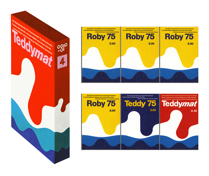
"I find this design by Karl Gerstner’s for a laundry detergent powder astoundingly smart and beautiful."
While this may seem self-evident considering your role at Lubalin, how would you describe your strategy for weaving design history into your work?
In graduate school, I mined historical narratives to drive the aesthetic part of my design work. I wanted to find stories that resonated with me and that would inform what I make. I don’t design as much as I used to, as my teaching and the Lubalin jobs occupy more of my time, but I’ve always tried to find ways to connect design history to my practice. I try to look through the work and get to the deeper thinking behind it. Once I find it, it’s mine to use as I please. That’s the beauty of design. Reading the imprint of past choices can teach us a lot about how to be a designer today.
Reading the imprint of past choices can teach us a lot about how to be a designer today.
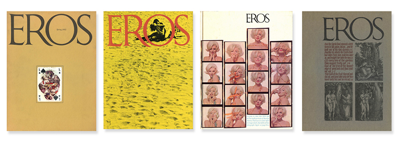
"The four issues of Eros magazine designed by Herb Lubalin is a must for every designer and student to know about and to spend time looking at."
Name a designer from the past that people may not know about (but should look up right now).
I have so many! But one name—two actually—is Lica and Albe Steiner, husband and wife. Search for them by the combined name they used: Licalbe Steiner.
From Sean Adams: When I was in school, one of my professors, who was an old-school International Style designer, told us, “Herb Lubalin is burning in Hell for what he did to type.” Years later, at an AIGA conference, an attendee stormed out when a presenter talked about Tibor Kalman’s influence. I’ve met people who refused to speak to me because I did “that clean stuff” in the 90s. Designers don't seem to be as villainized today because he or she has a different approach. Do you agree? Or are we, as a profession, still as binary and unwilling to accept alternative ways of thinking and making—sort of like the country right now?
Yikes! Your professor sounds intense, Sean. Then again, not too dissimilar to my own college experience. I think it’s true that there is less of a binary nature going on now. Designers are more willing to go across the spectrum and look at a wider range of ideas. The only concern I have is that it sometimes feels as though there is more ambivalence. Perhaps it’s the product of a more accepting field. I’m also finding that the range of names that younger designers have access to is narrower and closer in time range than it was for the previous generation. Names like Kalman and Lubalin and Bass are less familiar. Even Sagmeister is a name that doesn’t always ring with recognition.
Next week Alexander Tochilovsky asks Elysia Borowy-Reeder, executive director of the Museum of Contemporary Art Detroit (MOCAD): In the time you’ve spent working in museums, what’s the most significant change you’ve seen in how people interact with museums today? Is that change more due to the audience or the museums adjusting?


