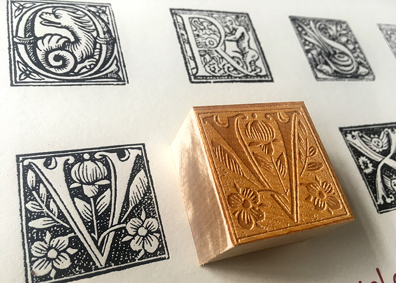
A limited edition exhibit poster using freshly cut wood type from Hamilton's collection of end grain maple.
During the late nineteenth century, illustrated hand woodcut initial caps were a fashionable and functionable typographic accent. A lot of visual information could be conveyed through this medium and so many were made and published it triggered a collecting craze for the printed specimens slashed out of European books and manuscripts. This act of desecration had an upside, however. Many were preserved in books devoted to their collection. A new exhibit at Hamilton Wood Type and Printing Museum, “Capitals: Initial Impressions- Renaissance Capitals From the Maywald Collection at the University of Minnesota (July 7-September 23) showcases around 200 of the 6000+ initials caps in the collection at the University of Minnesota. As Bill Moran of the Hamilton explains, “The initials are actual printed letterforms from hand-carved wood type that that date from 1470 to 1710 from all over Europe.” Clipping them from early printed texts “was a common practice in the late 19th century when they were collected and traded like rare baseball cards today.”
This collection was donated by Dr. Claus Maywald from the Gutenberg Museum in Mainz, Germany. He had them in his personal collection and he donated them to the University of Minnesota in 2011 so that the design faculty could use them as a teaching resource. Moran’s colleagues have scanned all of them at high resolution and are working to build a visual database that you can search based on a variety of classifications.
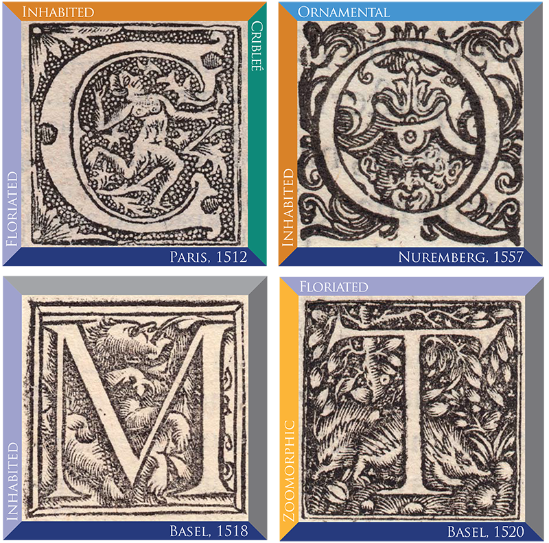
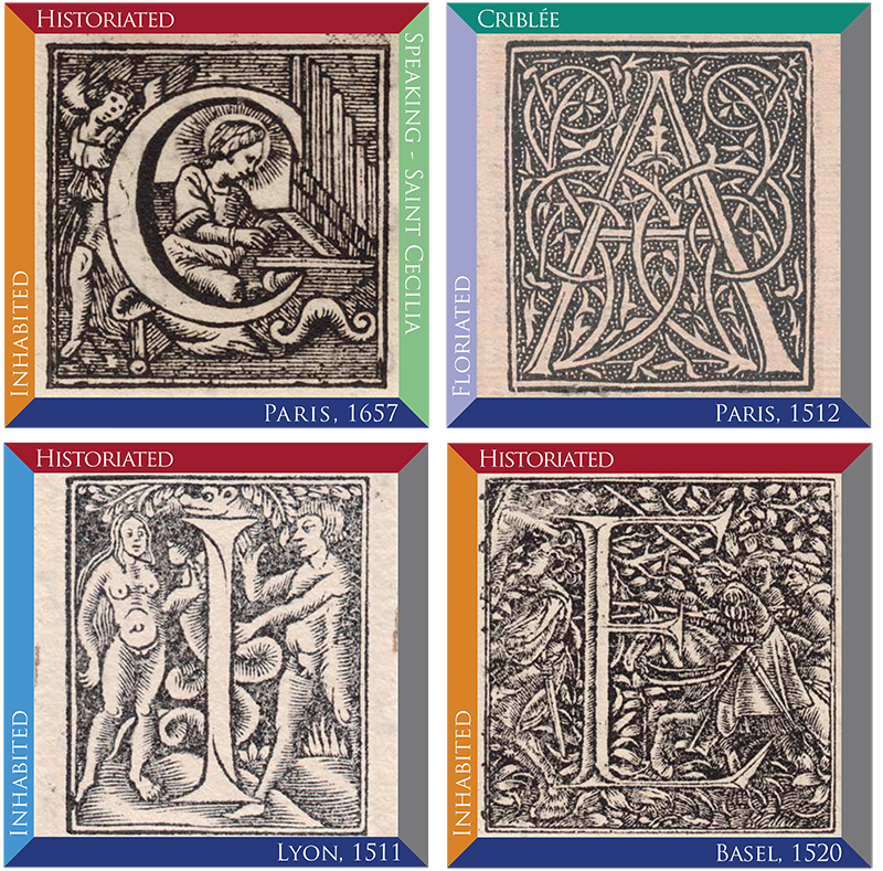
The initials above are a sampling of ornamental capitals that include their classifications and date of printing. Many of the letters span multiple categories.
The letters in the exhibit were selected based on a variety of classifications and overall beauty, including such style designations as:
Floriated — Letterforms that incorporate plant and/or flower motifs.
Historiated — Letterforms that employ people or places from a given story.
Inhabited — Those characters that have people, mythical beings, or faces in them.
Speaking — Designs that represent the first letter of the subject matter i.e. P for Piper.
Zoomorphic — Letterforms that include animals.
Criblée — A stippled dot pattern in the background
Calligraphic — Those letters that reflect the stroke of the flat-nibbed pen .
Ornamental — A term that describes decoration that is nonrepresentational.
“Additionally we chose the 25 letters of the Latin alphabet (I and J were the same letter back then) and cut new wood type for the exhibition poster using wood from Hamilton's collection of end-grain maple,” Moran adds. “And finally with the help of Paul Gehl, of the Newberry Library, we found 9 original books in which the letters appeared, and displayed digital copies alongside the original fragments. It was really cool to see the original page and how that beautiful piece of wood type fit into it.”
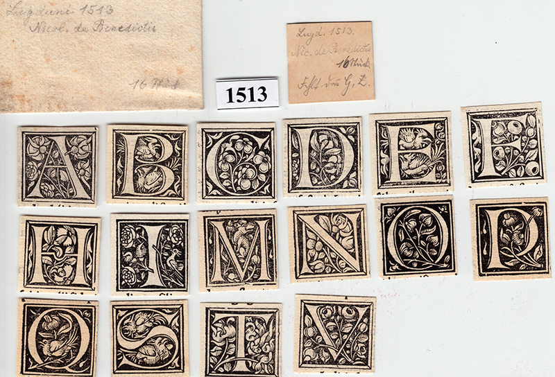
The initials as they are contained in their portfolios. In addition to the country and date printed, hand-written notes show the informtion copied from the original colophons of the books where they appeared.
The use of initial capitals was commonplace in Medieval manuscripts going back to the 7th century c.e. Scribes would illuminate the page with decorative letters to indicate a new paragraph. That tradition carried on after Gutenberg's invention of printing in Europe (the Chinese invented printing 500 years earlier) but rather than hand illustrating each capital they simply carved decorative letters into wood blocks and locked them up in the press along with the rest of the metal type on the page. “It's interesting to me that often,” Moran explains, “regardless of the subject matter in the capital, different capitals were used in a myriad of different books. Whether they we're religious doctrine, books on palm-reading, or the history of fireworks, a printer would use whatever they had on hand to begin a paragraph or page. Very rarely was a letterform created for a specific text.”
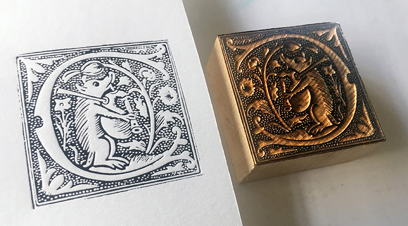
A close up of a newly cut wood type and a print made from the block.
These letters were once used as “clip art” in retro design, but do they have contemporary relevance? “Absolutely. In their time, initial capitals were used to enliven a page,” Moran replies. “They transformed what was essentially a series of gray symmetrical paragraphs into something much more vibrant. Clip art today has the same job. These initials provided another added bonus: they held symbolic imagery and iconic figures that were well-known at the time.”
Moran is scheduled talk about this material at TypeCon2018 in Portland this August 1-5. He will address the stylistic considerations and the subject matter included in the type as well as the symbolic underpinnings. “You've got mythical beasts, saints, the devil, people doing everything from dancing to fighting, and cherubs. Lots of cherubs.” Additionally he will focus on the letterform styles chosen by the engraver. Sometimes they used classic Roman forms like you'd see in an inscription, you see uncials, Lombardic capitals, and calligraphic-inspired type as well. And finally Moran will discuss the challenges of printing these. “Getting wood type that's 2" square to print well requires different inking than type that's 12 points. Renaissance printers were amazing with their skill in making a page look uniform.”
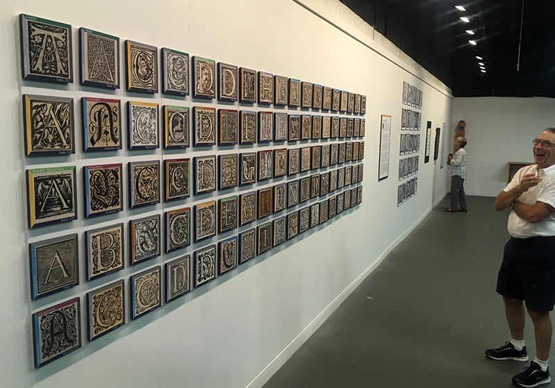
The exhibit included over 200 different letters, drawing from 6 differnt European countries dating from 1490 to 1600.
What surprised Moran most about this expansive collection is that wood type had its hey-day centuries before J.E. Hamilton first put pantograph to wood in 1880. “We've also learned that the detail achieved by the carvers was done mostly without magnification and only by natural light. Many of these letters are no larger than postage stamps and the skill required to do this (backwards and in relief) is extraordinary.” So craft and skill are vividly revealed in this exhibition. Yet what makes Moran most excited is that “the imagination of these men and women rivals anything being done via hand-lettering or calligraphy today.”


