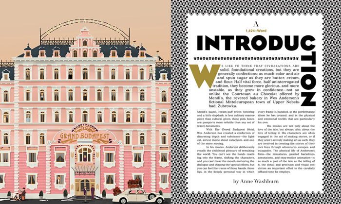
This week, the book The Grand Budapest Hotel, was released to the public. Fans of filmmaker Wes Anderson have been waiting for this thrilling follow-up to the The Wes Anderson Collection. Both books were designed by Martin Venezky’s Appetite Engineers in San Francisco. Martin worked with the same great team of Matt Zoller Seitz (author); Eric Klopfer (editor); and Max Dalton (illustrator) to create this stunning edition. Martin described himself as "[driving] the design locomotive.” The book is rich with patterns, fabrics, cards, stamps, Venezky-style typographic treatments, and a whole library of books-within-books that support the full story of the film, from initial inspiration through final edit. This kind of complicated “design orchestration” is most certainly a daunting task, but something Venezky handles with grace and ease. I asked him a few questions about how the book came together.
++
John Foster: Martin, your latest book on the Wes Anderson film Grand Budapest Hotel is a real beauty. And it seems that a good portion of the inventive graphic elements that you used for this one were developed for the earlier book, The Wes Anderson Collection. Specifically, I am referencing the imagined sets of stamps and cards that an Anderson character might be obsessively collecting. Can you elaborate on this?
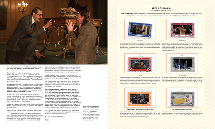
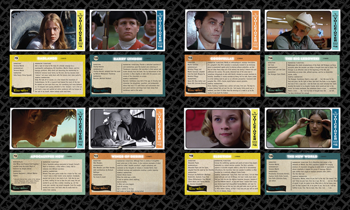
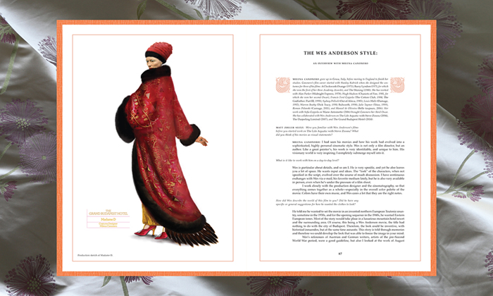
Martin Venezky: I tried to match a number of elements from the first book to this one. When I got the initial assignment for the first book in 2011 it was already titled The Wes Anderson Collection. I am no stranger to collecting stuff (and neither are you!), and my first inclination was to take the title literally and create some sort of odd stamp album. Stamp collecting was one of my childhood hobbies, and seemed like a perfect pastime for an Andersonian character. The idea was not well-received initially, but I kept it in the back of my mind. When I started work on the first sample chapter on Rushmore, I introduced the idea again with a series of Bill Murray stamps. Then I developed the idea further into other kinds of ephemera. The new book includes four sets of stamps similar to the Bill Murray set, featuring Dafoe, Swinton, Goldblum and Fiennes, and one magnificent card set featuring the history voice-over (using the fictitious “Cine-Star” brand).
JF: The illustrator, Max Dalton, has such a perfect style for the book. His work is quirky—like the films. Did you select him for the first book as well?
MV: No. Editor Eric Klopfer knew Max’s work and was keen on using him right at the start. I was a little skeptical since I thought that the book might be overwhelmed with too many competing styles. But as the project progressed and Max contributed chapter opening illustrations, everything seemed to work together. Although there are indeed a number of styles, they don’t compete with each other like I feared. Personally, I think the new book juggles the stylistic variety more gracefully.
JF: What was it like working with an editorial team?
MV: Most of the communication with Max was through Eric. Eric had an unusual role in the project. Most editors don’t get deeply involved with the design and illustration. But Eric played an important role in contributing to the look of the book and in keeping all of the parts under control—the writing, the editing, the illustration, art direction, photo selection, and permissions.
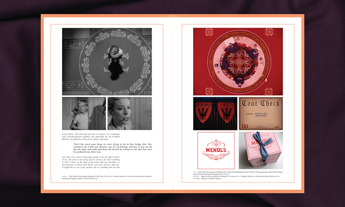
JF: You must have had an extraordinary amount of material to work from—movie production shots, photographs of scenery, and great character sketches by Juman Malouf. Add to that the incredibly ornate typographic treatments you did and you have this rich tapestry going on. Did you ever have to find things on your own to photograph? I am thinking of elements like the fabrics that provide background for many spreads in the book?
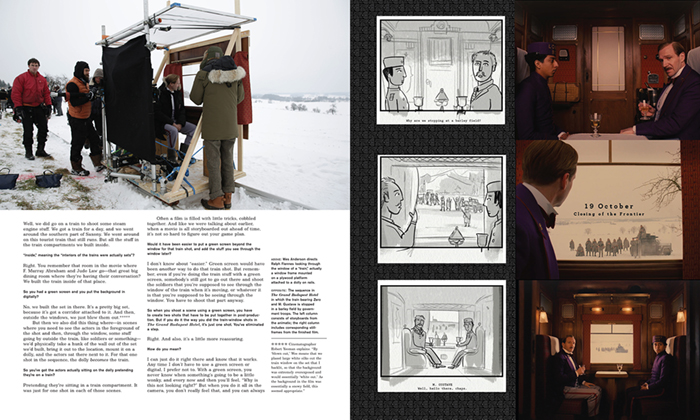
MV: Yes. I sourced all of the fabric backgrounds. I spent a day at Britex in downtown San Francisco armed with a bunch of Grand Budapest Hotel stills, looking for material that related to patterns, clothing, and furnishings. The fabric had a bigger role to play in this book (and in the film). The staff seemed to enjoy helping me with the challenge, especially finding fabrics that would photograph well and look appropriately expensive as an image.
JF: One of the features in Grand Budapest Hotel that I think is so wonderful is the “book within a book” idea. How did that come about?
MV: The idea was originated between Matt Zoller Seitz and Eric Klopfer. In their initial discussion, it was noted that the film is a set of stories inside stories, beginning with the original book held by the admirer, and working its way historically back to Zero’s origin story. At the same time, the film shifts its aspect ratio to match the time frame. All of this nesting in the film made it a natural strategy for the book’s structure.
JF: So how did you eventually solve this?
MV: Originally we were going to try and fit each interior book into its own signature so we could trim and bind them individually. As interesting as that idea might have been, it became cost prohibitive, as well as a difficult structure in which to map all of the material. I ended up developing the strategy of surrounding the smaller-sized books with fabric backgrounds, which, in the end, I think works better than the original plan. That solution gave us the freedom to reorganize the interior library as needed. We decided to design the books in sets … the interview series (orange), the behind-the-scenes series (gray), and the excerpts book (green). Each set was matched to a distinct typographic and design style, but still had to feel comfortable within the book as a whole.
Grand Budapest Hotel is published by Abrams, who also produced this trailer for the book.


