
Design: Richard Hollis. Poster for Whitechapel Art Gallery, 1980
Outside of Britain, Richard Hollis is probably best known for his books Graphic Design: A Concise History (1994) and Swiss Graphic Design (2006). Both volumes are indispensable components of any serious design library. The authority of these studies, their sense of intimate acquaintance with the development and practice of graphic design, comes from the less familiar side of Hollis’s activity: his long career as a designer since the late 1950s. An exhibition at Gallery Libby Sellers in London — curated by design historian Emily King — provides the first public opportunity to see and assess the entire shape of Hollis’s output (until April 28).
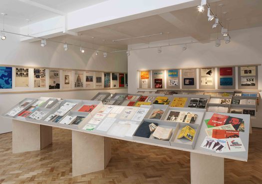
Richard Hollis exhibition at Gallery Libby Sellers, London. Exhibition design: Simon Jones. Photograph: Ed Reeve
Given the esteem in which Hollis has been held as a designer in recent years by his circle of admirers, it has always seemed surprising that his work, which was utterly distinctive in its time and context, hasn’t received more attention. If any article was published about him before 1988, when Robin Kinross wrote a profile titled “The New Tradition” for Blueprint, I have never seen it. By that time Hollis was in his mid-50s. (The piece was later reprinted in Unjustified Texts.) Kinross was Hollis’s ideal interpreter and champion. In 1992, he wrote a second profile for the fifth issue of the art magazine Frieze and that year published a conversation with Hollis in the Journal of Design History about the challenges of writing graphic design history — Hollis was by then in the midst of writing his concise overview. These remained the principal (if not the only) texts about Hollis until a piece in Dot Dot Dot no. 5 (2002), a short interview by me in Communicate (2004) and a long interview by Christopher Wilson in Eye in 2006.
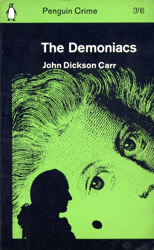
Design: Richard Hollis. Publisher: Penguin Books, 1965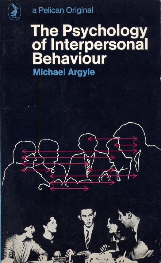
Design: Richard Hollis. Publisher: Penguin Books, 1967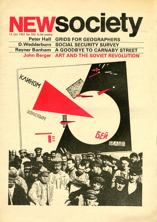
Design: Richard Hollis. New Society magazine, October 1967. (Issue not in exhibition.)
Design: Richard Hollis. Publisher: Pluto Press, 1973
From the mid-1990s, around the time his history appeared, Hollis became a much-valued though at times somewhat ambivalent contributor to Eye, writing reviews and profiles of Massin, Pierre Faucheux, Uwe Loesch, and others. Although he was still designing, the graphic achievements of the 1970s belonged to another era and fell outside the urgent new concerns of graphic designers focused on the Mac. Hollis is well connected (see his client list, and the obituaries of designers he writes for the Guardian) but comes from a generation temperamentally disinclined to engage in overt displays of self-promotion. Many much less significant contributions to British design have received far more coverage.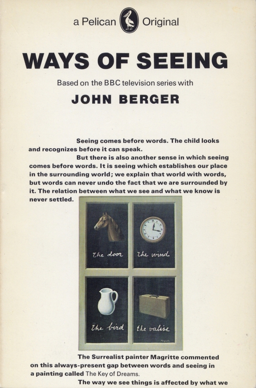
Design: Richard Hollis. Publisher: Penguin Books, 1972
Design: Richard Hollis. Publisher: Penguin Books, 1975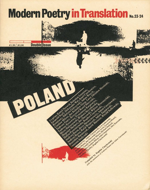
Design: Richard Hollis. Modern Poetry in Translation magazine, Spring 1975
In the early 1980s, before becoming a journalist, I worked for a few years as a typesetter and art-worker. I had a developing interest in typography and graphic design and this was when I first became aware of Hollis. I had read John Berger’s Ways of Seeing (1972) — Hollis’s most famous design, now something of a millstone for him — but he was credited only as one of the team that made the book and I hadn’t taken in his name. In 1981, working at a book production company called Reproduction Drawings, I was given a book to typeset titled The Hollywood Musical, published on behalf of the British Film Institute. In the job bag was a specimen copy of the first book in the same series, Godard: Images, Sounds, Politics (1980) by Colin MacCabe. It was designed by Hollis.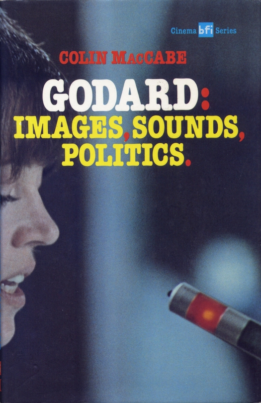
Design: Richard Hollis. Publisher: Macmillan Press, 1980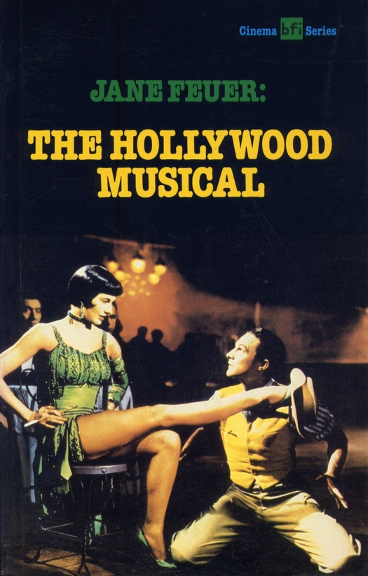
Design: Richard Hollis. Publisher: Macmillan Press, 1982. (Not in exhibition.)
I loved Godard’s films, which I was discovering at the time in London’s art-house cinemas, and I loved the book. I had enough of a grounding in typography to appreciate all the ways in which the Godard design broke with convention. Like Ways of Seeing, it had unusually large paragraph indents, used even for the first line of a new chapter. Names, titles and quotations were in bold, making the page grittily textured. The text typeface, Times, was offset by chapter titles and folios in American Typewriter Bold (I discussed this aspect of the book in a previous post). That visual disparity seemed very cool to me then, and it still does; the design, like the films, was intellectually serious while referencing the popular visual language of its time. Hollis used variable column widths, giving the pages extra margin space as needed and great visual energy, and he inset notes indicated by stars (not asterisks) into the text. Text and images — such great images! — were integrated with effortless panache. He ran small black and white reference pictures down the inner margins like spooling strips of film.
The Hollywood Musical (1982) is a more conventional linear text, although it retains the main typographic features of the Godard book. Typing it into a Compugraphic Editwriter in accordance with the mark-up was the high point of my short-lived career as a typesetter. As a film buff open to most genres of film, I was literally reading while I worked. Hollis gave the volume a fine, exuberantly colorful cover — Gene Kelly and Cyd Charisse in Singin’ in the Rain. He shows it on his website, though for some reason there is no design credit in the book.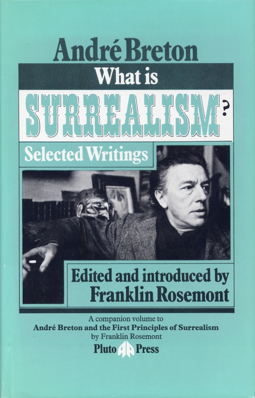
Design: Richard Hollis. Publisher: Pluto Press, 1978. (Not in exhibition.)
My view of Hollis is still shaped by these early sightings, formative moments before I became more committed to design. Around the same time I bought a copy of André Breton and the First Principles of Surrealism (1978), designed in its entirety by Hollis, and published by the radical imprint Pluto Press (the cover is similar to the companion volume shown above). He doesn’t like to think he has a style — to possess one would be to impose what he once called “the designer’s hieratic” on the client — but the book is immediately identifiable as his; it has big paragraph indents, naturally. The Kinross view of Hollis, which is close to Hollis’s down-to-earth view of himself, puts emphasis on practicality and utility, with much discussion of folding paper to produce a logically resolved piece that is both a poster and a leaflet of self-contained pages. I can also see what Hollis absorbed from modernist influences, particularly from the Swiss. I’m not against any of this, though it can become a bit pious, but I’m more attracted to his work for the precise aesthetic details of typography and layout, and what these subtle decisions and preferences signify (or in their moment signified) when measured against the conservative norms of British typography and graphic design from the late 1960s to the early 1980s.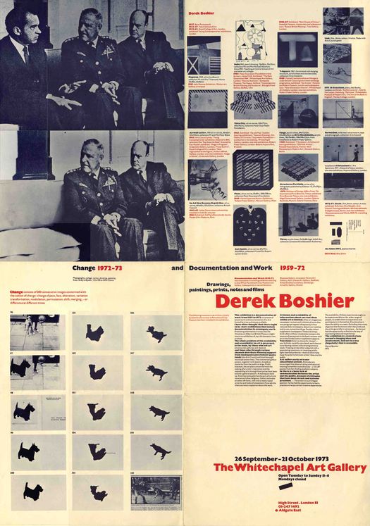
Design: Richard Hollis. Poster for Whitechapel Art Gallery, 1973
