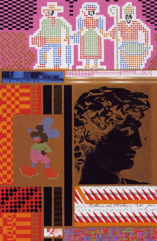
Eduardo Paolozzi, The Silken World of Michelangelo from Moonstrips Empire News, screenprint, 1967
If a visual artist created more concentrated, exhilarating images of science, technology and the media realm during the mid-20th century than British artist Eduardo Paolozzi, then I would like to see them. Paolozzi, who died on 22 April aged 81, was first of all a sculptor, but the screenprints he produced in the 1960s rank as masterpieces of the medium. You could call them examples of Pop Art, but they come from a different conceptual and aesthetic universe to American Pop in the Warhol/Oldenburg/Ruscha mode. Where so much US Pop tended to pare down its subject matter so that the image emerged in high relief as an icon, Paolozzi was closer to the image-overload of James Rosenquist. He was a visual researcher, a cataloguer and collagist, producing densely packed, allusively wired images based on fragmentation and collision. His screenprints embrace modern complexity and deliver it back to us zapping with electrical power.
I first saw his work in the school library as a teenager. Diane Kirkpatrick's 1970 monograph, pulled out at random one lunch hour, was a revelation. I was already obsessed with the Surrealists and here was a contemporary British artist consciously working in this tradition. Paolozzi, born in 1924, had even gone to Paris in the 1940s to study Dada and Surrealism at the source. "What I like to think I'm doing is an extension of radical Surrealism," he said later. Paolozzi's early bronze sculptures were strange totemic beings, decrepit robots from a dying civilization, with rough surfaces made from the impressions of unlikely objects. He gave them titles such as The Philosopher and His Majesty the Wheel. I was thrilled when Paolozzi's Large Frog (New Version), with a face like a switchboard, arrived one day for no obvious reason, not long after I had discovered him, in the foyer of our town's liberal arts college where I spent too much time in the library. Paolozzi's list of found materials, published in Kirkpatrick's book, was almost a poem:
METAMORPHOSIS OF RUBBISH
Dismembered lock
Toy frog
Rubber dragon
Toy camera
Assorted wheels and electrical parts
Clock parts
Broken comb
Bent fork
Various unidentified found objects
Parts of a radio
Old RAF bomb sight
Shaped pieces of wood
Natural objects such as pieces of bark
Gramophone parts
Model automobiles
Reject die castings from factory tip sites
CAR WRECKING YARDS AS HUNTING GROUNDS
Paolozzi amassed printed imagery with the same eclectic enthusiasm. In the late 1940s, while in Paris, he started making collages out of ads from American magazines, the covers of pulp novelettes and amazing stories, and scraps of packaging. He was a member in London of the seminal Independent Group, which focused on popular culture and modernism, anticipating many of Pop Art's concerns, and at the first meeting at the Institute of Contemporary Arts, in 1952, he spellbound the audience with slides of this material. In 1962, Paolozzi began working with silkscreen, assisted by screenprinter Christopher Prater, owner of Kelpra Studio in London. The screenprint Conjectures to Identity (1963) was the first sign of the compositional complexity to come. It includes patterned paper, technical illustrations, photographs of machinery and a scene showing people worshipping at an altar. In one print, the colours are a vibrant mixture of yellow, orange, purple and blue, but there are variations between prints, a technique Paolozzi and Prater used later so that every print in an edition has a unique set of colours.
The vision of technological modernity that Paolozzi's prints offer is so compacted and multilayered that it seems as much like a hallucination of the future as a description of the present. His titles sound like science fiction: Universal Electronic Vacuum, Zero Energy Experimental Pile, General Dynamic F.U.N. His prints are the visual counterparts of Norbert Wiener's cybernetic theories and Marshall McLuhan's concept of the electronic global village. One of his finest creations, Moonstrips Empire News (1967), takes the form of 101 prints housed in a magenta-tinted plastic box. (It's a source of lasting regret to me that I failed to stump up the money to buy it for a bargain price in a Tokyo department store.) Surrealistic free association determines the relationship between images and texts — Paolozzi's influences included Marcel Duchamp's Green Box and the writings of Raymond Roussel, James Joyce and William Burroughs — and the prints can be arranged, viewed and read in any order. Paolozzi juxtaposes machine parts with fashion photos, Disney characters with classical heads; areas around the images pulsate with bands of abstract, optical pattern. The level of design in his graphic work (as well as in his sculpture) is exceptional and these images achieve a degree of graphic complexity that sets them apart from most 1960s Pop screenprints and exceeds anything achieved in graphic design at the time, in both formal and technical invention.
Paolozzi went on to undertake many public commissions, such as the mosaics in the Tottenham Court Road London Underground station. There were graphic works, too. He considered becoming a commercial artist before pursuing fine art. In the mid-1980s, I came across a couple of covers he designed for reissues of the classic science fiction novels A Canticle for Leibowitz by Walter M. Miller and Earth Abides by George R. Stewart. But as many observers have commented — including The Guardian's obituary writer — Paolozzi's work after 1970 saw a decline in invention compared to the heights of the 1950s and 1960s, though he remained prolific. Artistic reputations are subject to fashion and in recent years, despite his knighthood and status as a member of the art establishment, Paolozzi's earlier achievements have been overlooked. He wasn't a figure that younger British artists tended to cite. My guess is that, in time, he will be reassessed as a print-maker of real brilliance and seen as one of the most outstanding British artists of the last 50 years. Few image-makers have portrayed the texture and seduction of our overlit technological landscape with such scintillating imaginative power.


