12.03.04
Jessica Helfand | Essays

Time, Space and The Microsoft Colonialists

Microsoft spaces

Albert Einstein once wrote that time and space are only modes by which we think — not conditions in which we live — but he might have reconsidered this supposition had he lived to see Microsoft's new foray into weblog development, introduced earlier this week to minimal fanfare.

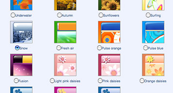
Microsoft's "Spaces" brings the concept of incipient suburban sprawl to the blogisphere. Its templates are minimal and unappealing, streamlined with the rounded edges that resemble so many computer applications. But what's worse are its implicit editorial expectations: photos and music (segregated, each comprising its own category) let users post their albums of pictures, or songlists, or wishlists as a disenfranchised bar of buttons. There is nothing to allow — let alone encourage — a more integrated platform for words and pictures, or, for that matter, real discussion and outside input. These aren't spaces: they're straightjackets, offering little if anything original in the way of advancing social, conversational, editorial or critical dialogue.

When I was a child, space was often described as the ultimate frontier. I was never quite sure what the last one had been — surely something important had taken place between Westward Expansion in the 1860s and the lunar landing a century later — but as far as I was concerned, space was a concept I could never quite wrap my mind around. My older sister, already courting the mercurial vicissitudes of teenage malaise, often revealed a fondness for such phrases as "spacey" — or it's more lyrical variant, "spaced out" — which I came to equate with a kind of comatose state you could only attain if you no longer had your name sewed into the collars of your shirts. If space was the ultimate frontier, I felt certain that just surviving childhood — with its attendant melodramas, most of them played out with my sister in the privacy of our own home — was the penultimate.

Years later, as a freshman in college, I studied architectural theory, where I read Gaston Bachelard's The Poetics of Space with the kind of obsessive zeal of the newly converted. I'd finally come to realize that spatial awareness had a deep and complex relationship to questions of taste, matters of cultural interpretation and formal expression. Here, understanding space meant questioning things like the idea of shelter, the notion of enclosure, the illusion of intimacy. Frank Lloyd Wright once wrote of the "space within" as "the reality of the building," but as I began my professional life as a graphic designer, the spaces I came to embrace were perhaps less about 3D than 2D, less about construction and more about composition — first in print, and subsequently, on screen. To the extent that the relationship between time and space might be said to characterize the very essence of modern thought, my own little metaphysical odyssey in spatial awareness may seem trite, even inconsequential. But don't we all struggle to reconcile these polarities, to some degree, as we grow more comfortable (some might say even passive) with the role technology plays in our lives? Weblogs may not, by their nature, connote the notion of "shelter" any more than a home page really looks like home: but at the same time, designers implicitly understand — and by conjecture, appreciate — the idea that customization means more than choosing backgrounds with daisies. And if blogging has any real future, and its design permutations have any impact upon that future, we should.

Marshall McLuhan once observed that whereas tribal man had deemed space an uncontrollable mystery, it was time that dominated our contemporary preoccupations. If Microsoft displayed its marketing genius by introducing "Spaces" three weeks before Christmas, its failure as a compelling editorial product — as evidenced by its restrictive format, its templated narrowcasting, its uninspired design parameters — illuminates its ultimate weakness: these spaces have nothing to do with space, in all its rich, fascinating and deeply human complexity. (Westward, Ho, Ho, Ho? I don't think so.) Perhaps the next frontier isn't space, but meaning. Or at the very least, smarter design solutions.

Posted in: Architecture, Technology, Theory + Criticism


Comments [20]

Regarding "incipient suburban sprawl" - thankfully, we are free to ignore Spaces if we choose. Unlike physical sprawl, it requires time and attention only from those who choose to participate, and disappears if ignored.
Michal Migurski
12.03.04
02:51

Its templates are minimal and unappealing, streamlined with the rounded edges that resemble so many computer applications.

Sorry Jessica, but rounded everything is the current blog design "thing," like it or not, and Microsoft's approach to anything has rarely been innovation. Rounded corners have finally become somewhat easy, and everybody wants in. It'll go away soon enough, just as bullet time did for video, and the dimensional text from the Panic Room credits will also. Yes, they're pretty bland, but you're not seriously going to claim you didn't see that coming. It's a monolithic corporation offering the same designs to effectively all of its users, simultaneously. You expected Cranbrook? Blogger(also monolithic if taken within the context of blogging) recently had a bunch of well-known web designers create new standard templates for them. Think they were all wildly innovative? Well, my paradigm has not been shifted. Of course, that wasn't the point at all. Read Dan Rubin's comment regarding intent under "Beautifully Generic." Frankly, the code for these is more interesting to me than the visuals.

On the other hand, the interactive layout designer thingy is interesting, and something I don't think I've seen yet. Spaces behaves much more like an application than most web services, and that is something to look at in itself; could be comforting to the user. Also, it's effectively v1.0. If there's something you don't like, or want added, then ask for it. TypePad seems to use a similar layout designer process, but I haven't actually used the service, as it's behind a payment process and I have no use for it.

I think you're making the mistake of applying your expectations to a product that probably isn't meant for you in the first place. Spaces is clearly not aimed at the person who wants control. They want something that lets them click a few buttons and go. It's for beginners (Yes, so is Typepad, but this is free.) and people who may not be able to wrap their heads around the idea of using say, the MT Keywords field for images in a gallery instead and then working out the template code to make that actually end up looking like a gallery, too. They want something that is meant to show pictures; they can understand that. Movable Type is nice, but it's openness is thoroughly confusing to a lot of people. You dismiss "editorial expectation" without considering the paralysis of choice, not to mention learning curve.

designers implicitly understand — and by conjecture, appreciate — the idea that customization means more than choosing backgrounds with daisies. And if blogging has any real future, and its design permutations have any impact upon that future, we should.

If I could point out a certain elephant, your layout is suspiciously familiar and your content very similarly compartmentalized:

(Spaces : Design Observer)
Blog list : Sites we recommend
Book list : Books we recommend/Books by contributors
Profile : About this site
Archives : Past entries
There are a few others that might be included with some slight interpretation, but I think the point has been made. And funny enough, all the Movable Type default templates are locked into a two-column, sidebar-on-the-right design (unless you want to mess with the stylesheet), while Spaces lets you move content around.

I'm sorry, but I fail to see the basis for this jeremiad.
Su
12.03.04
07:32

I'm not a Microsoft lover, but this critique seems to be more about your negative feelings towards the company than this new service. After all, there are plenty of weblog/journal services that are similarly "straightjacketed" whether it's lycos or blogspot or somesuch. Or even livejournal - but they succeed on a community level, if not on a "design" one.

So no, "Spaces" isn't revolutionary, but you weren't really expecting that from Microsoft, were you?
Oscar Bartos
12.03.04
10:36

Your main complaint seems to be the limited choices. I assume you did notice that this is a Beta product, right? Given the numbers of templates available for MS Office products, I'd expect before this goes beyond beta there will be plenty more template choices.

It's also a lot easier to use than MT. Sure, it's not for the kind of geeks that already have their own blogs, setup on their own domains, but it's certainly a decent competitor to Blogger and the price is right.
Tom Hanna
12.04.04
11:38

Actually, I've always been a kind of closet Microsoft fan. I was always impressed by the simplicity of their interfaces, by the fact that the basic default design idiom always veered toward tasteful minimalism and classic compositional conceits. I'd also add that Microsoft continues to embrace, even pioneer certain visionary ideas like social computing — so as forgiving as I'd like to be with regard the "Beta" thing, I'd like to make the point on a larger scale.

Given the abundance of really good research, to date, on the idea of space — both real and virtual, digital and architectural, social and behavioral — might there have been a better initial offering? I'm not now, nor have I ever been seeking a Cranbrook solution (though I heartily disagree with the reader who believes that Microsoft is not known for its innovation) but I do believe that design can do better. As for Microsoft, having built an enormous culture all its own, having succeeded earlier and endured longer than many of its competitors with regard to sustaining that culture — well, I just imagined there might have been something that revealed a deeper understanding, a greater awareness — in short, a bolder move.
Jessica Helfand
12.05.04
08:45

Apparently the Microsoft blog system censors a lot of expletives and other words which is a bit worrying.

But as regards the templating system, you could make a very strong case that the majority of web users are NOT designers and the majority of small web site designs are, lets face it , crude at best. So letting users choose a nice skin for their website is no bad thing if it at least makes the more general "space" of the web a bit more appealing.

We can argue over the 'style' of that solution but it has to be an improvement over many thrown together websites. And in the long term it might make web users more visually aware next time around.

Templates raise interesting issues for designers in print design too. If designers genuinely wanted to improve the vast majority of the print space, signage etc., perhaps they would be more willing to roll out a better wuality of template that the non-designer could use as a guide.

A template system for take-away menu's , yoga classes, bank offers, an other assorted junk mail we all get daily would be more than appreciated by the commuity at large I'm sure ;)


dave
12.06.04
07:47

Hmmm.......
My own opinion is that blog design (Assuming we're talking about the weblogs of people with little or no graphic design / interactive design knowledge) is that too much choice in terms of layout, typography, colour and image leads to badly designed (and often illegible) - sites, look at LiveJournal for various examples of this.
The alternative is the use of default templates or skins, the main problem with which is that they are essentially generic, and are applied arbitrarily to the content of the blog, with little concern for the site's content or the personality of the author (A Weblog is a personal thing, and generic tempalates do not communicate this). The other problem with many default tempates is that they are designed by programmers rather than graphic designers, and a lot seem to be explicitly 'techy' in their appearance. For instance, the default template for Blojsom (a weblog content management system) seems to refer explicitly to Mac OSX interface design, something which may not be appropriate to many sites. It can be seen Here [blojsom.com], and [reluctantly] on my site, until i get the time to actually design a layout for it myself.
Tim C
12.07.04
08:43

Yes, but here is what I don't understand: it seems to me that Microsoft includes, as a default, a random list of every other "Space" blog in existence. This is different than, say, any of us choosing (or maybe more to the point, not choosing) to include a list of sites we regularly visit, rubrics or categories we embrace. Blogger includes an arrow function that lets you browse randomly from blogger-blog to blogger-blog, thereby offering a similar (but much less intrusive) opportunity to showcase their own community of templated, yet highly different weblogs.

To come back to the notion of incipient suburban sprawl: I think including that list of everyone else's blogs right on your homepage is like just allowing a strip mall to ignore commercial zoning ordinances and build away, smack in your front yard.
Jessica Helfand
12.07.04
11:26

Dear Jessica,

I am afraid you are going to have to bite the bullet on this one. Despite your two attempts
at adding points to this arguement, it is, and has been quite clear that you are arguing your
contempt for the corporate giant, and not really pointing out the true evils of this new, and
free system. As Migurski had previously mentioned in this thread; the design of your own
blog here on design observer is exactly the template at Moveable Type. Also for anyone
who bothered going through Blogger.com far enough to look at the templates, one of them
seems awfully familiar to the previous Design Observer layout.

Before I continue, I have two questions to ask of you and the entire design community.

1) As designers should we be expected to know anything about programming? (action scripting, lingo, javascripting, perl, etc...)

2) Should we really expect programmers to know anything about "good" design?

I assume the reasons that design observer is not further designed or personalized as a blog
may be that no one knows the code well enough to program a blog from the ground up or perhaps,
giving you the benefit of the doubt, that this drab design is helping you to remain impartial and not
influence those with burnt umber on their noses to make assumptions about your collective opinions.

Care to provide further insight?


P.S. I enjoy that which I have read in Screens, keep up the good work.
Jacob Kay
12.08.04
04:26

Jacob: From the perspective of the person who has to actually build the sites(if you hadn't guessed):

1> Direct knowledge of actual programming is not necessary for the designer, but I do expect that they be aware enough of the tools' capabilities and limitations to know the difference between what is easy, reasonable, and a pain to implement—not to mention the impossible—and be sensitive to that in their work. For example, there's nothing wrong with freeform design, but it would probably be much easier to code if a few things were shifted into line here and there.
If the designer is not educated in the matter or refuses to learn, then I expect my suggestions be given serious consideration.

2> I think "good" is too flexible a term for your question, really. For a programmer, good design roughly equates to "efficient," because it bubbles up from the code: simple grids are easy to create, maintain, etc. and are therefore good in several senses. And from a designer's perspective, there's nothing particularly not-good about the results; they're just generally not that attractive.
But to answer anyway:
Probably not, but this is why designers are brought in. If Microsoft did have their programmers do the templates(Which I doubt; Tim C's statement was a generalization), then this is their own fault. They obviously have the money to pay people to do that properly.
On the other hand, the majority of the popular systems at the moment are open-source and often built by small groups, so Tim's comment holds true by and large. The open-source movement is finally learning that this just isn't acceptable anymore, and a growing number of projects are teaming with dedicated design people or at least proper interface designers.
Su
12.08.04
05:44

And for Jessica, while I'm here:

though I heartily disagree with the reader who believes that Microsoft is not known for its innovation

You're entitled to that, but the fact is that they don't usually, and they're the first to say it. You're also ignoring the second—questionable—part of Microsoft's embrace, not to mention the apocryphal third part, which is what generally comprises their "innovation." It's exceedingly rare for MS to do something first(try and name one), much less leave well enough alone once they do get on the wagon. Overall, the pattern is to say they support X standards, though they usually do so in a broken(Sorry, extended. Extended standard. Seriously. Mull that one over a second.) manner that often causes problems for everyone else, sometimes actively(ref the Opera browser's "Bork" edition for the best response to this so far), yet seems just magical when MS products are talking to each other.

You seem...very concerned...with the implications of the name "Spaces." I'm curious: Would your reaction have been as strong if the thing were just called MSN Blogs(as, arguably, it should be)? Because, really...regardless of what the name implies or what you might want to read into it, these are low-grade blogs which are by fiat subscribing to the painfully shortsighted definition put forth by those with the gall to proclaim that entries should be listed in reverse-chronological order(dated!), titled, and have a byline(Why? Most sites have a single author.) They aren't, and likely won't be, aspiring to anything more. It's hardly Microsoft that's limiting the format; they're just joining an existing trend.
Su
12.08.04
05:53

My reading of Jessica's post is that she was primarily responding to the name, "Spaces," and not trying to render some generic Microsoft bashing. "Spaces" as "incipient suburban sprawl" is consistent with the default, random list of other "Space" blogs that appears. This is not "communicating, sharing and socializing," to use Steve Ballmer's description -- this is enforced communicating, sharing and socializing in a special Microsoft zone of space within the blogosphere.

Comments here are correct that the default design template in "Moveable Type" used for this site is not so different from what is offered up by "Spaces." Jacob Kay asks why a bunch of designers would use such a drab design?

The decision to launch Design Observer with a default template was not because we did not have access to programming code: we have a professional interface designer and programmer on our team. Thus, the choice was intentional.

With four partners, we all probably had our own rationale. Mostly, though, we wanted the site to be known for its writing. Since all of us are involved in editorial design in our real lives, it was also clear to us that we would know more after a year and that ultimately the design of the site should flow from specific editorial needs, and with the perspective of greater experience and expertise.

Fifteen months into Design Oberver, and with over 150 posts and 1.7 million site visits, we are contemplating a redesign. As a forum for design writing and commentary, rather than a blog in the diary sense, the challenge will be to emphasize the writing, manage posts from numerous participants, create better archives, and to encourage and facilitate intelligent comments.

At this point, our drab design is becoming a limitation, not for its drab color but in its templated approach to presenting editorial content.
William Drenttel
12.08.04
09:51

A thought on Jacob's post...

Designers don't have to know how to program, although Su's comment about knowing the capabilities and limitations of a medium still holds true. However, writing markup code is emphatically NOT programming! 'Seperation of concerns' (Ie content, presentation, logic, control all handled seperatly) is a big thing in web design, and a lot of the technologies built with this in mind provide markup languages that are easy to understand, so designers have an effective way to provide a front end to the logic and backend systems made by programmers; Velocity is a good example of this. Sorry for the geeky nature of this post but i think this is a great example of how designers can work effectively alongside programmers - each working on seperate parts of a system.

So... designers shouldn't have to program, but they should be able to read and write HTML and CSS, along with something like velocity or Moveabletype tempate tags if necessary. I happen to think this is a good thing from a design point of view as well as a technical one; visualising a layout from looking at code requires you to really think about the design decisions you are making, something you don't get in a tool like dreamweaver where you can fiddle with the layout to your hearts content, without any limitations or problems to solve.
Sorry if this is rambling and off topic.... it is extremely late here!

su: sorry for the generalisation, although i feel that this is prevalent among some smaller software projects. There seems to be a very specific set of geeky signifiers used in a lot of interface design, and this overt reference to technology in the design of many weblogs is presumably intimidating for 'non techy' people - aside from the fact that a weblog is a personal page, and should reflect the interests of the author - rather than being shoehorned into a default template which is not sympathetic to the content, or (impossible?) completely transparent.
Tim C
12.09.04
12:29

But aren't blogs more or less obselete?

RSS is the present, and RSS works in the reader's space, not the blogger's. Having a variety of visual problems I find this attractive, since I can experience other people's lives and interests without concern for their choice of font or ornamentation. (I gather that Design Observer is very VT100 with pale sans serif text on a dark neutral background).

Why should the site even be text? Why shouldn't it be spoken or tactile?

Is graphical design dead? Of course not, but there is no reason it has to interfere with my web browsing experience.
Kaleberg
12.10.04
11:47

Well, that's a bit of a sweeping statement, no? What exactly leads you to say blogs are obsolete? But if you're going to put that forward, then why not continue the theme and say RSS is dead, long live Atom?

You might refer to what the RSS acronym actually stands for(Well, the two major options, anyway; nobody seems able to decide which to stick with.) as well as look at the format specs. RSS wasn't intended to be an independent publishing format. One of the fundamental elements of RSS is a LINK to the URL—and here we get into the fact that RSS isn't really intended to be a storage format, either—of the item being read. Not that there's anything keeping someone from doing it, mind you, except that it's also not very good for it. There are some below-user-level technical issues with using RSS for anything more important than as an alternative format, not to mention that RSS itself is a huge mess(Gory, gory technical details there, but worth scanning to understand the scale of the problem.)

Taking issue with a site author's font choice isn't enough reason to switch to another publishing format altogether. A decent browser and a user stylesheet will take care of that. A few weeks ago, I created an entirely alternate stylesheet for DO as an experiment, changing fonts, colors and some layout elements more to my liking.

As for your followup questions:
Audioblogs pop up periodically as a fad which quickly dies for several reasons I'll leave to the reader to research.
What tactile output devices are you aware of? I assume you don't just mean Braille, which is pretty much just a reformatting of text.
Su
12.11.04
11:57

I see Microsoft is always "holy". just a new blog system and hiiiii panic ! ...
Michel
12.19.04
01:09

"Albert Einstein once wrote that time and space are only modes by which we think — not conditions in which we live"

are you sure you possibly didn't mean to write Immanuel Kant instead? ;-)
Frank Rohse
12.30.04
06:49

To my knowledge, the Einstein reference is accurate. Of course, Einstein wasn't the first to remark on this: the Arabic physicist Ikhwan al-Sufa wrote in 900 AD: "Space is a form abstracted from matter and exists only in consciousness". Perhaps Kant felt the same way.
Jessica Helfand
12.30.04
07:06

"Perhaps Kant felt the same way."

he did.. I'd even admire your reference as the smallest possible nutshell for Kants Critique of Pure Reason.
thanks for your reply.
Frank Rohse
12.31.04
06:20


Jobs | March 28