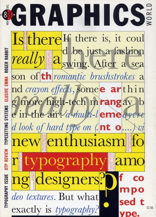
Graphics World magazine, November/December 1988. Typographic image by Phil Baines
This week I was reminded again of the British design educator Paul Stiff, who died in February, by the arrival of a collection of design essays that has just been published in Poland. It contains an article originally titled “Stop Sitting Around and Start Reading,” which Stiff wrote for Eye magazine in 1993. I can’t remember for certain whether he proposed this to me as editor, or whether I pressed him to write it. It was probably a bit of both, though, because I had made previous attempts to persuade him to contribute without getting anywhere, before finally cracking it.
I’ll come back to that essay in a moment, but one thing leads to another and the Polish book prompted me to go looking for an issue of Graphics World published in 1988 — the image above — that I was pretty sure I still had somewhere. The magazine contains a six-page article, said to be Stiff’s first, titled “Design for Reading.” It’s really three articles in one: a main text defending the vital importance of readability; a secondary text setting out principles derived from his own experiences of “object quality” as a reader; and a slide show of examples with opinionated captions. Here, Stiff describes the hapless designers of an architecture book as “fiddling and blipping away” at the design “just to maintain their own interest in the job.” Even this brief quotation gives a flavor of the article (and the teacher): absolutely set against any designer shenanigans that might interfere with the reading experience.
One can only imagine what Stiff must have thought of the typographic cover image by Phil Baines — then an up-and-coming experimental typographer and now a professor at Central Saint Martins. Baines takes Stiff’s first paragraph and scrambles (or should that be blips?) it to form a typographic conundrum that can be read, but only with some effort. It’s a strong cover that probably worked well to attract a younger generation of readers then becoming increasingly interested in the expressive, textural and connotative possibilities of type. It was also, in 1988, a sign of things to come, when designers would seize the typographic possibilities of digital technology and concoct new justifications for their experiments.
Five years later, “Stop Sitting Around and Start Reading” was a rigorously argued riposte to what Sharon Poggenpohl of Visible Language had called a “more responsive typography.” Lucid, argumentative and engagingly readable, Stiff insists that designers ground their ideas and theories about reading in evidence:
Sceptics might ask: of all the sources of knowledge about reading and communication (cognitive psychology, ethnology, ergonomics, discourse analysis, feminism . . .) why have typographers defaulted to those which neither offer nor require evidence. To ones which permit them to “theorise” reading as passive osmosis, to marginalise readers (mere receptacles) and at the same time to foreground the act of designing (explained as the “challenging” of empty vessels)? Whose interests do such theories serve?
I was pleased to publish what can now be seen as one of the key responses to the claims made by typographic theorists in those years. But dealing with Stiff wasn’t easy. He wanted endnotes so he could give his sources, which were critical to his argument. Even though we didn’t usually publish notes — Eye is a magazine, after all, not a journal — I agreed because I could see their necessity in this case, though I suggested we drop the page numbers. Stiff wasn’t happy with this, maintaining that it would ill serve readers; he was consistent to a fault. I thought that was overstating it. When the essay, slightly revised, was reprinted in Looking Closer 2 (1997) under a perhaps too emphatic new title, “Look at Me! Look at Me! (What Designers Want),” he put the numbers back in.
That volume is still the best place to find his essay. I would like to supply a link, but the text isn’t available online and the Eye site doesn’t list it in the contents for issue no. 11 vol. 3, where it appears. I hope that can be rectified soon, and someone should put “Design for Reading” online, too. [UPDATE: “Stop Sitting Around and Start Reading” is now online.] It would also be good to see a collection of Stiff’s writings, including his work from Information Design Journal, where he was co-editor (1986-1990) and then editor (1990-2000), and Typography Papers, an occasional publication that he founded in 1996.
Stiff is an important figure. He was a man of principle with demanding standards and he had a deep influence on both colleagues and the students he taught in the world-renowned department of Typography & Graphic Communication at the University of Reading. But he was not well known outside academic circles, even within British design. Given the quality of his very occasional interventions, it always seemed a shame that he didn’t engage more widely with the design scene, in the way that his colleague and close friend Robin Kinross has done — see obituaries of Stiff by Kinross here and here. Stiff’s second ever contribution to Eye (according to its website index), a short piece about British road signs, appeared in a special issue about information design in winter 2010. His recent major project, a superb, book-sized eighth issue of Typography Papers, titled Modern Typography in Britain: Graphic Design, Politics, and Society, the fruit of a research initiative at Reading, shows him working, as historian, writer and editor, at the height of his powers.
