Growing up in the 1970s, there were many things that baffled my emerging aesthetic sensibilities, not least of which were t-shirts worn over pointy-collared blouses; long greasy hair parted in the center; and drugs. This last topic was an issue of considerable bewilderment to me, since my sister and I were the only people I ever knew for whom recreational drug use was essentially a non-issue. After all, our father worked for a pharmaceutical company: how could doing drugs be cool if they were what Dad did for a living? In our house, "better living through chemistry" translated to only the most minor of interventions — the occasional antacid, for instance — and even then, determining a suitable dosage required an initial consultation with my Mother, my Father, and The Merck Manual.
I swore to myself that when I grew up, I would find a way to shield myself from the unforgiving scrutiny of my peers, the cool ones who understood and participated in the drug culture from which I felt so alienated. Later, as a design student, I convinced myself that I had found my own kind of cool — a kind of expressive, idiomatic cool behind which I (or at least my work) could blissfully masquerade. That was the ticket: I'd just design things that were cool! Who needed to know that I never actually did drugs, that my hair was parted on the side, that truth be told, I wasn't cool in the least? Over time, I became utterly committed to my flawed hypothesis, determined to prove that design and pharmacy had nothing in common.
This was, of course, long before Damien Hirst.
And well before eBay.
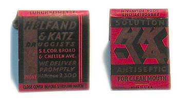
Now retired from his corporate life in the pharmaceutical industry, my father remains an exceptional man in numerous ways: a gentleman and a scholar, a collector and a writer, — and a demon auctionista. He was the first person I knew to expertly mine the endless categories that comprise eBay; the first to use a sniper program to regularly perform his bids; the first to understand the obscure, if targeted logic of the Boolean search. I laughed, initially, when he confessed to regularly doing a search on "Helfand" (who knew there was a dairy farm in New Hampshire with our name?) but he outdid himself last month when he discovered a matchbook from Helfand & Katz, my grandfather's now-defunct pharmacy in Philadelphia. Endearingly preserved (and miraculously put up for auction independently, though matchbooks are, more often than not, sold in lots), I was even more amazed to find that someone actually took real time to design this thing. Black and red, compositionally dense and informationally rich, boasting an exaggerated logo for "HK-14" — Helfand & Katz's own brand of antiseptic solution. Who knew? Why, the very fact that I can write "Helfand" and "brand" in the same sentence is enough to make me break out in hives.
I'm not suggesting that my grandfather himself actually designed this matchbook, but someone did, making him — what — the client? The art director? The account executive? Did HK-14 ever make it out of the store, into the mainstream? Did it have multiple incarnations, its logo emblazoned on a coffee mug, for example, or positioned jauntily alongside advertisements in the Sunday newspaper supplements? Who came up with the hip abbreviation, the slanted letterforms, the marketing strategy? Was it Helfand? Was it Katz?
Was there an HK-15?
The idea that design and pharmacy have a harmonious history right in my own family shouldn't surprise me. After all, I grew up in a house filled with phamaceutical posters and all sorts of obscure drug ephemera, laying the visual groundwork both for my father's passionate interest in ars medica and, in some ways, my own vocabulary as a graphic designer. Yet somehow, collecting it was never the same to me as making it. Still, as the only person on the planet who actually prefers justified type to ragged, how can I help but experience a thrill when I look at the word "antiseptic" aligning with the word "solution" — on my grandfather's matchbook cover? It's a delicious example of when worlds — make that generations — collide. If nothing else, it makes me eager to hunt down more Helfandiana on eBay.
Then again, I wouldn't want to get into a bidding war with my father.
