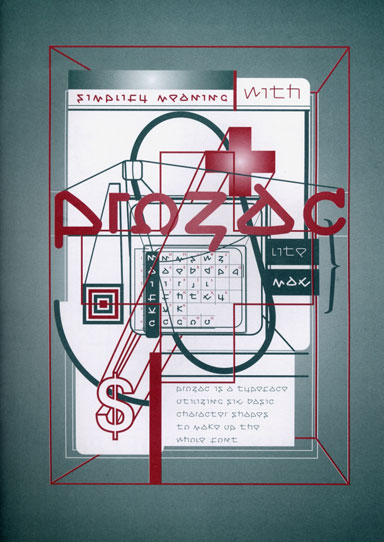
Type specimen for Prozac designed by Jonathan Barnbrook, 1997
“Where are the idealistic fonts, the artsy fonts, the non fonts, the political fonts, the funny fonts, the difficult fonts, the fonts that do not look like fonts, fonts that are frontiers of new belief?”
That’s a very good question. The organizers of “Conceptual Type — Type Led by Ideas” posed it at a conference held in Copenhagen last week. I was invited to speak at the one-day event staged in the Black Diamond, a hulking angular gemstone of a building attached to Copenhagen’s Royal Library. I accepted because this isn’t a line of inquiry, I have to admit, that is much on my mind these days.
Typographic experimentation, which was once a source of feverish interest among forward-thinking designers, ceased to be a pressing concern some time ago. If graphic design in the 1990s was dominated by the idea that type (and typography) needed urgent reinvention — with designers casting themselves self-gratifyingly in the role of visionary architects of the letterform — then the past decade has been a period of consolidation as the type foundries went “pro,” optimized the major font families, and re-launched them in OpenType versions.
The conference organizers, Mads Quistgaard, Steen Ejlers, Ida Engholm and the Royal Danish Academy of Fine Arts, wanted to know what might come next. With an eye, perhaps, on the prevailing cultural turn to the “conceptual” — conceptual art, conceptual design — they wheeled out an old definition from Sol Lewitt:
“In conceptual art the idea or concept is the most important aspect of the work. When an artist uses a conceptual form of art, it means that all of the planning and decisions are made beforehand and the execution is a perfunctory affair. The idea becomes a machine that makes the art.” (“Paragraphs on Conceptual Art,” Artforum, 1967)
I’m not sure how well this much cited text serves the idea of conceptual type, and I said as much in my talk. Type design is a finicky craft in which the smallest details require inordinate care. Is it possible to imagine a successfully realized typeface of any kind where the execution is merely perfunctory? Nor does conceptual art’s lack of concern with visual form offer type designers much room for aesthetic manoeuvre. In type design, the minutely calculated formal differences between one face and the next are everything.

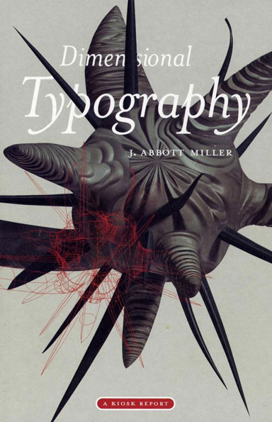
Dimensional Typography by J. Abbott Miller, 1996, showing the Rhizome letterform designed by Miller based on a typeface by Lucas de Groot
Nevertheless, we can see what Quistgaard and his colleagues are driving at. In conceptual type, the underlying idea is the most important factor even at the expense of legibility. “What sets conceptual letters apart is a rigid adherence to their guiding principles above other concerns,” write Bruce Willen and Nolen Strals in Lettering & Type (2009). This idea was always controversial — in the 1990s, these debates earned the reductive and ultimately not very illuminating name “legibility wars.” Perhaps for this reason, some conference speakers preferred to interpret the word “conceptual” as though it simply meant “type with thought behind it,” stripping the term of any useful descriptive or critical meaning.
Given our present-day practical orientation in design — it’s become an ethical imperative, a matter of almost compulsory good citizenship — it’s remarkable, in retrospect, how defiantly conceptual, how unashamedly arty and impractical some type design became in the 1990s. To give just one example here, in my Copenhagen talk, I touched on the Fuse project launched in 1991 by Neville Brody and Jon Wozencroft, and type designer Peter Bil’ak also discussed the project in his conference lecture.
For readers who have never seen a copy, each issue of Fuse had a theme — runes, codes, religion, superstition, disinformation, cyber, pornography, etc.— and four contributors created experimental typefaces around these concepts. Brody, Phil Baines, Erik van Blokland, Pierre di Sciullo, Tobias Frere-Jones, Margaret Calvert, Jeffery Keedy, Ian Anderson, Peter Saville and Cornel Windlin were just a few of the participants.

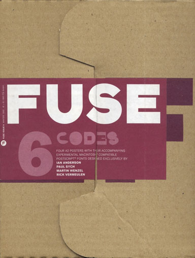
Fuse no. 6, Codes, 1992. Editor: Jon Wozencroft. Designer: Neville Brody
The fonts came on a floppy disk housed in a cardboard box with four folded posters by the designers showing their inventions in use, and an introductory essay by Wozencroft that made few concessions to the insufficiently up-to-speed reader. Fuse’ s self-assigned revolutionary purpose seemed to be nothing less than to remake debased everyday language by remaking and re-mystifying typographic form. This sometimes meant shucking off the dull, familiar outlines of any known alphabet and plunging into a transcendental wonderland of near or even total abstraction.

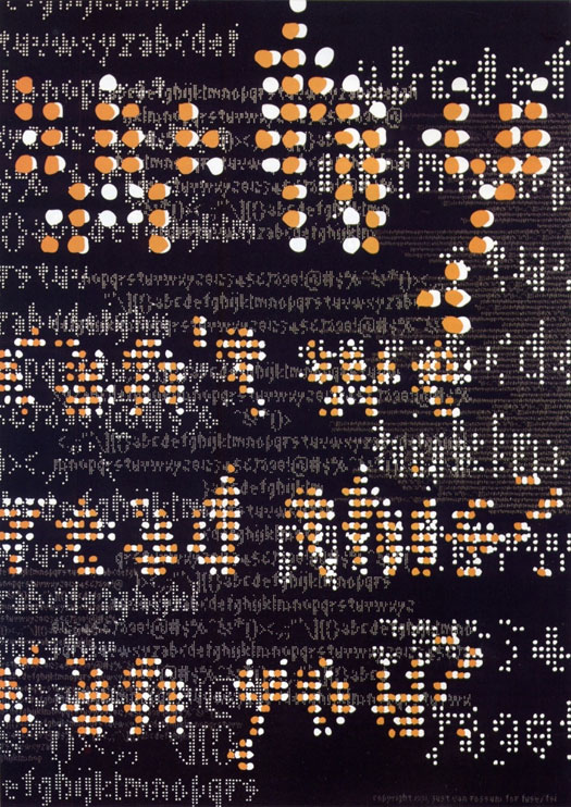
Poster showing Flixel by Just van Rossum from Fuse no. 2, Runes, 1991
Was Fuse a significant series of experiments in typographic history? At this point it’s difficult to tell. It was certainly noteworthy at the time, generating 20 issues and three conferences in London, Berlin and San Francisco, but for a project of this ambition, involving the input of so many designers, it has left surprisingly little trace on the Internet. There isn’t much information about Fuse in the archive on Brody’s Research Studios website. Wikipedia has no entry — a sign of wider neglect — and the references to the project in Brody’s Wikipedia entry are vague.
I had to rummage around in my attic to unearth some old issues. Erik Spiekermann, Fuse’s first publisher at FontShop International, also spoke at the conference and he told me he didn’t have a complete set either. Nor, he thought, did Brody. There was talk of a Fuse book while the project was running; years later it hasn’t appeared. The best critical assessment, though its skepticism didn’t please the Fuse team, is still Michael Rock’s “Beyond Typography” published in 1994 in Eye.
It’s clear, anyway, that Fuse deserves careful re-evaluation, and this is true of the entire phenomenon of conceptual type design in the 1990s. There is plenty of interest today in audacious letter design — from Marian Bantjes’ ornamental calligraphy to the letterform-as-sculpture trend inspired by Stefan Sagmeister — but Fuse professed a larger cultural mission. Despite the efforts of the conference organizers, I doubt this is yet the moment to revisit the kind of conceptual type once pursued with such passion, still less to expect the return of a mass impulse among designers to experiment with type. Although 500 designers and design students attended the conference, it seemed to be appreciation of a local design event conceived on this scale that attracted them rather than the subject itself.
