05.05.04
William Drenttel | Essays

Learning from Las Vegas: The Book That (Still) Takes My Breath Away


Why did its authors hate the design of this book so much?

In 1999, I wrote a piece for Lingua Franca mentioning SMLXL (Rem Koolhaas and Bruce Mau) in which I naively suggested that, "Not since Robert Venturi's [et al] Learning from Las Vegas has the design of a book so eloquently expressed the point of view of its authors." Of course, I was speaking of the work of Muriel Cooper, the MIT designer.

Roger Conover, the architecture editor at MIT Press wrote me a long letter telling the true story. "Robert Venturi and Denise Scott-Brown [and Steven Izenour] found her design so offensive and anathematical to their ideas that they threatened to withdraw publication. There was a knock-down fight between Muriel and Denise, both of them refusing to compromise. The deal we made with them was to go ahead with the cloth edition as Muriel had designed it, and then let them design the second edition — the smaller book which is still in print and which bears very little comparison to the original edition with the glassine wrappers — which in Muriel's view DID reflect the ideas of the authors. But in the author's eyes did not. Perhaps because they could not see as well as Muriel [sic] could the monument that they were in fact building even as they of spoke of anti-monumentality."

Thirty years after its original publication, Visible Language has created a special issue titled, "Instruction and Provocation, Or Relearning from Las Vegas." Among its (very academic) essays is this same story, retold by Michael Golec. Here, he casts a different net: an articulation of the "dynamic (or subjective)" in the 1972 edition by Muriel Cooper versus the "deadpan (and objective)" in the 1977 revised edition by Denise Scott-Brown. It took five years, but the authors got their way: a cheaper, more traditional edition that became a classic in classrooms. But it's also a less complex, less rich rendition of this seminal text. Ironically, the authors acted fearfully in the face of the very chaos that made their visual documentation so compelling.

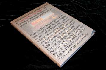
An early example of the designer as auteur, this piece of design history is all about a book few have actually seen. Learning from Las Vegas (1972) is, after all, now a $3500 rare book. Meanwhile, the author's 1977 version is available for $13.27 as a cheap paperback.

There is further history here, as Muriel Cooper, who died in 1994, can be read both backwards and forwards. Forwards, she became the director of the Visible Language Workshop at the MIT Media Lab. (Janet Abrams reflects on her 1994 interviews with Muriel Cooper at MIT in the current issue of ID Magazine.) Her work with dynamic typography in three-dimensional space was the beginning of her impact on interactive design, and a decade later, her influence is still evident. (This Intel commercial by Imaginary Forces/Mark Zurolo is a case in point.)

Her amazing interpretation of Learning from Las Vegas did not come out of the blue: even in 1964, she was exploring new forms of information design in her role as design director of MIT Press. Michael Golec smartly cites the example of The View from the Road, an important and visual study of highways in the American landscape. This book not only foreshadows her typographically complex and cinematic approach to the Las Vegas project, but it obviously is the source of inspiration for approaches later adopted by Richard Saul Wurman.

Learning from Las Vegas, as designed by Muriel Cooper, was a deeply layered experience befitting the underlying argument of this text. Whatever we think of postmodernism today, this book was a fundamentally radical design in 1972 — one that quite literally upset the apple cart of Swiss modernism.

Thirty years later, it still takes my breath away.


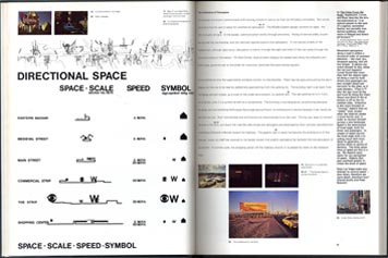
Spread from Learning from Las Vegas, 1972


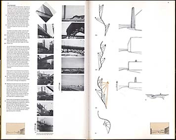
Spread from A View from the Road, 1968

Posted in: Architecture, Graphic Design, History, Media, Social Good, Technology, Theory + Criticism


Comments [19]

Architects can make wonderful collaborators for graphic designers. They can also be willful, arrogant and stubborn. Most of them are terrible at graphic design, and often see its deployment as an unwelcome imposition on their aesthetic vision. I can't tell you how many times I've been asked to create a signage program for a building and been told by an architect, "Well, we feel the building itself is the sign." (Translation: Keep your graphic design the hell off my building.)

Robert Venturi, Denise Scott-Brown and Steven Izenour created a practice that truly embraced graphic design, especially signage, and specifically undesigned, vernacular signage. But it was a radically different idea of graphic design than that which was practiced at MIT by Muriel Cooper. Cooper could have found a pretty clear design brief for herself in Venturi's Complexity and Contradiction in Modern Architecture, with its call for an architecture that would embrace the "messy vitality" of the "ugly and ordinary," as opposed to the heroic purity of Modernism.

But asking Murial Cooper to deliver an ugly and ordinary book design would be like forcing Mies van der Rohe to put a mansard roof on the Seagram Building. The conflict was inevitable. The pity is that a truly extraordinary book is trapped in a pointlessly mundane shell, and Cooper's dazzling alternative is beyond the reach of all but a few big-spending collectors.
Michael Bierut
05.06.04
08:47

What a great way to star the day... an article about Muriel!

I'd have loved to be a fly on the way and seen the arguments she had with Denise about the book's design... I bet things were flying all over the place. As a student of hers ('91), I remember how infuriating she could be. But - in the end - she knew what she was talking about - and for that, we loved her.
David Young
05.06.04
11:24

Wow. I've never seen the cloth edition before now and the paperback design seems more inert than ever. I had always wondered how MIT could let such an important book go virtually undesigned. Thanks for this post.
rebecca
05.06.04
07:13

To be fair to Denise Scott Brown and her colleagues, the crux of her argument with Murial Cooper had less to do with the design of the first edition of Learning from Las Vegas per se and more to do with MIT Press' imposition of a design on the authors' project. Learning from Las Vegas asks that designers and planners be more permissive and more tolerant of what is already there. That MIT Press and Cooper had ignored the authors' central theme seemed (and still seems, according to Scott Brown) outrageous. Despite questions that address the quality of the design of Cooper's first edition versus Scott Brown's redesigned second edition, Learning from Las Vegas has had a deep impact on our culture. Could Cooper's design have further aided the reception of this important text? We'll never know.
Michael Golec
05.07.04
10:49

On view this minute (until June 6, 2004) at the Canadian Centre of Architecture in Montreal is an exhibition "Learning From...Ruscha and Venturi Scott Brown, 1962-1977: Everyday Architecture and Urbanism of Los Angeles and Las Vegas" organized by CCA curator Mirko Zardini. It is a modest but incredibly interesting comparison of the photographs that Ed Ruscha took for his early books (particularly the ones on parking lots) and the Venturi's Las Vegas project. Some of the correspondance concerning the dispute over the design of the first edition (lent by Roger Conover at The MIT Press, who had the prescience to save it) is on view in the vitrines.

The objections of Venturi and Scott Brown, at least those on view in Montréal, are very (insultingly!) specific to the Cooper's design, and explain why they insisted on control of the subsequent editions. Looking back, there are a couple of interesting things about the episode. First, the institutional politics of the situation: that despite such vocifereous complaining on the part of very articulate authors, Muriel Cooper was powerful enough to prevail, and get the first edition out the way she envisioned it. Second, that despite the visual sophistication of Venturi and Scott Brown, they were still resistant - as so many otherwise sophisticated architects and artists are, to this day - to the notion ideas can be conveyed through visual (graphic) means. The second edition is a debased "crystal goblet:" the ugly n' ordinary version of the idea of transparent typographic design.

The fact that Venturi & Scott Brown were engaged and committed to "what is already there" does not really explain their numbness to the possibility of the expression of that idea. Their built projects hardly replicate the commercial roadside vernacular, but instead translate it: if they were so committed to a totally straightforward rendition of the pre-existing, wouldn't they have simply hired local sign-makers to put the graphics on their buildings for them? When I was an undergrad on a class field trip to Philadelphia long, long ago, we visited the firm in their offices and I remember asking them that precise question: and they (I think it was Steven Izenour) replied that of course they would never just go to the source, that they were interested in using the vernacular as a starting point for their own design. So how weird, in retrospect, that they could not see the extension of that attitude into the issue of the design of their own book, and instead went with standard issue, "default" printer's typography of bland academia for their argument (which actually contradicts the visual form the book finally took).

Cooper's first edition is a magnificent specimen of book design, and design history, but I'm not so sure that it is the perfect design for that particular text. There are issues of scale and typography that just a few years later, when postmodernism started to sink in with graphic designers, might have been used to express the content with formal subtlely more comfortable to the authors. But it is all moot now since the tantrum over the first edition resulted in such a brain-dead re-design (or de-design). But thanks to Muriel Cooper for her temerity to to fight for that first edition, and The MIT Press for backing her up: it leaves us all one of the stranger episodes that somehow combines postmodernism, typography, and the age-old struggle on the part of graphic designers to gain some sort of respect for the idea that their work actually supports meaning.
Lorraine Wild
05.07.04
02:26

It would be cool if someone would dontate a copy to scan and put on the web, page by page...any volunteers?
Ken Kelleher
05.07.04
02:46

Ms. Wild makes some excellent points, all of which are covered in my article as well as those by Aron Vinegar, Dell Upton, Ritu Bhatt, and Nigel Whiteley. See Visible Language 37.3.
Michael Golec
05.07.04
03:40

'Too many cooks in the kitchen. . .' was part of the reason there was such a struggle and the '77 edition. Good for Muriel to have been the lone master chef on that feast.
Putting the debate aside -how valuable is the content of this textbook for those who buy the 'cheap' edition these days as students of architecture?
Shahla
05.07.04
05:36

I'm speaking from nothing but fading memory and the evidence you supply in this posting, so be kind. But ...

Am I the only person here who agrees with Scott-Brown, Venturi and Izenour? Snazzy though Muriel Brown's design seems to be in a visual sense, as a reader I find it incredibly off-putting. I'd never actually read such a book. I'd flip through it, letting my eyes enjoy the bounciness and chic of it. Word-wise, though, I'd read nothing but a few captions and headlines and a few lines of text. I'd think "Hey, snazzy design. I'd sure hate to see that happen to my text." I'd mutter things to myself about how all text is to grandstanding designers is a lot of gray stuff to arrange in clusters and columns. And then I'd throw the book aside, having had myself a fun, and near-wordless, visual experience.

The book as she designed it strikes me as a designer's showpiece, not an author's. It seems to me that she's showing off at the expense of the writers, and not providing their work with a modest, attractive, and near-invisible frame, which is what it sounds like they wanted. And why shouldn't they have wanted such a thing? They put a lot of time into their text, probably wanted it related to as directly as possible by the reader, and apparently didn't conceive of their book as a collaboration with a designer.

I don't mean to be huffy. But it seems to me that heavy-on-the-design books need generally to be collaborations from the outset. If someone's worked super-hard on the text as text -- so that it works completely as a sequence of words and needs nothing more but a little presentation to be complete -- then the last thing he/she's going to want is an intrusive design. That'd be like coming up with plans for a pleasant and complete-unto-itself building and then handing them to Peter Eisenman for a final polish.

I guess the rationalization for her approach is ... what? That she's doing in book-design terms what the authors are advocating in their text? I'm not sure I agree. Couldn't the argument be made that "learning-respect-for-plain-wrapper-type book design" would be more in line with the book's argument? And anyway, putting all that aside, why should the design of a book so thoroughly do to the style of the book's presentation what the argument of a book advocates? That seems to me like head-up-the-ass reasoning, as well as liable to fall under the category of, say, underlining the obvious.

I dunno. Seems to me that there's a time and a place for showy, innovative book design, and that this wasn't it. There's a time and a place for semi-invisible, er classic and transparent, book design too, no?
Michael Blowhard
05.07.04
06:36

Er, I got a little overexcited and forgot my manners. Apologies for being impolite: lovely posting, and many thanks for it.
Michael Blowhard
05.07.04
06:38

Specific details of the typographic design (especially all that line spacing) of the first edition of LFLV are dated, undoubtedly. And I actually think that the contextualism that would have perhaps led both parties into a more flexible collaborative "stance" is part of the later influence of postmodernism (on graphic design practice, anyway) that I alluded to in my earlier post. But to me it's pretty hard to argue with the sequence and presentation of the images, particularly the analytical documentation of buildings and signs in space on the strip of Las Vegas. That work simply isn't as visible in the later editions, a sacrifice that seems pretty extreme for the sake of the "ordinary." What would be the point of rendering all of that visual documentation "semi-invisible?" Why make a map out of every word of every sign on the Strip (a wonderfully historic document now that the Strip is in such a bloviated state) if one didn't intend for it to be able to be read ?
Lorraine Wild
05.07.04
07:23

If anyone is looking for them, both the 1972 and later editions are offered for sale on abebooks.com. Curiously there is also an affordable 1968 pre-print.
Toby
05.10.04
10:43

I'm happy to find this site (courtesy of 2blowhhards.com) and happy to know I own a $3,500 book.

As an architect and urbanist, it seems to me that graphic design suffers from the same problem as architecture and urban design. Namely, the Modernist idea that design is about the heroic singular vision of the designer (see Howard Roark). Frankly, this is why our cities are so f***** up.

In the traditional city, the first role of the architect is to shape the public realm: the city is more important than the building. Within that framework, the civic building is more important, and gets a place of honor. But the idea doesn't work without the framework.

Peter Eisenman, Rem Koolhaas, Zaha Hadid et al don't believe this. They think the purpose of architecture is to allow them to erect monuments to their own genius.

More importantly (because those guys build about one tenth of one percent of what's built, if that), most shlock architects, developers and builders believe that what's important is their building -- put the parking lot in front, where people can see it; make it an object, so people can admire it; etc. With the exception of a few places like Manhattan, this is universal in America. And it's a big part of the reason why America looks like s***.

SIDEBAR: Jim Kunstler (Home From Nowhere, Geography of Nowhere) says that when you weaken the public realm you weaken the common good, and democracy suffers. I agree.

What does this have to do with graphic design? Easy.

Robert Venturi and Denise Scott-Brown have spent their long and distinguished lives developing an aesthetic which is intensely important to their place in the world. If you work for Bob, you soon learn that he cares about every line and every dot on every drawing.

And then a graphic designer comes along, picks up the baby that these two have been laboring over for two years with blood, sweat and tears and says, "No, my vision."

As designers, I don't see how you can fail to understand that. Imagine the the graphic designer you most hate. Then imagine that graphic designer was picked to put together the AIGD monograph on your life's work. Would you say, "Okay, whatever he wants."?

Like Michael, I look back on the preview of what I wrote and found it overwrought. But as an author, I have to say, don't you realize how upsetting it is to a designer to have another designer impose an alien and unsympathetic vision on your work?
John Massengale
05.16.04
11:40

John, thanks for your comment. However, it seems to me like you want to have it both ways. Kunstler and New Urbanists argue against the model of heroic architects creating isolated masterpieces, impervious to their urban contexts. Doesn't the interaction of different voices and different points of view provide a partial remedy for this?

Yet, in the second part of your comment, you position Venturi and Scott-Brown as authors of a unique, inviolable work of art, fully entitled to object if a single line or dot is altered. As I recall, this was Howard Roark's position almost verbatim. When his building was changed, he blew it up; when Venturi and Scott-Brown's book was altered, they had it reprinted.

Publishing is a collaborative process, and different people do what they do best. Sometimes authors are so close to their work they are unable to understand how best to communicate their ideas to a larger audience. Good graphic designers acting as surrogates for that audience can provide a necessary act of translation.

in the end, collaboration is hard, especially between modernists and their discontents. If you want to see a truly uncomfortable moment in a documentary film, just watch Richard Meier and Robert Irwin "colloborate" on the landscape of the Getty Center in the (optimistically titled) film "Concert of Wills."
Michael Bierut
05.16.04
02:59

It seems to me that in the process of going from the specific to the general, I'm getting tarred with stereotypical positions I don't hold. (Perhaps you feel the same about what I said -- I'm not sure how much we actually disagree.)

First of all, I'd rather talk about urbanism, than "what New Urbanists say." Duany and Kunstler are friends and colleagues. If I quote them it's because they've made a point well, not because I'm swallowing the Kool-Aid.

Having said that, what is on the cover of The New Civic Art, but Gehry's Bilbao Guggenheim, a great building? (Chosen for the cover, I might add, by Duany and Plater-Zyberk, not the book designer.) That makes 2 points.

1) The principles of ubanism do not oppose Modernism, object buildings, or even personal experession, as your comment perhaps (?) suggests. 2) It is precisely the principles of urbanism that set the context for the Guggenheim, like a jewel in a setting. By that I mean, it is a civic building, and therefore an object building; the museum is axially placed at the end of a street, perfectly terminating the vista; it sits in the bend of a river, well placed for an object building; its shining titanium skin contrasts with the masonry and stucco buildings surrounding and framing it; its soaring, dynamic shape contrasts with the gravity-induced, load-bearing forms surrounding it.

There is nothing in urbanism that opposes the work of genius. The form of the city demands, however, that the genius work differently in the background building framing the vista than in the object building terminating the vista.

That was one of the points of Complexity and Contradiction.

In the end, on the other hand, anyone who loves design has to love great design. If Venturi, or Zaha or someone unknown to us designs a great building, I'm not going to complain about it.

But if I were the client, I might, and that's where we're disagreeing. As an architect, I try to put myself at the service of the client. If I think that won't work, I don't take the job. And that's what I think the book designer should have done in this case.

As designers, I think we should realize how important how important is to us and to others, and not try to force our vision on others. If any of us were in the position of Bob and Denise, we would not be happy.
John Massengale
05.16.04
03:31

Sorry, I'll try to make this a short follow-on.

Kurt Andersen had Bob and Denise on yesterday. I said to him that PERSONALLY I don't like their buildings, or their planning, BUT that I was happy to hear them on their show because they are so talented, intelligent and well-intentioned. If the last adjective sounds as though it is supposed to diminish the first two, it is not.

They are complicated people (aren't we all), but they really try to serve their clients and the communities they build in. I don't think any of us should feel that we FUNDAMENTALLY know better than our clients. If the point comes when we think we do, we should resign the job.

That does not contradict the fact that it is our job as professionals to do the job as well as we can. These are merely two sides of the same coin.
John Massengale
05.16.04
03:39

John, I agree that the relationship between modernism and urbanism is a complex one and not easily reducable to stereotypes. I suspect, as you do, that our positions are actually pretty close.

You raise an interesting point when you suggest that Muriel Cooper was not serving the interest of her clients in her design of LFLV. I wonder whether she felt the client were the authors (Venturi, Scott-Brown et al.) or the publisher (MIT Press). When I've designed books, more often than not it's been the publisher to whom I've felt responsible.

In my experience, a clearly defined client and a clearly defined brief are the most important elements to creating a successful design. Maybe that was the key problem here.

By the way, if anyone else out there missed (as I did) Bob Venturi and Denise Scott-Brown on Kurt Andersen's radio show Studio 360, you can catch it here.

Michael Bierut
05.16.04
04:54

If MIT Press was ultimately responsible for the design, publication and distribution of the LFLV text, which book best serves their interest? The easy answer, it seems, would be which ever version allows MIT Press to realize the largest return on their investment. As an object, it sounds like the '72 edition is held in higher regards than the later edition ($3500 vs. $13.27!) I realize that MIT did not recouperate $3500 for every '72 edition sold, the price of the book reflects the quantities available. However, the demand for the object must also reflect how it was designed - that is, theoretically it is the same material presented in both books, just a different design. If the later addition is a more accurate rendition of the LFLV project, why would anyone want the '72 edition? Can we not assume that the market value is an indication of consumer preferrence and from this preference do we not find that the '72 edition is a more engaging design? Afterall, why would the book buying public want a less interesting edition unless it was significantly less expensive?
jon grizzle
05.16.04
07:03

I once saw Venturi give a lecture about a museum project where, instead of talking about the design that was going to be built, he produced a dozen new schemes on an overhead projector. Letting any design opportunity (book design, napkin design, etc.) go must be extremely painful for them. It is safe to say that the "homely", "ordinary", and "cheap" version of LFLV takes their breath away to this day.
Mark Yoes
05.21.04
05:22


Jobs | March 28