
Heller packaging program, 1968, designed by Vignelli
When I was a kid the other kids in school used to joke that I was going straight to Hell because my name was Heller. If I heard it once I heard it a thousand times…a day. And I’d be lying — and probably would go straight to Hell — if I didn’t say the joke got tired very quickly.
When I was a kid the other kids in school used to joke that I was going straight to Hell because my name was Heller. If I heard it once I heard it a thousand times…a day. And I’d be lying — and probably would go straight to Hell — if I didn’t say the joke got tired very quickly.
Heller was a double-edged sword of a name. It was demonstrative (proud) and blasphemous (embarrassing). Other surnames were lyrical; some were poetic, but mine was a verbal command with certain negative connotations (if indeed you believed in Hell). Nonetheless, whenever I was called down to the principal, which was to say so often I had my own chair and desk in Mrs. Spellman’s office, I’d dread the sound of “Mr. H-E-L-L-E-R, get down to the principal now!” I didn’t have to even hear the rest, “H-E-L-L-E-R,” said it all; it was as though the teacher spoke in letter spaced all-caps Railroad Gothic. How I wished my name was more lower-case, like Smith, Jones or Boone.
But this story is not about me; rather it is about another Heller (in upper and lower sans serif) and Vignelli (in Bodoni). In fact, Massimo Vignelli lifted the yoke of H-E-L-L-E-R off my back. Free at last!
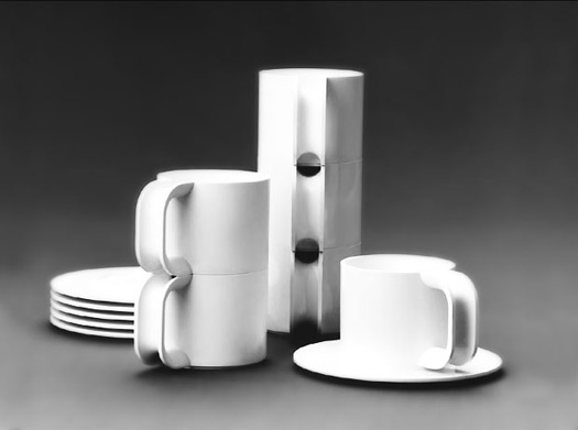
Heller Compact Stacking Cups, 1970
It was the late seventies when I saw the packages for Hellerware for the first time. Never before had I seen Heller composed in such handsome type. Upper and lower case, neatly letter spaced Helvetica printed in bright red. Most packages for dishware was relatively benign, often letters were set with elegant swashes or baroque curlicues. But Heller was bold yet simple, minimal yet weighted. In addition to it being eye-catchingly handsome, it was my name writ large. And on the smaller boxes it even said Hell on the front and er on the side. What audacity! What modernity! What an honor to have my name so beautifully displayed.
If you’re wondering whether the Heller of Hellerware and I are related, we’re not. It turns out that my real family name was Geller, changed when my grandpa got on the “H” line at Ellis Island. But even before that, it was changed from Gellermanovich. I guess things could have been worse. Just try turning that into Helvetica.


