I remember like it was yesterday. It was a cold, damp day (or was it warm and sunny?) in 1970 (or 71?), well anyway, a brand new New York newspaper landed on the newsstands. What a surprise! Compared to The Daily News, New York Post, The New York Times and The Village Voice it was a breath of fresh newsprint. All that unused white space, precisionist modular layout and limited use of typefaces and point sizes — The Herald designed by Massimo Vignelli was so beautiful I could cry.
In a field marked by ham-fisted formats cobbled together in metal by crusty veteran “make-up editors” who possessed “news judgment” yet had little interest in the finer points of design, The Herald was a rare gem. A few other jewels shined in the newspaper business prior to The Herald, including its namesake, the defunct New York Herald Tribune redesigned in the mid-sixties by Peter Palazzo. And at the Times, design director Louis Silverstein was feverishly redesigning the “grey lady” starting with the feature sections, although the news would remain locked in a 19th century tight eight-column format for almost a decade longer. The Herald, a weekly, was a clean, crisp and rational alternative.
I worked as a designer in the New York underground press. To call these underground papers “alternative” suggested how naively unstructured they were. They were also sloppy (although exuberantly so). Most “layout” people were not and would never be designers. But I had aspirations to be a pro. The Herald was my model in this quest. But that’s enough about me.
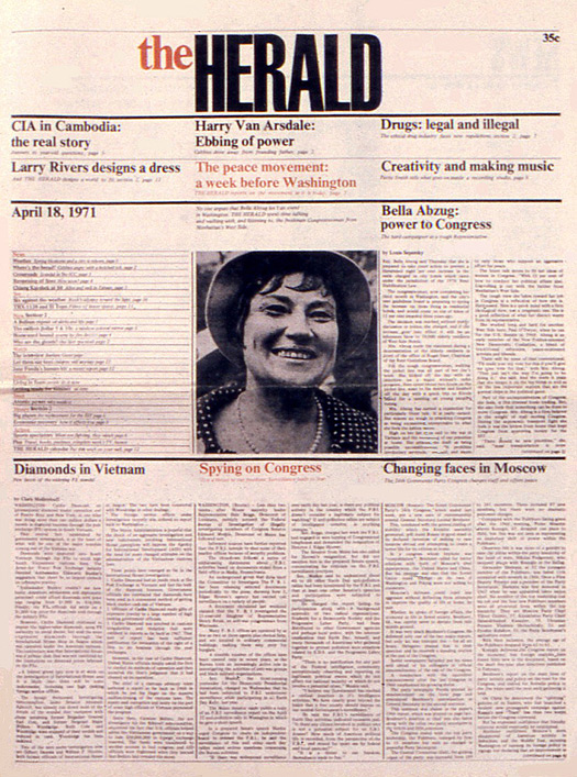
The Herald, April 18, 1971
Vignelli welcomed the opportunity to try his hand at newspaper design. Many designers tried transforming the conventional daily, but so much stuff got in the way. Advertisements for one! Vignelli railed that “selling every bit of newspaper space to advertisers” was a principal failing. Partial page ads were blights around which dog-legs and other onerous wrap-around and layout contortions had to be accommodated. Modular layouts based on standard-size units were not yet accepted. So it was revolutionary (in a conservative kind of way) for Vignelli to institute a modular format. Of course, he was aided and abetted by not having to deal with ads — The Herald wasn’t accepting them in the beginning.
In fact, Vignelli was adamant — advertising must be kept away from the editorial. “He started working on the layouts, testing [the proposition] that you could still do a newspaper without advertising, or [have] all the ads concentrated in some specifically designated pages,” says Beatriz Cifuentes, Vice President of Design at Vignelli Associates.
In fact, Vignelli was adamant — advertising must be kept away from the editorial. “He started working on the layouts, testing [the proposition] that you could still do a newspaper without advertising, or [have] all the ads concentrated in some specifically designated pages,” says Beatriz Cifuentes, Vice President of Design at Vignelli Associates.
“It takes people with vision, courage and strong intellectual drive to generate a new newspaper with new style of content and new visual aspect to convey it appropriately,” Vignelli noted in Vignelli From A to Z. “To design a newspaper means to organize the information in such a way that it will facilitate the makeup of the issue…and in the end, to convey the information to the reader in the clearest way possible.”
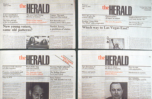
The Herald, four front pages
This prohibition of advertisements allowed Vignelli to “conceive and design a newspaper in a completely new way,” he further explained, “starting with a grid of six columns of 17 modules in height. Each module contained a certain number of lines, each line a certain number of letter spaces, making it easy to calculate the depth of each story based on a given amount of words.” Vignelli’s precise measuring system prefigured notions endemic to computer-aided design by two decades. Every design component was allotted a strict measure. “Titles were allocated one module high, the rest were for picture and stories, and in the supplement tabloids (The Herald was a “sectioned” paper with two supplements inside), modules were allocated also for white space rarely seen in newspapers…. Every page or two constituted a section of the whole paper, and all pages were structure in clear horizontal bands, which gave a strong, easy-to-read look.”
Readable it was, yet critics complained that The Herald was too pristine. Newspapers, it was argued, are meant to be as dirty as ink on newsprint. Presenting the reader with variegated headline sizes and subheads was a metaphor for the frenetic pace of a news cycle. The Herald was bland: Without hierarchical titles — and set in only one typeface (Times Roman) — a lead story was given the same importance as an off lead. However, Vignelli emphasized that newspapers were equipped for fast production. “And indeed [this] was produced quickly!”
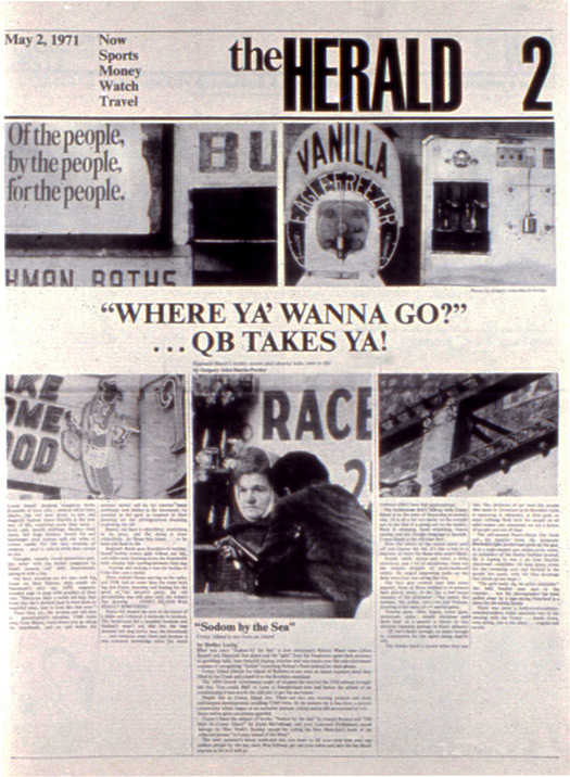
The Herald, May 2, 1971
Vignelli said The Herald was “a very important experience for me, and it was followed with great attention by newspaper designers around the world.” Furthermore it led to designs for other newspapers he designed, including the European Journal, Skyline and IDCNY.
The Herald folded, however, because “in those days, newspapers were controlled by mafia groups,” Vignelli laments. “And either you paid big quantities of money, or your paper would be destined to disappear soon. I guess that is what happened.”
As fate would have it, about a year after The Herald went to sleep with the fishes, the publisher contacted me about art directing a revived version, which he was thinking of renaming (though I don’t recall what). He also planned to retain in tabloid form aspects of the Vignelli format. I worked on one issue, trying to stick to the original look. Nonetheless, I couldn’t help myself; I busted the grid and introduced various headline type sizes and multiple quotes. All I can say in retrospect is, I could cry. Sorry Massimo.


