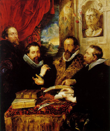
The Four Philosophers, Rubens stands at left, behind his brother Philip, who sits at a table with Justus Lipsius (wearing the fur collar) and Jan van den Wouvere, a family friend
Today, Peter Paul Rubens is celebrated as the Old Master with a taste for canvasses grand in scale and extravagant in splendor — a man who liked to work big, in all senses of that word. Rubens, no doubt, enjoyed painting large pictures with large themes and large women. These works, however, have an unfortunate tendency to occlude his many other accomplishments. Rubens was a child of the baroque, but a renaissance man, and one of the most accomplished in history. Though he considered painting to be his true calling — he called it his “dolcissima professione” — it was actually just one of his several careers. In his day, Rubens was also revered as a diplomat, an architect, a classical scholar, and even a graphic designer, though there was really no such professional designation at the time. Indeed, he was as comfortable working at the small scale of the printed page as he was on a massive series of paintings destined for a royal palace.
For Rubens and his contemporaries, a certain broad diversity of knowledge was considered a necessity. Expertise in the natural sciences, politics, religion, and history were understood to be mutually informative aspects of a single world system. In our own modern age of specialization, there is an unfortunate tendency to label this kind of general interest as dilettantism. In graphic design, of course, it remains useful. As Michael Bierut has written on this very site, “the more things you’re interested in, the better your work will be.”
Most of Rubens’s work as a graphic designer was conducted in the service of the publishing industry: he created elaborate title page designs, illustrations for books, and what today we might call “identities” for publishing houses. This was highly unusual. While earlier figures like Durer and Holbein had made the occasional woodcut illustration, no other major artist had worked for the publishing industry with anything close to the frequency of Rubens.[1]
Why did Rubens take up this putatively “minor” commercial art when he had so much else on his plate? Beyond his own broad field of interest, the most obvious answer is that Rubens simply loved books. He read them, wrote them, collected them, and painted them in his pictures. They were surely an inspiration to him: his works are saturated with literary references. Rubens was a man of letters, and liked to associate with others of a similar erudition. In a famous group portrait, he appears with his brother, a noted scholar, and the great philosopher Justus Lipsius, their mentor, behind a table laden with books.
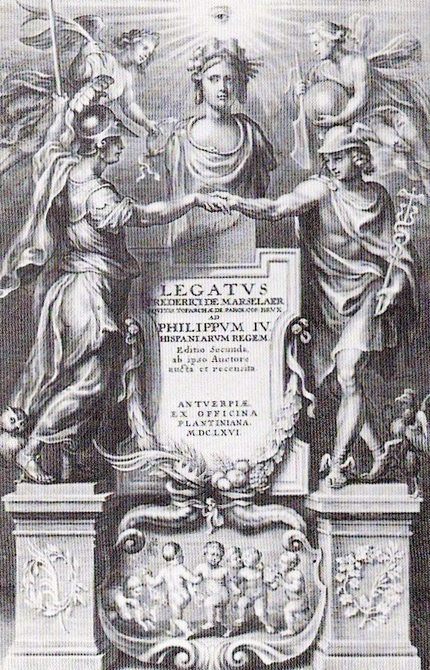
The title page Rubens designed for Legatus, a primer on diplomatic conduct by Frederik de Marselaer
One of Rubens’s closest friends was the poet and publisher Balthasar Moretus, the grandson of Christophe Plantin, the founder of Antwerp’s Plantin Press. The two went to grammar school together in that city, and remained close throughout their lives, though they were an odd match as adults. Rubens was hale and handsome, Moretus a half-paralyzed bachelor. They were nevertheless two of Antwerp’s preeminent citizens, and the large workshops they built for themselves became (and remain still) destinations for tourists.
Moretus was Rubens’s most frequent design client. To save his friend money, Rubens generally did his work for Plantin on holidays, so he would not have to charge Moretus his rather exorbitant day rate (Rubens was notorious for his high prices), and even then he agreed to be paid in books. The titles for which Rubens designed varied widely in subject matter: there were religious texts, scientific works, philosophical tracts, even a two-volume monograph on Genovese architecture that Rubens authored himself. That diversity was in large part attributable to Moretus’s vision. Under his direction, Plantin, which had come to prominence as a publisher of liturgical works, greatly expanded its list of titles in the humanities. As with religious texts, state and church privileges were required for these works, a form of censorship that had the benefit of protecting the copyright for the author and publisher. Plantin was just one of several distinguished presses in Antwerp, a center of the European publishing trade, and hardly the only house for which Rubens worked. His support of the city’s publishers, as both a designer and consumer of books, may be attributed in some part to the sense of civic duty that led to his engagement in politics. (Rubens’s diplomatic career is the subject of my new book, Master of Shadows.)
Rubens’s was most often called upon to create elaborate frontispiece or title page designs. These were complex allegorical compositions that typically framed some kind of architectural device (a stele, a shield, an open book) that carried the title information, which Rubens would sometimes write in by hand to aid the typesetters. (It has been suggested that Gian Lorenzo Bernini modeled the tomb of Pope Urban VIII on one of Rubens’s title page structures.) Like his paintings, these works, with their intricate symbological systems, could be complex to the point of opacity. Sometimes, the books in which they were printed would actually carry an explanatory text. The scholar Julius Held has suggested that it was the intellectual challenge of composing these allegorical puzzles that drew Rubens to design work.
Rubens generally prepared his designs with pen and ink on paper and sometimes as oil sketches. These studies were then passed on either to intermediary draftsmen or directly to an engraver, who worked at the artist’s direction. Rubens and his deputies could be quite exacting, as a letter to an engraver from the draftsman Erasmus Quellenius indicates:
“I hope you will not mind my frank opinion about this print which has been very well engraved. Yet it is not quite clear what God the Father, sitting with his scepter in the center above, has in his right hand. In order to facilitate a better execution I should like to inform you that it is a book with seven straps, each of which has a seal in this manner…. Furthermore, the head of the same God the Father is rather large, as are his hands, particularly the left one, and most of the heads are in fact somewhat too large…..”
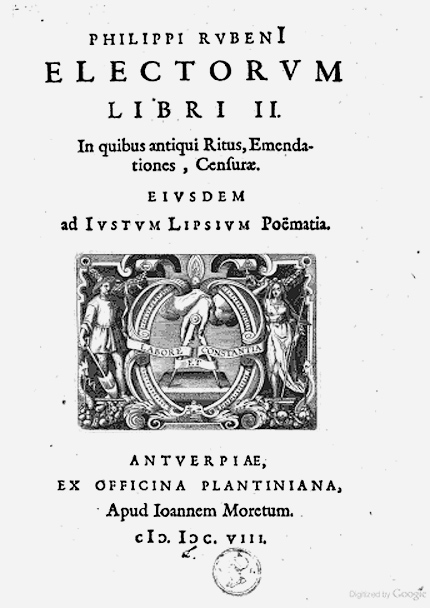
Title page for Electorum Libri II, by Philip Rubens, with the Plantin "golden compass" colophon. Rubens did not design the title page, but contributed several illustrations
Given Rubens’s reputation (and that kind of attention to detail), authors were generally thrilled to learn that he had been commissioned to illustrate their work. “I know that Rubens, with his divine genius, will find something for that page, suitable to my poetry,” one author wrote to Moretus about a proposed design. Another told Moretus, “I prefer his judgment and your judgment to my own thoughts” — a phrase sure to warm the heart of any publisher.
Those with the temerity to question Rubens were typically shot down, posthaste. When an author suggested that one of the artist’s allegorical figures might be too scantily clad, for instance, Rubens responded that she was “covered sufficiently,” and that ended the matter. Rubens answered a Benedictine monk’s complaint that he had incorrectly placed the Virgin Mary in one of his compositions with a reference to a Psalm specifically describing her in the position in question. He wasn’t always right, though. One of his illustrations for a book on optics wrongly demonstrated the relationship between luminosity and distance. Of course, he could blame the author for that mistake.
One of his more intriguing compositions, given his personal history as a clandestine agent and political operative, was his design for the title page of a book on diplomatic protocol. The author, Frederik de Marselaer, had actually consulted Rubens when he was editing the book, as he was considered an expert on such matters. For the book’s title page, Rubens placed the figures Minerva (representing wisdom) and Mercury (patron of ambassadors) reaching out to one another below an allegorical personification of “good government,” itself crowned by the towers of a vigorous city. Rubens took so long delivering the image that it could only be used on an edition of the book published after his death. The author and the publisher, however, were pleased to have it despite the wait. It had taken some time, wrote Moretus, “but it will also last long!”
Rubens found inspiration where he could, often in the antique. He was especially interested in the insignias and symbols of ancient coins and medals, a fascination he shared with his friend Moretus. These pieces may well have served as models when he was asked to design logos for Antwerp’s publishing houses. Moretus himself hired Rubens to redraw Plantin’s “golden compass” colophon, still a familiar mark for bibliophiles. The compass suggested the firm’s all-encompassing publishing program while neatly illustrating its “labore et constantia” motto — the swing arm of the compass representing “labor,” the stationary pivot “constancy.” Rubens also designed a colophon for the publishing house Meursius. This mark placed a chicken (the press was based in a building known as the “Fat Hen”) between the familiar gods Minerva and Mercury. The hen, if not the most distinguished of icons, at least suggested the idea of fecundity.
Perhaps the artist’s most elegant mark was a simple, informal one made offhand and for himself early in his career. Adjacent to his name in an Antwerp guestbook, he sketched a small circle with a dot at its center. Above, he wrote the Latin epigram “Medio Deus omni campo.” "God is all things in the middle of the field." Art’s most celebrated exemplar of the great and the grand saw himself as a man of quiet moderation, a single point in a disc no bigger than an antique coin.
For more about Rubens, please see Mark Lamster's new book Master of Shadows: The Secret Diplomatic Career of the Painter Peter Paul Rubens (Nan A. Talese, 2009).
Notes
1 The definitive source on Rubens’s design career is Rubens and the Book, edited by Julius Held (Williamstown: Williams College, 1977). Held’s collection Rubens and His Circle (Princeton: Princeton University Press, 1982) is also invaluable.


