A Better World by Design conference at RISD/Brown in early October 2009." /> A Better World by Design conference at RISD/Brown in early October 2009." />


10.05.09
William Drenttel | Gallery

Better World by Design Poster

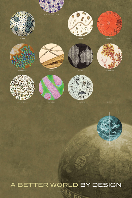
Poster commissioned by A Better World by Design Conference at RISD and Brown. Design by Winterhouse, 2009

For some time, Jessica Helfand and I have been collecting samples of microscopy — microscopic photography and illustration — which includes everything from actual science photography to early scientific illustration from our library, a good deal of which is inspired by the petri dish. Where this poster was concerned, there seemed to be a certain visual richness in the idea that A Better World by Design might be inspired by early illustrations of pollution ("Monsters," for example, takes its cue from pollution in the Thames River in the mid-19th century) while more lethal afflictions ("Bubonic Plague," "Diarrhea" and "Parasites"), and even diagnostic images in early medicine ("Eyeball"), had their place also. To us, the notion of gesturing to A Better World by Design became an invitation to express a perspective on how we actually inhabit the earth, which is itself a reflection of the fragility of our bodies and of the planet we call home.


Comments [8]

Dated navel-gazing.
Go over to gigposters.com and learn how to design a real poster.
Michael Nott
10.14.09
01:53

I would not have gathered any of the ideas you describe in your text by looking only at the poster. I find the image (ie the poster) almost impossible to read.
chris
10.15.09
05:23

You may be interested in the 2009 RE:DESIGN Awards, which relates to some of the issues discussed above.

Modern Painters magazine and Louise Blouin Media are looking for innovative and environmentally sustainable designs that thoughtfully explore new ways to live, work, play and interact in the domestic environment.

For more information visit:
http://promotions.artinfo.com/mp-re-vision/
Olivia
10.15.09
02:33

Didn't really dig this poster all that much but that's what makes us different, we all have different tastes in art

< href=http://www.broadstonemedia.com>Orlando Website Design
Lsams
10.15.09
08:37

as for me, I like this poster and the upper part of it, too small to be read, in homepage, made me click on the note, and I would like to be able to design as good a poster and use evocative old stuff that way.
thx for this blog.
clemence
10.16.09
04:39

I like it.
rimshot
10.19.09
04:21

very 1950's Graphis Advertising Annual feel to it. Nice.

I checked out gigposters.com. You must be young, Michael.
Lots of deer and dragons 'n stuff.
Ricky Tick
11.01.09
07:38

Okay I'm convcnied. Let's put it to action.
Servena
07.27.11
10:00


Jobs | April 19