Typography


On Fighting the Typatriarchy
"My intent was to make a typeface that stands for the strength of a woman at different times in her life. In Indian culture, a woman is expected to be the powerhouse of responsibilities." An excerpt from Feminist Designer.


Caroline Fuchs
On Design, Courage, and the Power of Typography
Opening remarks given by Dr. Caroline Fuchs, Curator at Kuratorin bei Die Neue Sammlung The Design Museum at the opening of Paula Scher’s new retrospective, "Paula Scher: Type is Image."


Jessica Helfand
Type is (More Than) Image
From record albums and book covers, to editorial illustration and identity programs, to three-dimensional environmental graphics all over the world, typography has always stood at the core of Paula Scher’s work.


Nancy Sharon Collins
Mount Street Printers
Specialty printing shops are special, indeed.


Kathleen Meaney
Asafo-fonts
The best graphic design teacher is over 100 years old, a brilliant story-teller, and still dances on air.


Richard Baird
LogoArchive pLAy
LogoArchive began by documenting the forms, form language, and meaning-making that developed out of mid-century modernist identity programs.


Debbie Millman
Design Matters Live: Gemma O'Brien
From a life-changing letterpress moment to early viral fame and the current COVID crossroads, Gemma O’Brien remains a master of illustrious letterforms.


Steven Heller
Ferro’s Letters
An unpublished book of lettering from the great Pablo Ferro.


Brian LaRossa
The Tension Between Graphic and Type Design
Ask someone on the street if they’ve heard of Helvetica and they’ll likely say yes. Ask them who designed Helvetica and I guarantee they’ll have no idea.


Steven Heller
Seymour Chwast: Few Words, Many Letters
Seymour Chwast, a man of few words, wishes there were more than 26 letters in the alphabet.


Steven Heller
The Americanization of 20s New Typography; Or the Soft Sell of the Avant Garde
Die Neue Typographie (The New Typography), the early 20th century revolution in graphic design, is being re-evaluated this year in light of the Bauhaus centenary.


Michael Bierut
S6E4: Reneé Seward & Chester Jenkins
Reneé Seward teaches communication design at the University of Cincinnati and is the founder of See Word Reading. Chester Jenkins is a partner in Constellation, which creates new typefaces, and Village, a coop that publishes them.


Ken Gordon
Four Reasons You, Young Designer, Should Read This Academic History of Empathy
Empathy, you must know by now, is a major keyword in the design business.


Steven Heller
Benjamin Sherbow: The First Typographer?
Steven Heller brings us the story of Benjamin Sherbow, who revolutionized typography in the early 20th century.


Steven Heller
Initial Caps: The Birth of Illustrated Typography
The “clip art” of Medieval manuscripts.


Debbie Millman
Matthew Carter
Debbie talks to the great type designer Matthew Carter live on stage.


Sean Adams
The Strange Case of the Designer
What makes a graphic designer strange? Is it the obsessive attention to kerning on street signs, arguing whether PMS 172 is orange or red, or collecting odd scraps of paper on every European vacation?


Sean Adams
The Design of Comfort
What I found in the typography of Disneyland was an incredibly dense design solution beyond typography with intentional choices to create a specific experience.


Maya P. Lim
Why Not Futura? How Futura is Actually a Conversation with the Past
Maya P. Lim talks to Never Use Futura author Douglas Thomas.


Steven Heller
Typefaces: The New Plaster Casts
A typographic homage to Ladislav Sutnar.


Maya P. Lim
Never Use Futura
It could have been Never Use Comic Sans. Or Never Use Arial. Or—dare I write it?—Never Use Helvetica. Instead, Douglas Thomas chose Futura.


Finding Marguerita
With her designs, Marguerita Mergentime was stirring up conversation, provoking human interaction, and providing a visually compelling backdrop to socializing long before today’s concept of user experience had evolved.


House Industries
Finding a Kindred Spirit
“I’m not sure if we needed a new logo and thought of House, or if we needed a new logo because of House.” —Jimmy Kimmel


Christopher Calderhead, Jerry Kelly
Celebrating Hand Lettering
Surely the alphabet is one of the major accomplishments of mankind, and the artistic expression of this utilitarian creation can eailsy rise to the level of fine art,


Nadine Chahine
Singing in Arabic
“Isn’t there space for more than one Arab narrative?” Advocating cultural respect through typography.


Michael Bierut + Jessica Helfand
Episode 49: My First Tattoo
Tattoos, Type 1 diabetes, ID cards, taking MBA students to the art gallery, Kerry James Marshall, Mark Rothko, Mike Mills, the 2017 Citizen Designer Pledge


Michael Bierut
Battle Hymn of the Tiger Mentor, Or, Why Modernist Designers Are Superior
Does a strict upbringing make you a better designer?


Michael Bierut
The Typeface of Truth
What are the implications when Errol Morris declares the typeface most likely to induce credulity is Baskerville?


Debbie Millman
Design Matters from the Archive: Tobias Frere-Jones
Debbie talks to type designer Tobias Frere-Jones about his career and why typefaces are like the air we breathe.


Jessica Helfand
Logocentrism
For Paul Rand, a modern mark was a simple mark, and the secret to making things last lay in keeping them simple.


Steven Heller
Dashboard Type
What Type of Driver Are You?


José Teunissen
Fashioning Type
Fashion, graphic design, and the body


Hans Rudolf Bosshard
Building Blocks of Type
The lettering of city buildings: observation and readability


Steven Heller
The D Word: Feral Type
Josef Váchal’s bookplates


Petr van Blokland
The Future of Typography
System Reboot?


Ellen Lupton
The Making of Typographic Man
The self-reflexive type


Jason Murdock
Face Forward: Fluid Identity
The End of the Rebrand?


Cathy Gale
Face Forward: X Marks the Spot
The multiplicities of X


Steven Heller
The D Word: Paolo Soleri + Donald Wall
Where visionary architecture and design met


Aoife Mooney
Face Forward: Express Yourself
Fluid Expression In Typeface Design


Sara Jamshidi
Face Forward: Tobias Frere-Jones
A new typography + design conference


Steven Heller
The D Word: Titling Type
Earnest amateurs and DIY type


Adam Harrison Levy
Clickety-clack
The lost (and found) art of the typewriter


Debbie Millman
Design Matters From the Archive: Louise Fili
Debbie talks to Louise Fili about designing book covers, designing for restaurants, about why she prefers working for small businesses, and about the importance of sketching.


Debbie Millman
Design Matters From The Archive: Marian Bantjes
Debbie talks to Marian Bantjes about her daring typography and her highly ornamental designs.


Adrian Shaughnessy
Typographic Tipping Point
Have we reached peak typeface?


Ava Kofman
The Printer’s Progress
The (book) art of ideals


Rick Poynor
Posters by Hans Hillmann for Jean-Luc Godard’s Films
The work of a master of cinematic graphic design


Erik Spiekermann
Should Architects Understand Type?
The relationship between architecture and graphic design has deep roots.


Rob Walker
“Kern Your Enthusiasm”
HiLobrow's "Kern Your Enthusiasim" is a smart, insightful series about lettering and typography


Jason Santa Maria
On Web Typography: Smart Quotes
Punctuation is a system.


Rick Poynor
The Mysteries of France:
A Gothic Guidebook

Guide de la France mystérieuse, illustrated by Roman Cieslewicz, is a surreal beast of a travel book.


The Editors
Parametric Posters from MuirMcNeil
New posters by MuirMcNeil demonstrate the parametric principles of their typeface designs.


Laura Tarrish
Hunter | Gatherer: Text as Textile
Evidence of fabric embellished with needle and thread has been found as far back as the Cro-Magnon days (30,000 B.C.). The artists featured here, writing with stitchery, challenge our expectations of what is commonly considered a domestic art.


Debbie Millman
Gary Hustwit
Gary Hustwit is an independent filmmaker who has produced six feature documentaries, including Helvetica.


Observed
A Neue Font We Don't Need
Last week saw the wide publication of Comic Neue — an updated version of the much maligned Comic Sans.


Bryn Smith
De Vinne at the Grolier Club in New York
A review of the Grolier Club’s quiet, yet noteworthy exhibition, “The Dean of American Printers: Theodore Low De Vinne and The Art Preservative of All Arts”.


Chris Pullman
How Can One (Re)make Swiss Typography?
Chris Pullman on the 1970's covers of Typografische Monatsblätter, a monthly journal serving the Swiss printing and typography industry.


Observed
Typolitic
Typolitic is a new website that presents some of the best typographic student work from undergraduate design courses around the world.


Alexandra Lange
Not Afraid of Noise: Mexico City Stories
A photographic tour of Mexico City, house by house, wall by wall.


Observed
The A to Z Project
Bierut, Doyle, Gill, Haze + 40 more...all in the A to Z Project for FreeArtsNYC.


Alexandra Lange
Art On Campus
A review of the renovated Blaffer Art Museum and James Turrell's latest skyspace, "Twilight Epiphany."


Steven Heller
Lettering Large
An excerpt and gallery from Steven Heller and Mirko Ilić's new book: Lettering Large: Art and Design of Monumental Typography.


Observed
Letterforms + Birthdays 2014 Calendar
Rob Saunders, Curator of the Letterform Archive has designed a 2014 calendar with each month featuring a rare masterwork from the Letterform Archive, exquisitely reproduced in high fidelity and full color.


Alexandra Lange
L.A. Loves Deborah Sussman
A Kickstarter for an upcming exhibition on the wotk of Deborah Sussman in Los Angeles.


Debbie Millman
Oded Ezer
Typographer Oded Ezer talks about the idea of a universal language — and how his limitations as a musican and poet led to his extraordinary typography.


John Foster
Asemic Writing: Open to Interpretation
Michael Jacobson’s Gallery of Asemic Writing is a website repository for international artists, writers, readers and viewers.


Sean Adams
Sean Adams on Typography
Sean Adams is a partner at AdamsMorioka in Beverly Hills. Sean is President ex officio and past national board member of AIGA, and President ex officio of AIGA Los Angeles. He teaches at Art Center College of Design.


Alexandra Lange
MoMA’s Modern Women
The Museum of Modern Art's new installation, "Designing Modern Women," could have made a bolder statement about the transformative role of women in 20th century design and architecture.


Roshanak Keyghobadi
Composing in Space: Tactile Poetry of Farhad Fozouni
A review of work by Iranian graphic designer Farhad Fozouni.


Observed
The Beauty of Letterpress
Neenh Paper has released the Beauty of Letterpress, Issue 4, designed by Mikey Burton.


Observed
The Strange Paragraph Symbol
In his book, Shady Characters: The Secret Life of Punctuation, Symbols & Other Typographical Marks, software engineer and writer Keith Houston looks into punctuation, symbols and other typographical marks.


Alexandra Lange
That Personal Touch
In the age of the digital signature, what does script mean?


John Foster
Enjoying TypeToy
This week's Accidental Mysteries highlights the blog TypeToy — an online collection of mid-century design and typography created by Aaron Eiland.


Observed
Modern Pictograms
Modern Pictograms is an icon typeface for interface designers by John Caserta, a project of The Design Office.


Debbie Millman
Jennifer Sterling
Jennifer Sterling on her process, how money should be designed, and the way teaching has influenced her career.


John Foster
The Proper Art of Writing in 1655
Accidental Mysteries for March 03, 2013 focuses on the proper art of writing in 1655.


Debbie Millman
Roberto de Vicq de Cumptich
Roberto de Vicq de Cumptich discusses growing up in Brazi, the role of art versus design, and why it is so important to be witty.


Observed
Introducing Ductus
Introducing Ductus, a new typeface from Thomas Jockin.


Rob Walker
Let’s Make A Mark
Ellen Susan proposes a new punctuation mark, the ElRey, for the digital-text era.


John Foster
Accidental Mysteries
From 1935 to 1944, the 
Farm Security Administration hired economist Roy Stryker to set up what would become one of the most important photographic documentary projects in the history of the nation.


Debbie Millman
Jason Kottke
In this audio interview with Debbie Millman, Jason Kottke talks about blogging for over fourteen years and what it means to be "old" online.


John Foster
Accidental Mysteries
Peter Vogel's mysterious aging techniques are highly guarded, and for good reason.: as works of art, his handmade signs are nothing short of spectacular. 


John Foster
Accidental Mysteries
An extraordinary selection of ornate 19th-century typography.


Rick Poynor
Dom Sylvester Houédard’s Cosmic Typewriter
Dom Sylvester Houédard: Benedictine monk, champion of concrete poetry, and master of the “typestract.”


Debbie Millman
Louise Fili
Louise Fili discusses the importance of sketching, her obsession with typography and why she prefers working with small organizations.


Rick Poynor
Herbert Spencer and the Decisive Detail
In Herbert Spencer’s most memorable photographs, signs of official communication fray into visual poetry.


Alexandra Lange
3rd Annual Holiday Card Review
Holiday card designs for 2012 reveal the social media preoccupations of their buyers, whether it is Pinterest, Facebook, Instagram or old-fashioned (perhaps Downton Abbey-inspired?) stationery.


Louise Fili
A Life in Letters
An excerpt from Louise Fili's Elegantissima.


Observed
Arial vs Helvetica: War is Hell
The type world just isn't big enough for the both Arial and Helvetica. So what happens when they go to war?


Alexandra Lange
Obama’s New Fonts
Obama bets on American nostalgia, shrinking Gotham and picking a script.


Bill Moran
Hamilton Wood Type and Printing Museum
The Hamilton Wood Type Foundry museum, a living monument.


Rick Poynor
Studio Culture: The Materialism of Matter
Studio, print shop, dance club and store: a photographic essay on Matter's design HQ in Denver.


Rick Poynor
The Enduring Influence of Richard Hollis
An exhibition of Richard Hollis’s work provides the first public opportunity to assess the entire shape of his output.


Michael Erard
The Elements – Molecules, Atoms and Quarks – of Style
The cipher shared by great poets and the best brand namers is essentially that the littlest things mean the most.


Rick Poynor
Typographic Stories of the City Streets
Characters, a new book by Stephen Banham, investigates the stories behind Melbourne’s street signs.


Rick Poynor
Motif Magazine: The World Made Visible
Motif magazine, founded in 1958, anticipated a new way of seeing, documenting and appreciating the “visible world.”


Pat Kirkham
Reassessing the Saul Bass and Alfred Hitchcock Collaboration
The evidence, scholarship and debates: Saul Bass and the famous shower scene in “Psycho.”


Rick Poynor
Saul Leiter and the Typographic Fragment
In Saul Leiter's color photographs, the fragment is infinitely more mysterious and suggestive than the whole.


Alexandra Lange
What Makes Architecture Useful?
At Experimenta Design 2011, the buildings of Lisbon make the best argument for the ongoing usefulness of good design.


Rick Poynor
Richard Hamilton, the Great Decipherer
The artist Richard Hamilton, who died this week, was an acute observer of design and the contemporary world.


Rick Poynor
Paul Stiff, the Reader’s Champion
For the late Paul Stiff, design educator, writer, editor and skeptic, typography must never neglect to serve the reader.


Paul Shaw
Standard Deviations: Types and Families in Contemporary Design
When the Museum of Modern Art decided, at the beginning of this year, to expand its purview and include typefaces, it was a moment of celebration. However, the feeling of elation quickly gave way to puzzlement.


Erik Spiekermann
Erik Spiekermann - Putting Back the Face into Typeface
In this video, Erik Spiekermann discusses his process and methods for designing type.


Andy Chen
Battle Hymn of the Tiger Cub
Is design strictly a set of rules?


Jessica Helfand
Sticks and Stones Can Break My Bones but Print Can Never Hurt Me: A Letter to Fiona on First Reading "The End of Print"
In 2000, Jessica Helfand wrote a letter to her daughter Fiona, giving her a primer on graphic design.


Alexandra Lange
Sans Serif Seasons Greetings
The market in "modern" holiday cards grows every year, but the choices--Helvetica, brown and baby blue, color blocks--still seem dated.


Rick Poynor
Rethinking Conceptual Type Design
In Copenhagen last week, the organizers of “Conceptual Type — Type Led by Ideas” posed the question: “Where are the idealistic fonts, the fonts that are frontiers of new belief?”


Michael Bierut
Michael Bierut on Typography
In a video interview with The Atlantic, Michael Bierut talks about typography.


Meena Kadri
Two Rupees Worth

Now that the dust has settled on India's launch of their rupee symbol we are starting to see its application beyond the initial fanfare.


Ken Botnick, and Ira Raja
The Subtle Technology of Indian Artisanship

How India's craftsmen offer lessons in design thinking.


James Merrill
"b o d y"
A poem by James Merrill.


Eric J. Herboth
Eames the Typeface
A look at the new Eames Century Modern typeface, designed by Erik van Blokland, and developed by House Industries in collaboration with the Eames Office.


Dirk Wachowiak
Peter Bilak & Satya Rajpurohit: Interview on Typography
Dirk Wachowiak interviews Peter Bilak and Satya Rajpurohit on their recent collaboration, the Hindi version of Bilak’s Fedra.


Alexandra Lange
Where Have All the Type Geeks Gone?
Set in Helvetica, the title for Up In the Air looks plain wrong.


Mark Lamster
Belgium: A Note on the Type
When you think about national schools of typography, Belgium isn't the first country that comes to mind.


Sebastian Carter
Jan Tschichold — Master Typographer
Jan Tschichold was one of the most distinguished typographers of the last century, and has had many admirers, among whom he himself was not the least. Jan Tschichold — Master Typographer is, as its title suggests, intended as a tribute to it's subject, but it is one which would have displeased him greatly.


Ars Libri Ltd
Writing & Calligraphy
This remarkable collection of Writing & Calligraphy from the noted connoisseur and bibliophile Peter Arms Wick.


Alexandra Lange
Numbers Game
In an attempt to skirt around the Landmakrs Preservation Commission, modernists in my neighborhood are declaring their taste through their house numbers.


Jonathan Barnbrook
New Year's Greeting
A New Year's greeting from Jonathan Barnbrook, with a quote from George W. Bush.


Steven Heller
Charles Peignot: Man Behind the Faces
This is but one example of Charles Peignot’s influence on type and typography, which made his professional life so important to the history of design...


Steven Heller
Vanity Fair Type: 1930 Style


Paola Antonelli
The Typographer’s Guide to the Galaxy
Before Oded decided to mix chemistry and typography, his work already explored the inner soul of letters by letting them channel the personality of a poet’s or a musician’s work.


Matthew Peterson
The Cuckoo Bird and the Keyboard
Designers are famously nauseated by novices' use of neutral quotes — or dumb quoes — in place of true quotes. Why do we care so much? Should we?


Jessica Helfand
Type Means Never Having To Say You're Sorry
Designers make choices about the appropriateness of type based on any number of criteria, and "liking it" is indeed one of them. But is that enough?


William Drenttel
Stephen Doyle: A Few Words
Stephen Doyle is a graphic wordsmith.


William Drenttel
Wood That We Could
Remember back in the late 1980s, when Minneapolis was a hotbed of creative energy? Back when brochures were tied together with braid and twigs? Minnesota was making a play for the next big thing: the North Woods look. Well, it's back...


Rob Giampietro
The Fonts of Summer
Why not summer fonts? I can't think of a good reason why not. Like all things summer, a summer font need only follow a few simple rules. Be catchy. Be simple. Be happy. And be gone soon enough to belong to a single summer only. It's the Summer of Grouch. ITC Grouch, that is.


Adrian Shaughnessy
Barnbrook Bible: A Graphic Autobiography
Jonathan Barnbrook's new book, Barnbrook Bible, ranks amongst the most ambitious personal projects undertaken by any graphic designer...


Jessica Helfand
Harry Potter and The Enchanted Letterforms
The most recent theatrical release of Harry Potter and the Order of the Phoenix includes a paradigm shift that warrants particular recognition, for the simple reason that this may be the first film in which mere letterforms, once the purview of the production designer, break free and actually join the cast.


Jessica Helfand
Why Is This Font Different From All Other Fonts?
Earlier this spring, our local art-supply store closed its doors. The promise of discount art supplies looms large, so off I went. There was a paltry selection of picked-over goods, until a chipboard assortment of "birthday letters" caught my eye. Birthday letters? I think not. This is Faux Hebrew.


Michael Bierut
Thirteen Ways of Looking at a Typeface
Why choose a particular typeface for a particular situation? Here are thirteen reasons.


Michael Bierut
Our Little Secret
The documentary Helvetica premieres in a world where everyone knows how to do something that once only very few did: how to set type.


Dmitri Siegel
The New New Typography
French design duo Vier5 make new typography. The author raises questions about modernism and typography.


Debbie Millman
Doyald Young
Master typographer Doyald Young is also the author of The Art of the Letter, Logotypes, and Letterforms: Handlettered Logotypes and Other Typographic Considerations.


Jessica Helfand
The Not-So-Golden Age of Zero Tolerance
When I was a student, the assignments and their expected outcomes were intentionally conceived as chore-like, specific and frankly, narrow. This was the age of zero tolerance: deviation from a designated format was neither an approved approach nor an acceptable method. Today, the opposite is more likely to be true: a student who does not expand his or her approach to a project is strongly encouraged to do so.


William Drenttel
Silk Road Typography
"This is the Silk Road at its worst: a kind of PC 1990s where each and every interest has to be fairly represented — a letter for every voice. The result is Babel, seven discordant voices singing in the wind." Commentary on new European Union 50th anniversary logo, and a look back at the 100th anniversary logo for the New York Public Library.


Michael Bierut
The Golden Age of American Commercialism
The encroachment of commercialism into everyday life seems like a peculiarly modern phenomenon. Yet around one hundred years ago, America began a romance with salesmanship that today seems almost delirious. A 1922 business directory shows how great crass commercialism used to look.


Jessica Helfand
The Global Curse of Comic Sans
In this coastal region slung just below the Pyrenees, one might expect to see evidence of the enduring cultural tensions between Spain and Catalonia — different kinds of signs or symbols, for instance â€" but on the surface at least, no such rift is exposed. Instead, Catalonia clings to a visual language that celebrates the goofy: this is a country awash in Comic Sans.


William Drenttel
Move It Down . . . A Little to the Right
That some years ago, some poor sign installer went to put the first letter of the name of the museum up on the wall, and someone screamed, "No, you idiot! Lower! Much Lower! Get it down close to the edge. And a quarter-inch to the right." That the building is the Guggenheim Museum, and that the architect was Frank Lloyd Wright, makes this photographic detail especially interesting.


Rob Giampietro
Kafka & Typography
For many, including myself, "The Trees" is about typography, and, in its first sentence, Kafka lets letters speak directly to the reader themselves: "we are like tree trunks in the snow." Picture a field after a recent snowfall. Think of the straight, almost runic lines of the fallen boughs. Approaching them, they seem like characters from an unused alphabet.


Debbie Millman
Ed Fella
Ed Fella is an artist, graphic designer and educator whose work has had a critical influence on contemporary typography in the United States and in Europe. 


Michael Bierut
Variations on a Theme: New York's High Priorities
A half-page weekly feature in New York magazine has become a showcase for some of the world's best graphic designers.


Jessica Helfand
Freedom of Speech or Filching of Style? The New Law of Eminent Lo-Mein
DIY design invading typography terrain: culture-jamming in the domains of freedom of speech, pharmaceutics, and pop-culture.


Debbie Millman
Jonathan Hoefler + Tobias Frere-Jones
Jonathan Hoefler and Tobias Frere-Jones are partners in their own eponymous type foundry where they developing and digitize original typefaces.


Adrian Shaughnessy
"Can you make the type bigger?"


Rick Poynor
The Guardian’s New European Look
The Guardian's choice of the "Berliner" format, half-way between broadsheet and tabloid, is an inspired alternative. The paper is the first British title to adopt this European page size. Elegant, well-proportioned pages make its tabloid rivals look like poor relations.


Debbie Millman
Marian Bantjes, Alexander Gelman + Michael Surtees
An interview with Marian Bantjes, Alexander Gelman and Michael Surtees of DesignNotes.


Jessica Helfand
Our Bodies, Our Fonts
Body markings — piercings, tattoos and so forth — have recently evolved into a kind of marginalized form of graphic expression, yet one that sheds an unusual light on some of the more mainstream ways in which design often reveals itself.


Michael Bierut
I Hate ITC Garamond
ITC Garamond, a popular typeface designed in 1975, is quite simply ugly, and I hate it.


William Drenttel
Font Forensics, Or Whether George W. Bush Is Hiding Something


William Drenttel
Penmanship: The Voice of A Future Designer
Reading handwriting is an old art: graphology is one of the more articulated forms of divination, and handwriting analysis has long had the trappings of a science with its history and court experts.


Michael Bierut
The Bodoni Conspiracy
Eerie parallels between the cover designs of the reports of the 9/11 Commission and the Monicagate investigator Kenneth Starr suggest a conspiracy that can be traced back to sixteenth-century type designer Giambattista Bodoni.


Jessica Helfand
Ask Not What Your Typeface Can Do For You: Ask What You Can Do For Your Typeface
"Manhattan-based architect Frederic Schwarz's memorial 'Empty Sky' WILL USE Times New Roman..."


Michael Bierut
Stanley Kubrick and the Future of Graphic Design
Stanley Kubrick's attention to the nuances of graphic design, typography, and branding went far beyond his well-documented obsession with Futura Extra Bold. 2001: A Space Odyssey in particular projects a perfectly designed vision of the future that has never been topped.


Jessica Helfand
Annals of Typographic Oddity No. 2: Spaceship Gothic


Jessica Helfand
Blanket Statements


Jessica Helfand
The DNA of AND: Ampersand as Myth and Metaphor


Jessica Helfand
Annals of Typographic Oddity: Mourning Becomes Helvetica


William Drenttel
Typography and Diplomacy


Michael Bierut
Rob Roy Kelly’s Old, Weird America
The late educator and designer Rob Roy Kelly has had a lasting influence on the profession of graphic design, particularly through his landmark book "American Wood Type."


Rick Poynor
Notes on Experimental Jetset
Experimental Jetset’s argument that design should have a certain autonomy and an inner logic separate from tastes and trends makes sense, but as a rationale for defaulting to Helvetica, is it convincing?


Jessica Helfand
Sign Language: Endangered Species or Utopian Uprising?
At turns provocative and peculiar, photographs of a new building in Birmingham, England, hint at a utopian uprising: No angles. No signs. In other words: no branding?


Rick Poynor
Unnecessary Revival
As a first-time enthusiast for American Typewriter, I was happy to see it pass into history. Resurrecting the typeface now that the typewriter has given way to digital technology is just nostalgia ― soft at the core.


Rick Poynor
Those Inward-looking Europeans
Three American design teachers visit London and the Netherlands. European designers, they say, are not paying attention to design history. Maybe the visitors are missing local factors and broader global issues.


William Drenttel
Information Archaeology
Russ Kick is "a self-described 'information archaeologist...'" The revealing of state secrets through deconstructing a PDF.


Jessica Helfand
Color Me Kurt
Having seen Schwarzenegger as a black man before he was elected Governor, one can only imagine what's next for Colors under Kurt Andersen.


Michael Bierut
The New York Times: Apocalypse Now, Page A1
Michael Bierut on the typographic redesign of the New York Times, October 2003.


William Drenttel
VAS: An Opera in Flatland
VAS: An Opera in Flatland is the first full-length novel by Steve Tomasula and Stephen Farrell.


William Drenttel
Twin (Cities) Type in Flux
A new typeface commissioned for the City of Minneapolis moves when the wind blows. Is this what Gutenberg imagined when he invented movable type?


Jessica Helfand
The Real Declaration


William Drenttel
Paul Rand: Bibliography as Biography
This is bibliography as biography, and a posthumous testament to the considerable scope — and ongoing life — of one designer's mind. A Selected Bibliography of Books from the Collection of Paul Rand


Observed


Everything you ever wanted to know about the origins of Dutch design (but were afraid to ask).

A meditation on the history of design—and the rise of strategy—from Jarrett Fuller.
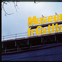
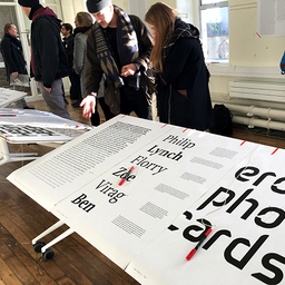
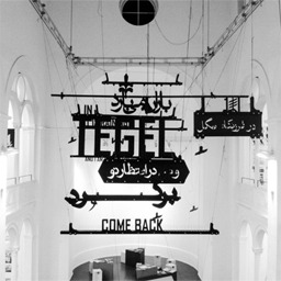
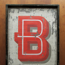
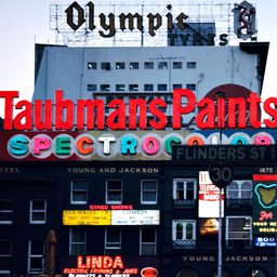
A meditation on analog beauty—and vernacular signage—from Elizabeth Goodspeed.

Richard Stengel makes a compelling case that journalism should be free to save democracy. “According to the Reuters Institute for the Study of Journalism, more than 75% of America’s leading newspapers, magazines, and journals are behind online paywalls. And how do American news consumers react to that?” (Subscription required.) 

Please, please, pleaseget some sleep.

The Supreme Court allows Idaho to ban transgender health care for minors. For now.

Historically, we’ve invested huge resources to keep cities and nature separate. But we now know that the health of the soil and the health of people are the same story. So, what does this have to do with design? Join the unstoppable John Thackara and Milan Politecnico professor Ezio Manzini today at 11 am ET as they discuss this critical—and surprisingly overlooked—environmental issue.

Conducted through audio interviews, Ana Miljački's I Would Prefer Not To is an oral history project on the topic of the most important kind of refusal in architects’ toolboxes: refusal of the architectural commission. (Miljački, an architectural historian and theorist, is also Director of the Critical Broadcasting Lab at MIT.) Produced in conjunction with the Architectural League of New York, this podcast features conversations with a number of fascinating practitioners including Diller + Scofidio's Elizabeth Diller, WXY partner Claire Weisz (who we interviewed in Season Three of The Design of Business | The Business of Design) and Nina Cooke John (a Season Nine guest).

This past winter, a diverse cohort of students from the MADE Program at Brown + RISD and Harvard immersed themselves in a wealth of data provided by the City of Boston with the mission of uncovering novel, meaningful, and joyful perspectives on navigating and understanding the urban environment. Their resulting projects—a series of interactive exhibits ranging from envisioning the evolving contours of the coastline to revealing the secret lives of the city’s trees—will be on view this week at the Boston Museum of Science.

Designers are leaving corporate life in droves, re-designed out of their own jobs. “The strategic design gold rush is over,” reports Robert Fabricant.  So, where are they going? “[A} new class of platforms and networks have emerged, including NeolDesign Executive CouncilChief Design Officer School, Design Leadership Job Board, and Design Leaders.” This isn’t a bad thing, he says. “These platforms specifically target ‘fractional’ design leaders who are looking to support one another, collaborate on projects, better communicate their value, and source new income-generating opportunities, both individually and collectively.” 

A new project designed to amplify Indigenous-owned businesses on Google Maps and Google Search gets high marks from Huitzilli Oronia, a Chicana designer from Denver, Colorado, and the creative production agency Hook.  Oronia contributed Google’s Indigenous-owned attribute icon and associated launch materials to the initiative. “This wasn’t just another campaign; it represented an opportunity to help Indigenous business owners share their heritage and foster deeper connections between the businesses and their consumers,” she says.

Yet another social app built around talk, not text! 

Faith Ringgold, the multimedia artist whose soaring work documented race, class, family, community, justice, and the African American experience in the U.S., has died. She was 93. Her work included painting, sculpture, mask- and doll-making, textiles, performance art, and children’s literature. “Few artists have kept as many balls in the air as long as Faith Ringgold,” the New York Times art critic Roberta Smith wrote in 2013. “She has spent more than five decades juggling message and form, high and low, art and craft, inspirational narrative and quiet or not so quiet fury about racial and sexual inequality.”

Nike is under fire for its “needlessly revealing and sexist” Team USA women’s track and field kit. “Wait, my hoo haa is gonna be out.”

AI is rewriting the internet. Here’s what to expect from Microsoft’s Copilot, Google’s Gemini, and OpenAI’s ChatGPT-4. “These AI tools are vast autocomplete systems, trained to predict which word follows the next in any given sentence. As such, they have no hard-coded database of ‘facts’ to draw on — just the ability to write plausible-sounding statements. This means they have a tendency to present false information as truth since whether a given sentence sounds plausible does not guarantee its factuality,” says reporter James Vincent. Yay! The future sounds…?

The National Governors Association has launched a new Health Equity Learning Network to support policy solutions and share strategies to reduce health inequities in the U.S.

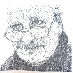
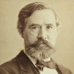
Daniel Kahneman, the Nobel Prize-winning psychologist who became known for his groundbreaking work in bias, heuristics, and how people make decisions, has died at 90. Kahneman became widely known for his 2011 book Thinking, Fast and Slow, which aimed to “improve the ability to identify and understand errors of judgment and choice, in others and eventually ourselves, by providing a richer and more precise language to discuss them.”

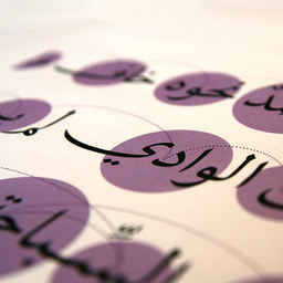
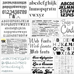
Maqroo means readable: Leo Burnett Dubai agency has partnered with Omantel telecom network to create a new dyslexia-friendly Arabic font. “Arabic is one of the oldest and most beautiful languages in the world. With 12 million words it is also the most complex, making it even harder for those with dyslexia to learn it,” says Leo Burnett Dubai art director Abdo Mohamed. (It’s also beautiful.)

Wicked looks good.

The much anticipated Humane AI Pin has arrived, an expensive, subscription-based wearable chatbot — or “second brain” — that nobody seems to like very much. Yet, I guess.

Who will represent working-class life?documentary about the UK-based photographer Tish Murtha is asking important questions about which stories are told visually — and supported by the art establishment — and why. “She showed the reality of poverty and deprivation in communities where the misery of unemployment had been allowed to settle by the Westminster political classes who considered it a price worth other people paying for the boon of undermining trade union power,” writes Peter Bradshaw. “But in capturing the faces, particularly the faces of children, Murtha showed her subjects’ humour, optimism and refusal to be cowed.”

An employee who worked as an art installer secretly hung one of his own paintings in the Pinakothek der Moderne in Munich, and we’re not that mad about it. “He was carrying tools; that’s why he went totally unnoticed,” said Tine Nehler, a museum spokesperson. “As a technician, he was able to move around all areas of the building outside of opening hours.”

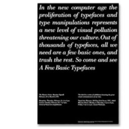
Marian Bantjes critiques the design and logic (and design logic) of the food pyramid (and pyramids in general).

Lesly Pierre Paul’s New Vision Art School turns to the arts as a way to continue local traditions and keep neighborhood children out of gangs. 

Tahnee Ahtone joins the Nelson Atkins Museum in Kansas City as Curator, Native American Art. She was previously the Director and Curator at the Kiowa Tribal Museum in Carnegie, Oklahoma.

News we love: founded in 2002 by Nínive Calegari, a teacher, and McSweeney's founder (and author) Dave Eggers, 826 Valencia receives a $1 million donation from Yield Giving, a massive philanthropy effort by Amazon co-founder MacKenzie Scott.

Next week, Case Western will host design anthropologist Christina Wasson, who will deliver the 2024 Applying Anthropology to Real World Problems Lecture. Entitled The Participatory Design of Indigenous Heritage Archives, Wasson will describe how she has adapted participatory design methods to develop archives that preserve indigenous languages. (Thursday, April 18, at 4 p.m. in Mather Memorial Building, Room 201.)

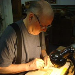
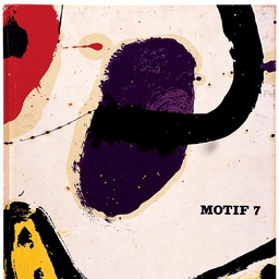
Margerete Jahny belonged to a rare demographic of industrial designer: she was East German—and female—and according to design historian Günter Höhne, she was the first East German industrial designer, of any gender, with a university education.

New “networks” and “platforms” targeting “fractional” design leaders who are looking to support one another, collaborate on projects, better communicate their value, and source new income-generating opportunities, both individually and collectively. More on the reinvention design leaders are facing, by Robert Fabricant.

Democratic state lawmakers in Colorado are ending the practice of anonymous surveys to determine which bills should live or die. The change to make all parts of the survey public comes months after a judge ordered lawmakers to stop using their previous secret ballot system to prioritize legislation because it violated Colorado’s open meetings law, reports the Longmont Leader.


Jobs | April 19